

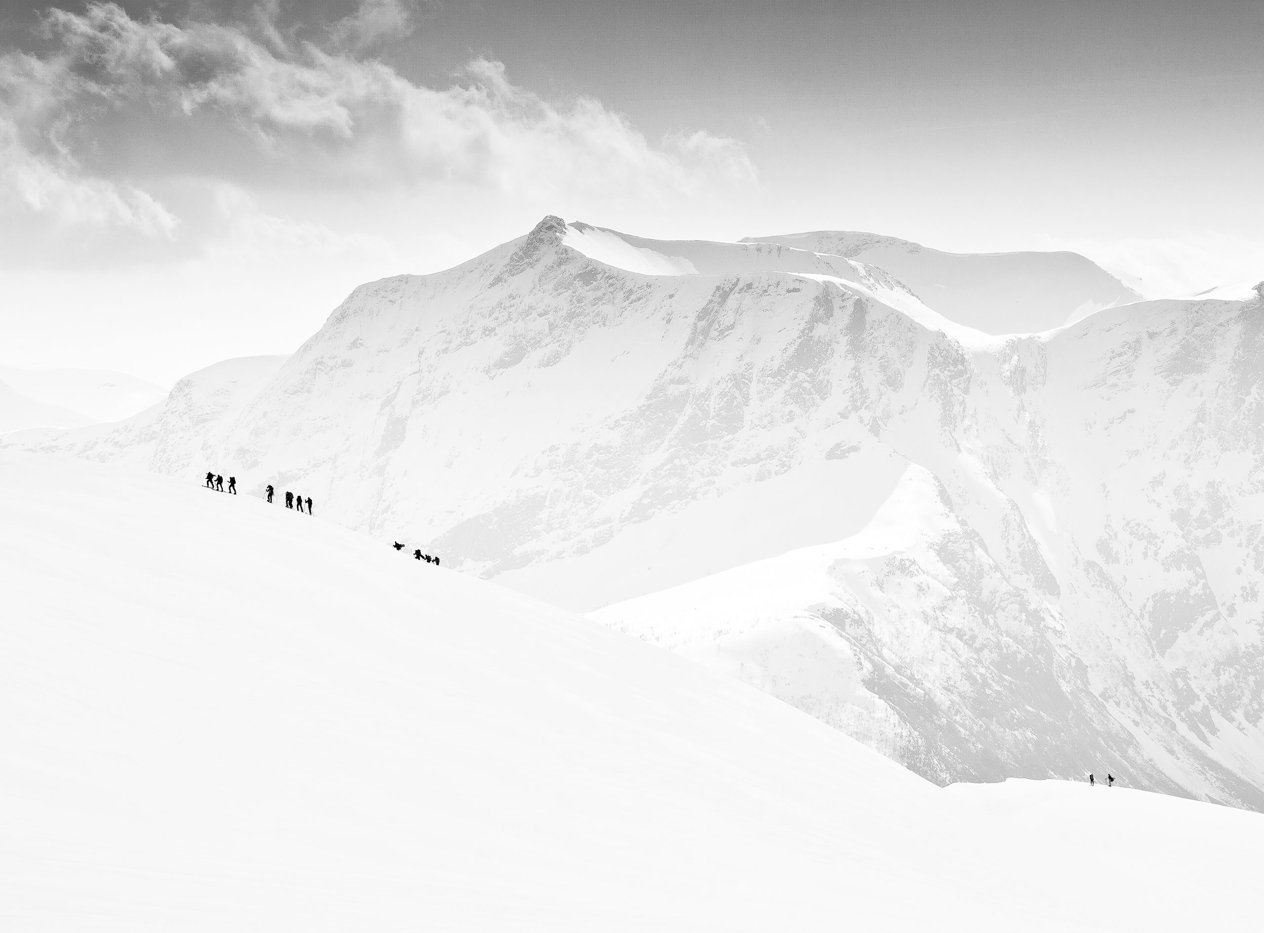
|
|
|
|
by Editor Jane Lyons
Edited and published by Yvette Depaepe, the 20st of November 2026
*“To be truly iconic you have to be recognized in a silhouette.”* — Slash

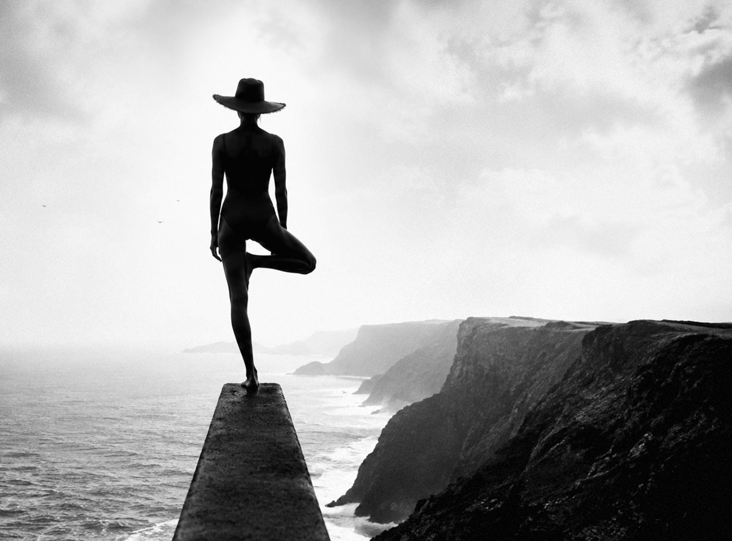
“Wonderful view” by Nic Keller
Silhouettes are so effective in photography because they eliminate distractions, enabling us to focus on the shape, light, and emotional impact of an image. By eliminating detail, silhouettes simplify a scene, often making it more powerful in the process.
There is something intriguing about what a silhouette reveals and conceals. Without facial expressions, colours or familiar details to guide us, we must interpret the image for ourselves. A simple outline can suggest mystery, drama, solitude, humour or even sadness. Sometimes, what we cannot see becomes as important as what we can.

untitled by Leyla Emektar La_
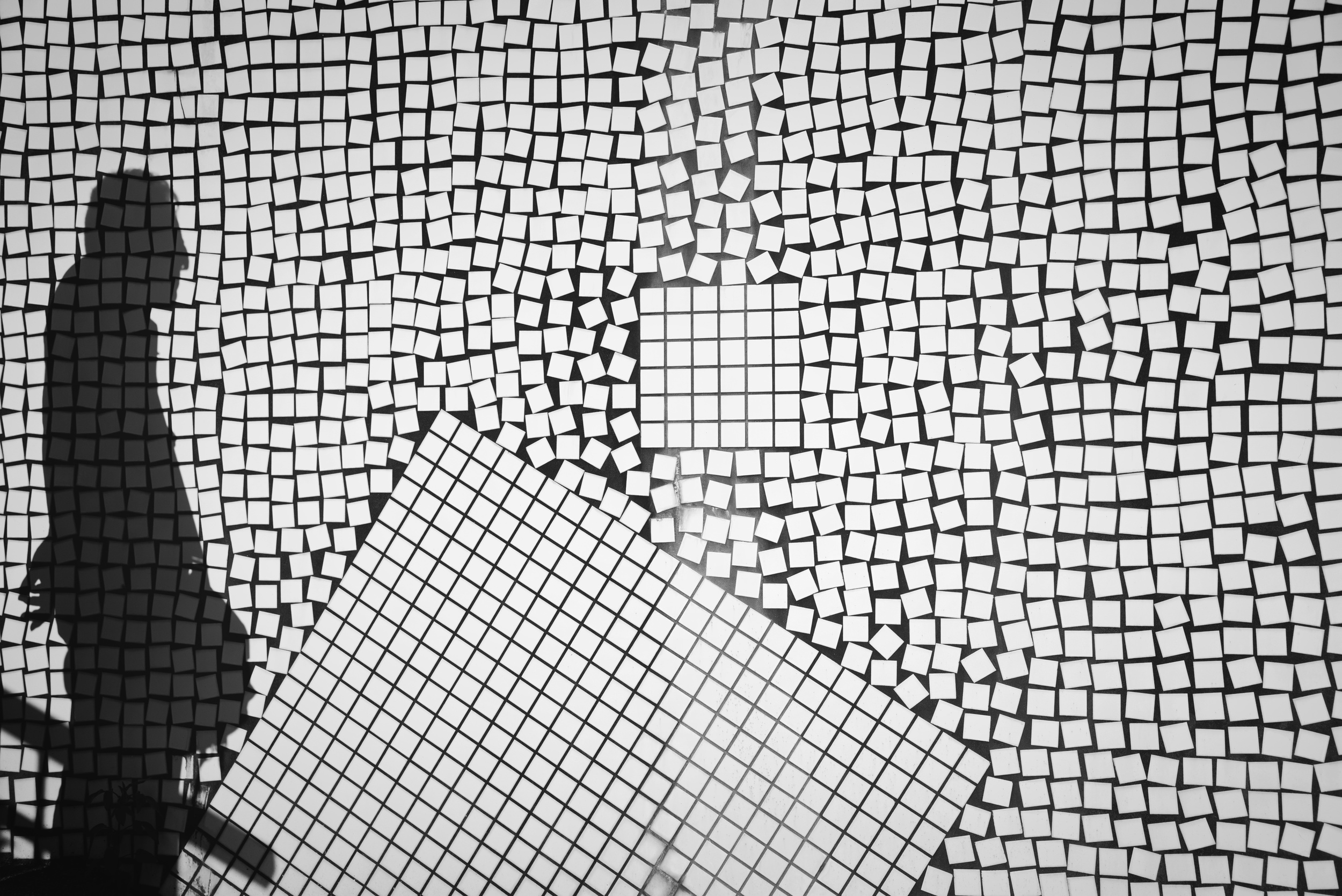
“Afternoon shadow” by Reiko Kiri
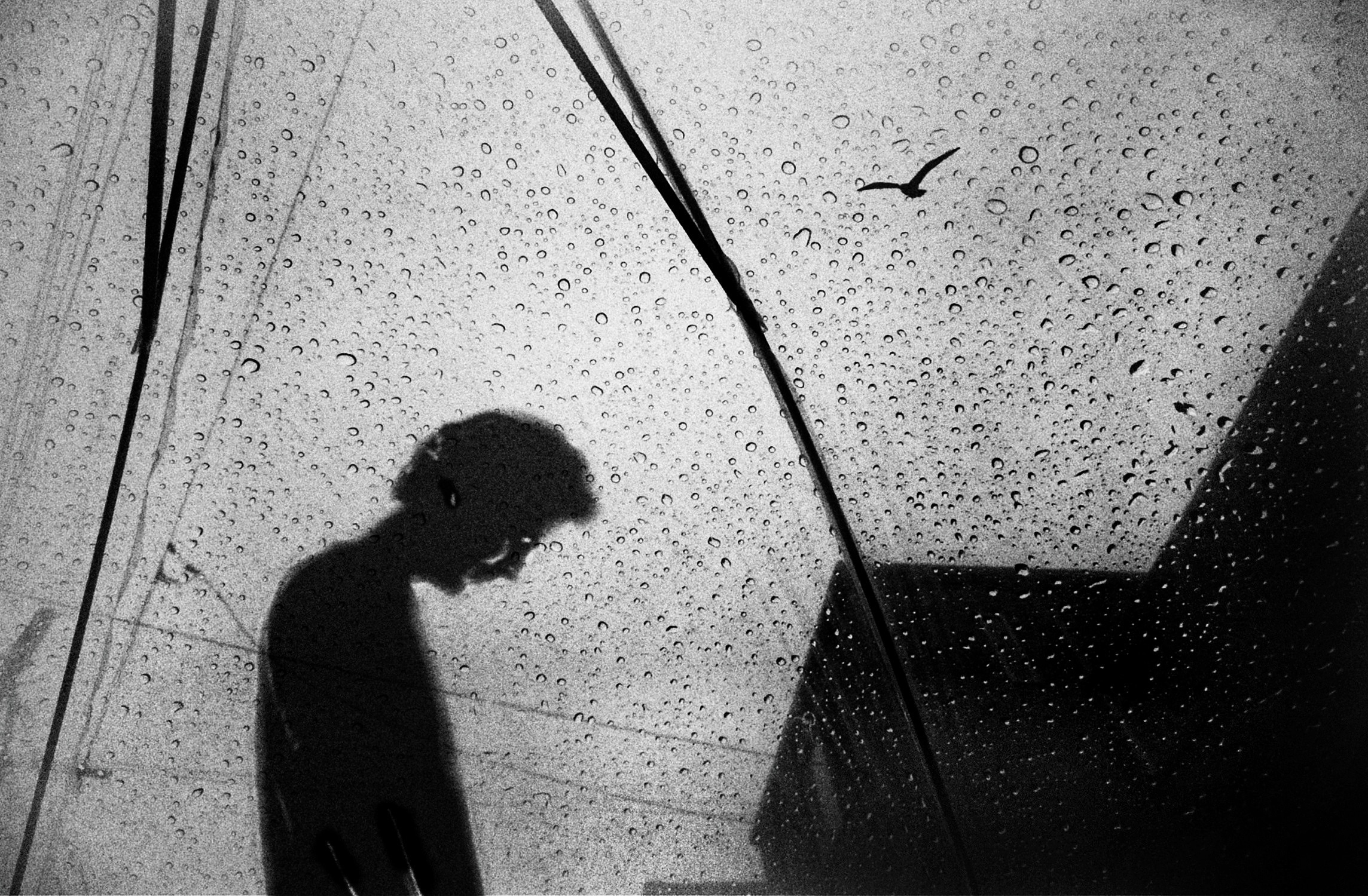
“Silence of Sorrow” by pphgallery

“Tango Argentino” by Holger Droste
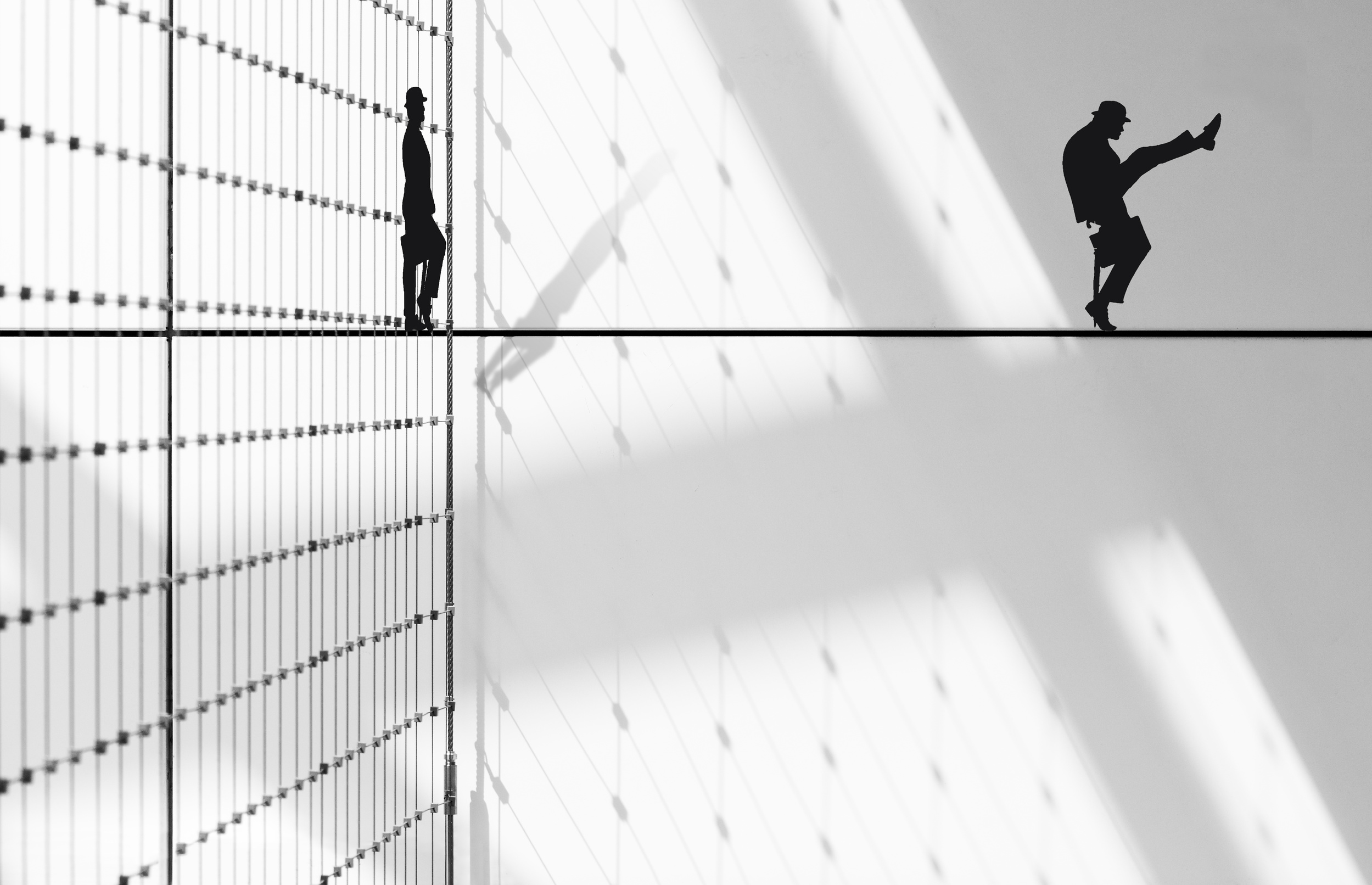
“Silly Walk” by Greetje van Son
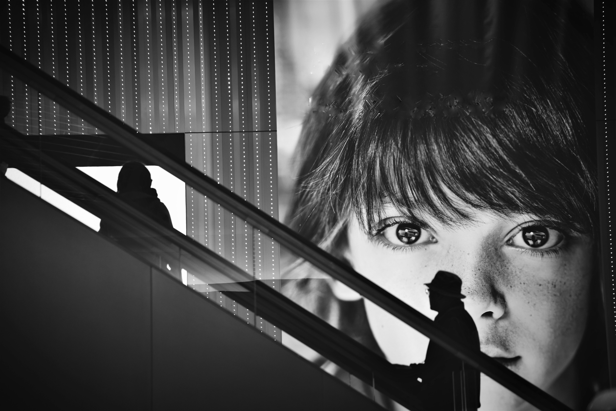
“Emerge Silhouette” by Reiko Kiri
From a practical standpoint, silhouette photography allows us to transform challenging lighting conditions into creative opportunities. Rather than fighting strong backlighting, we can use it to our advantage. How many times have you made an exposure mistake, only to find that the resulting silhouette was more interesting than the original photograph?

“Meeting Point” by Hans-Wolfgang Hawerkamp

“On their way” by Mania De Praeter
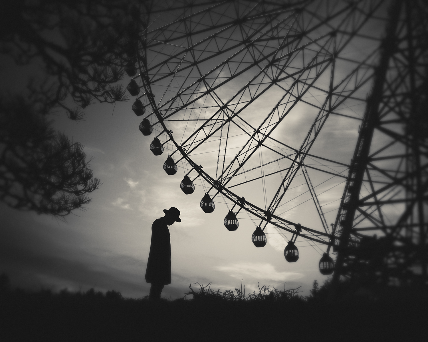
untitled by Hengki Lee
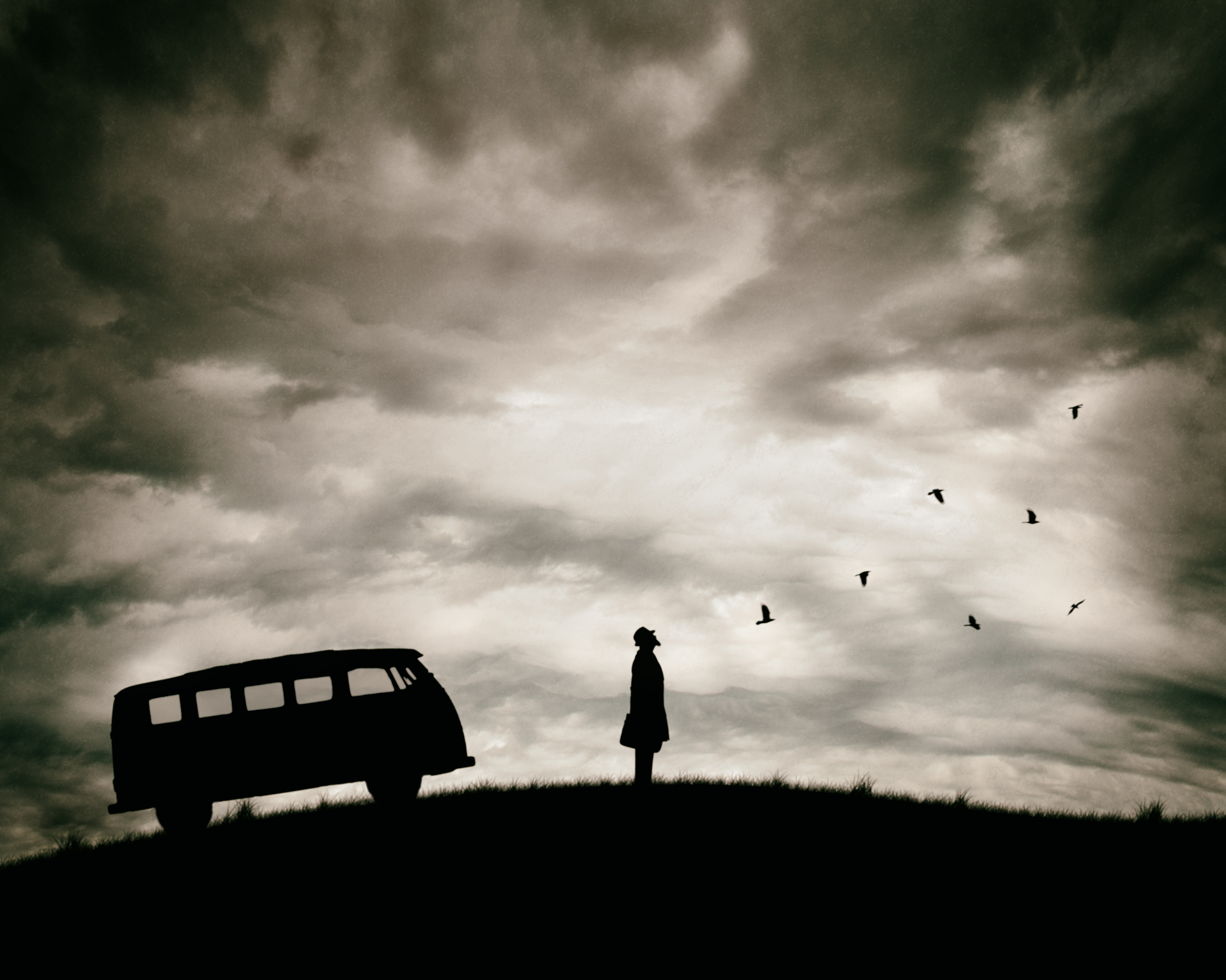
“Freedom” by Petri Damstén
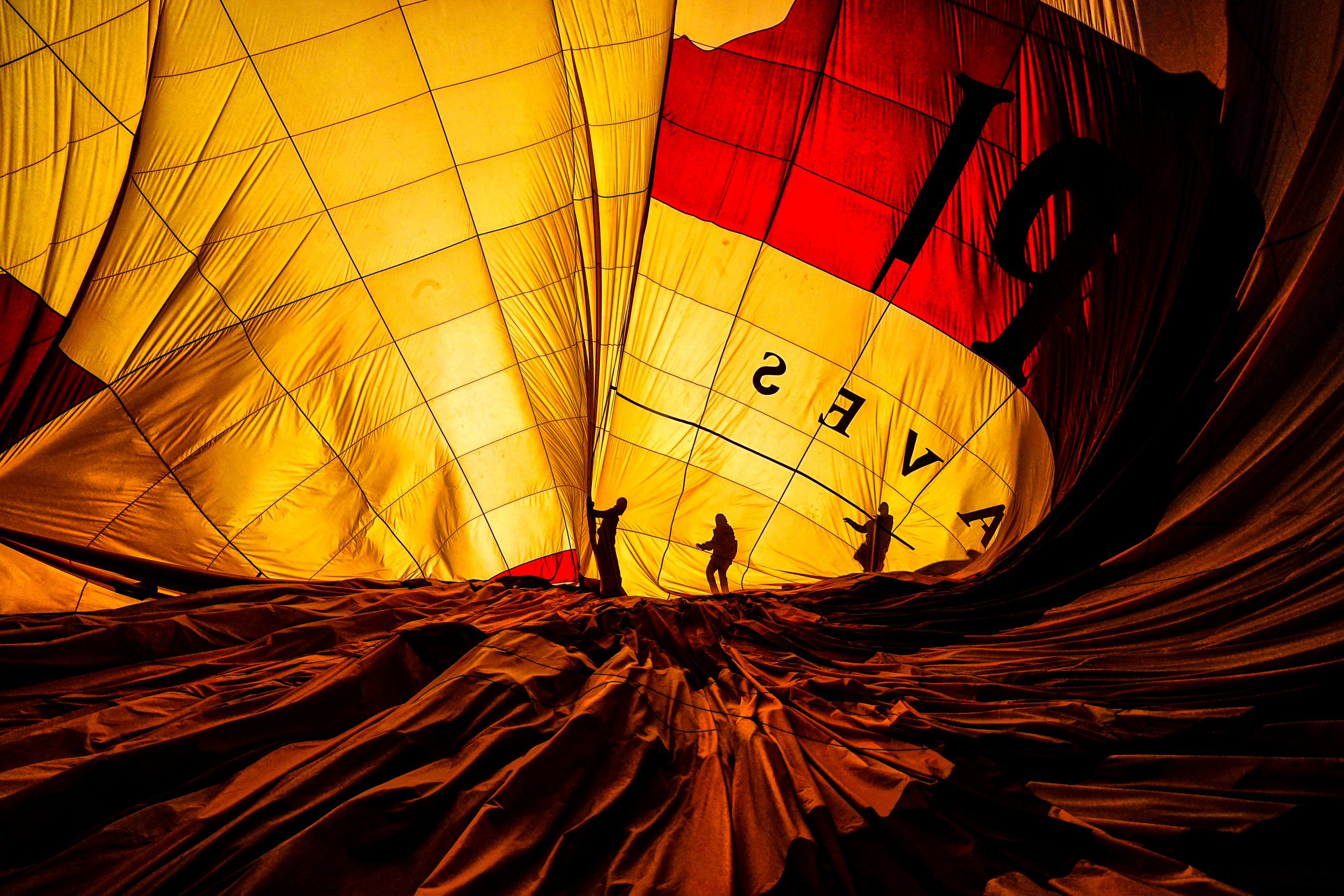
“When the balloons go out” by Gilcan Mete
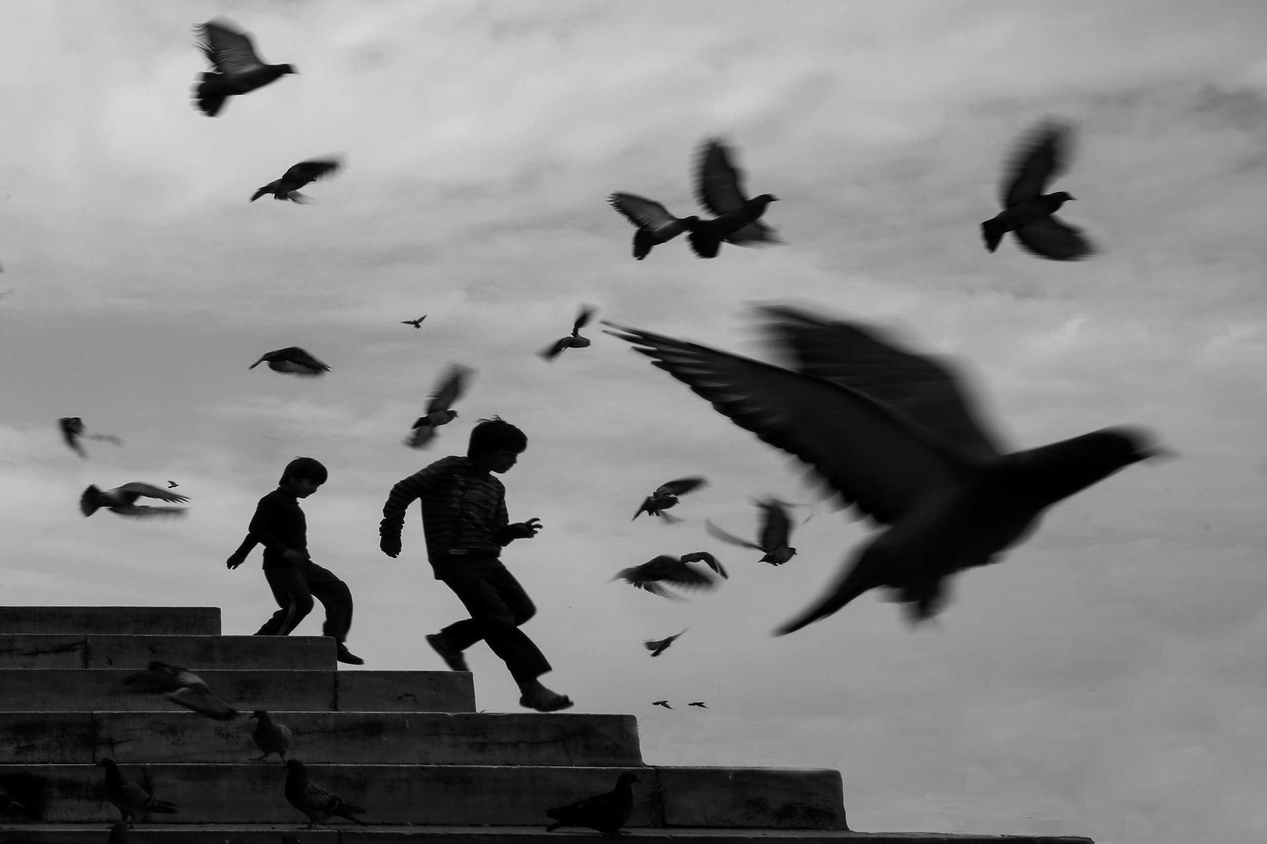
“Freely” by Ummu Nisan Kandilcioglu

“U Bien Bridge” by Emel Sefer
Lighting is, of course, the key. Having a strong light source behind the subject, such as a bright sky, a setting sun or even a window, makes it easier to create a clean, well-defined silhouette. The trick is to expose for the brighter background rather than the subject, allowing the foreground to fall into shadow. Exposure compensation can also help by darkening the image deliberately.
However, successful silhouettes involve more than just exposure. Composition becomes especially important when details disappear. The placement of a figure, the relationship between shapes, the use of negative space, and even the smallest gesture can determine whether an image is ordinary or memorable.
Working with silhouettes is also a great way to hone your visual skills. It encourages us to look beyond the obvious subject and pay closer attention to form, balance, and how light transforms a scene. Even ordinary objects and familiar situations can suddenly become something quite unexpected.
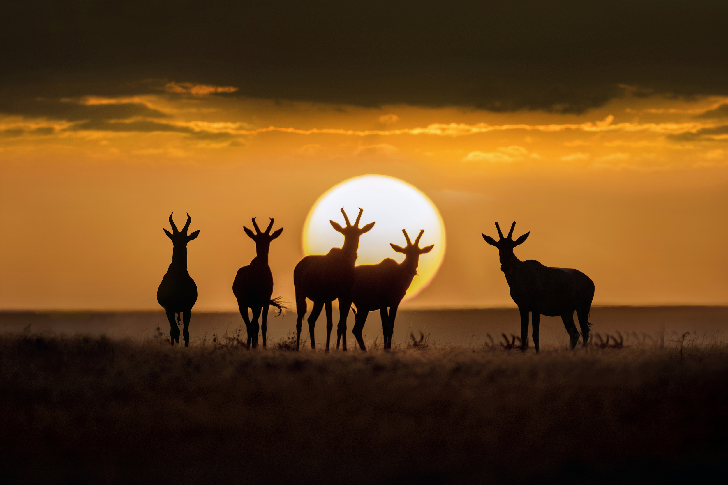
“Topis at sunset” by Xavier Ortega

“There is nothing new under the sun” by janini (Zhana Topchiva)

“We are here waiting for you” by Shenshen Dou
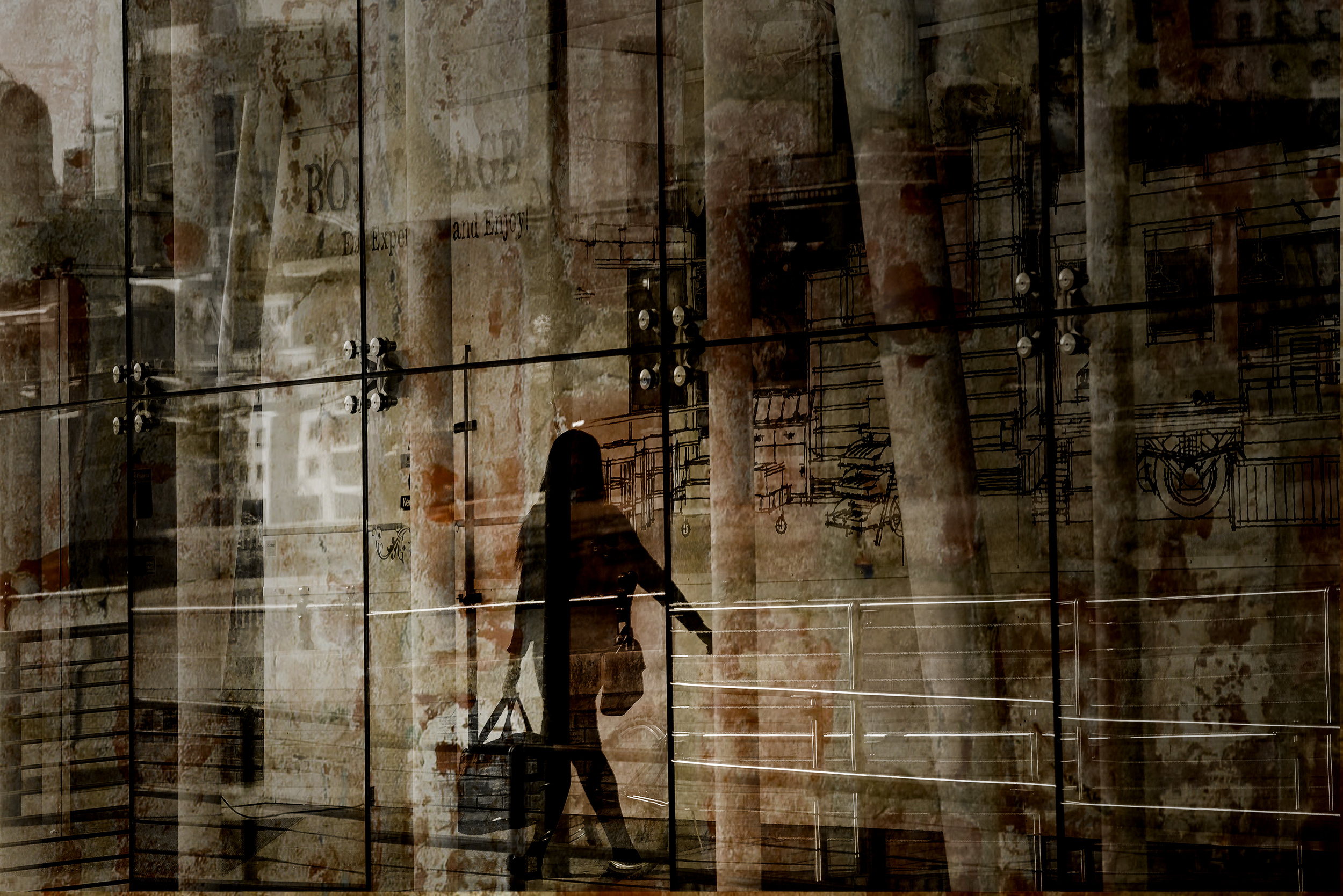
“Bon Voyage” by Chris Hamilton

“Alone with big clouds” by Nic Keller
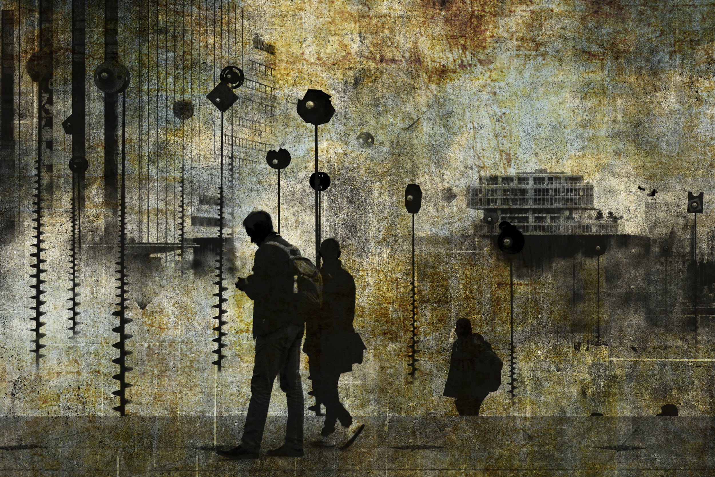
“Architecture” by Isabelle DUPONT
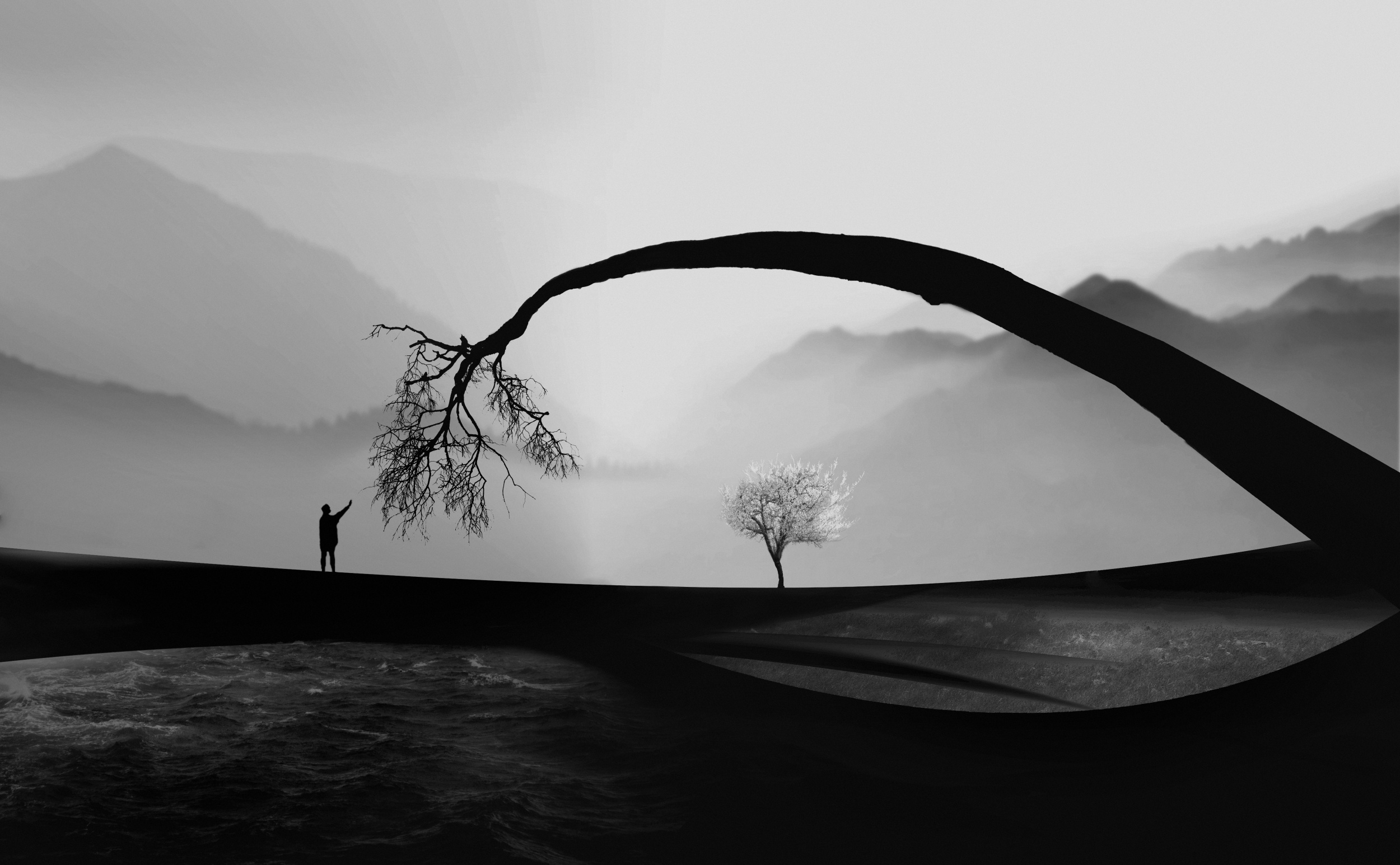
“Touch” by Hadi Malijani (Malenjani)
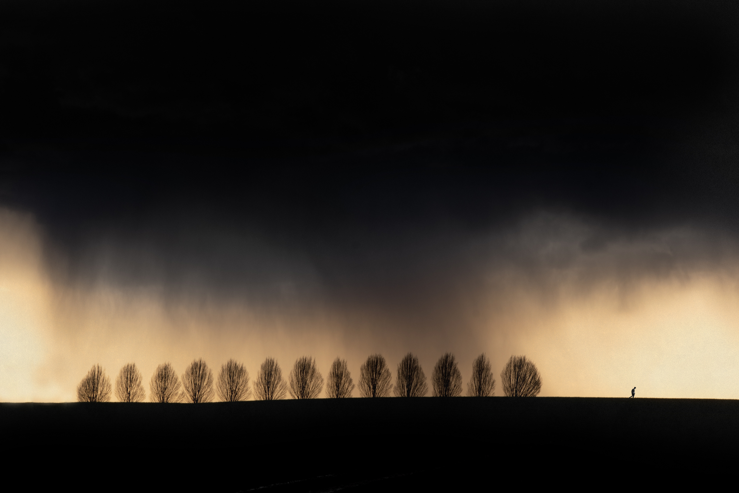 “A Silent Weapon for a Quiet War” by Adam Dauria ☂
Black-and-white silhouettes are perhaps the most iconic examples, with their strong contrasts and graphic simplicity. However, colour introduces another dimension. It can set the mood, add warmth or drama, and create striking contrasts between subjects and their surroundings.
The photographs in the 1x archive demonstrate the extraordinary range of creative possibilities that silhouettes offer.
From simple outlines to complex compositions filled with movement and atmosphere, they show that sometimes a photograph can be far more compelling with less information.
 | Write |
 | Hadi Malijani (Malenjani) PRO Dear Jane,
Thank you for this wonderful article and for including my photograph in your carefully curated selection. I particularly enjoyed your perspective on turning challenging lighting conditions into creative opportunities. It is a beautiful reminder that photography is not always about controlling every element, but also about recognizing unexpected possibilities and making something meaningful out of them.
My appreciation to you and Yvette for bringing together such a diverse collection of work and sharing it with the 1x community. Congratulations to all the featured photographers! |
 | Hans-Wolfgang Hawerkamp PRO thanks a lot dear Jane for this great honour to be featured again with an image. It´s a fascinating theme for an article. Thanks also to Yvette for her work as a publisher
|
 | Sokol Priftaj PRO Wonderful article |
 | Christine Hardcastle PRO Fantastic article and images! Thank you! |
 | Yvette Depaepe CREW Fine article, well written in your lovely style, Jane ... Great choice of images too. Thanks, my dear friend ... and congratulations to the authors. Have a wonderful weekend ahead. Cheers, Yvette |
 | Greetje van Son PRO Hello Jane. With much pleasure I read and looked at your article 'silhouets. You have choosen a lot of beautiful photos and I am glad to see one of mine among them. Thanks a lot for choosing and share this article. Thanks to Yvette for publishing! |
 | Ralph Scylla CREW Dear Jane,
What a lovely article, and what a wonderful selection of photographs!
I particularly enjoyed your observation that sometimes what we cannot see becomes just as important as what we can. To me, that is precisely where photography becomes more than a mere representation of reality. By taking away detail, we leave room for imagination, interpretation and emotion.
I also like the way you combine practical advice with a genuine appreciation of the artistic possibilities. You remind us that simplicity is not necessarily the absence of complexity, but sometimes the result of understanding what really matters.
A beautifully written and illustrated piece. Thank you for a very enjoyable read! |
by Editor Ralph Scylla
Edited and published by Yvette Depaepe, the 18th of November 2026
Seven photographs, seven songs, and a few things I never quite managed to say.
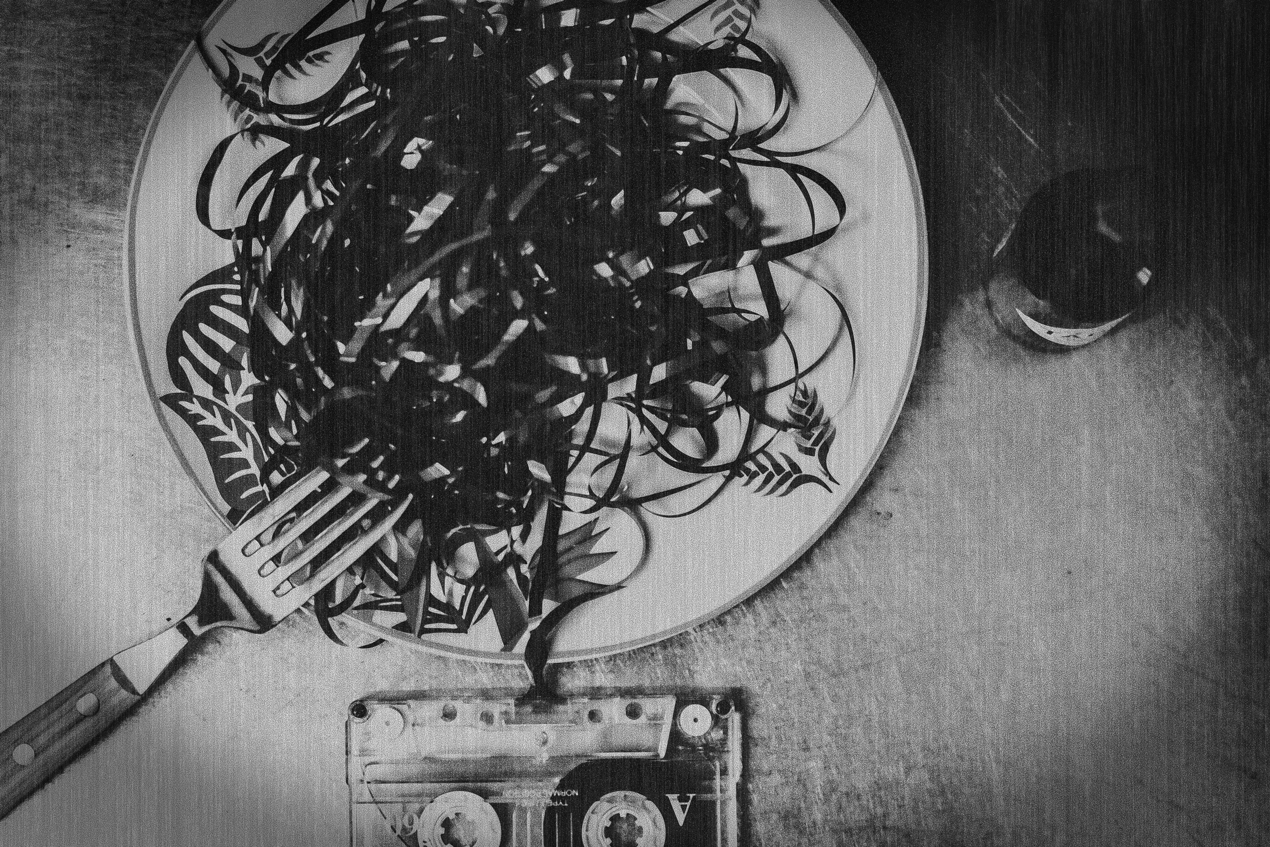
“analog dinner” by Teruhiko Tsuchida
I belong to a generation that expressed romantic feelings by sitting in front of a radio with one finger on the record button.
For hours.
We waited for the right song, hoping the DJ wouldn’t talk over the introduction or, even worse, the ending. We recorded it onto a cassette, rewound it, listened to it, and occasionally discovered that we’d recorded the weather forecast as well.
Then we did it all over again.
Making a mixtape was a serious business. The order of the songs mattered. The opening track had to be perfect. The final song had to say something profound, preferably something we were far too embarrassed to say ourselves.
We wrote the titles on the little cardboard insert, sometimes decorated the cover, and eventually presented our masterpiece to the woman of our dreams.
With trembling hands.
It was, essentially, a declaration of love disguised as a collection of other people’s songs.
Unfortunately, the woman of our dreams didn’t always share our enthusiasm. I suspect some of my most carefully assembled mixtapes ended up in drawers, never to be heard again. Others may have been recorded over with something more useful. The weather forecast, perhaps.
You might think I would have learned my lesson.
Apparently not.
Many years later, I made another musical compilation, this time for my daughter Hannah. No cassette, no radio, no trembling hands. Just a playlist.
Whether she ever listened to it is another question.
But I’ll come back to that.
I’ve paired seven photographs from 1x with seven pieces of music that came to mind while looking at them. Think of it as a mixtape you can start anywhere.
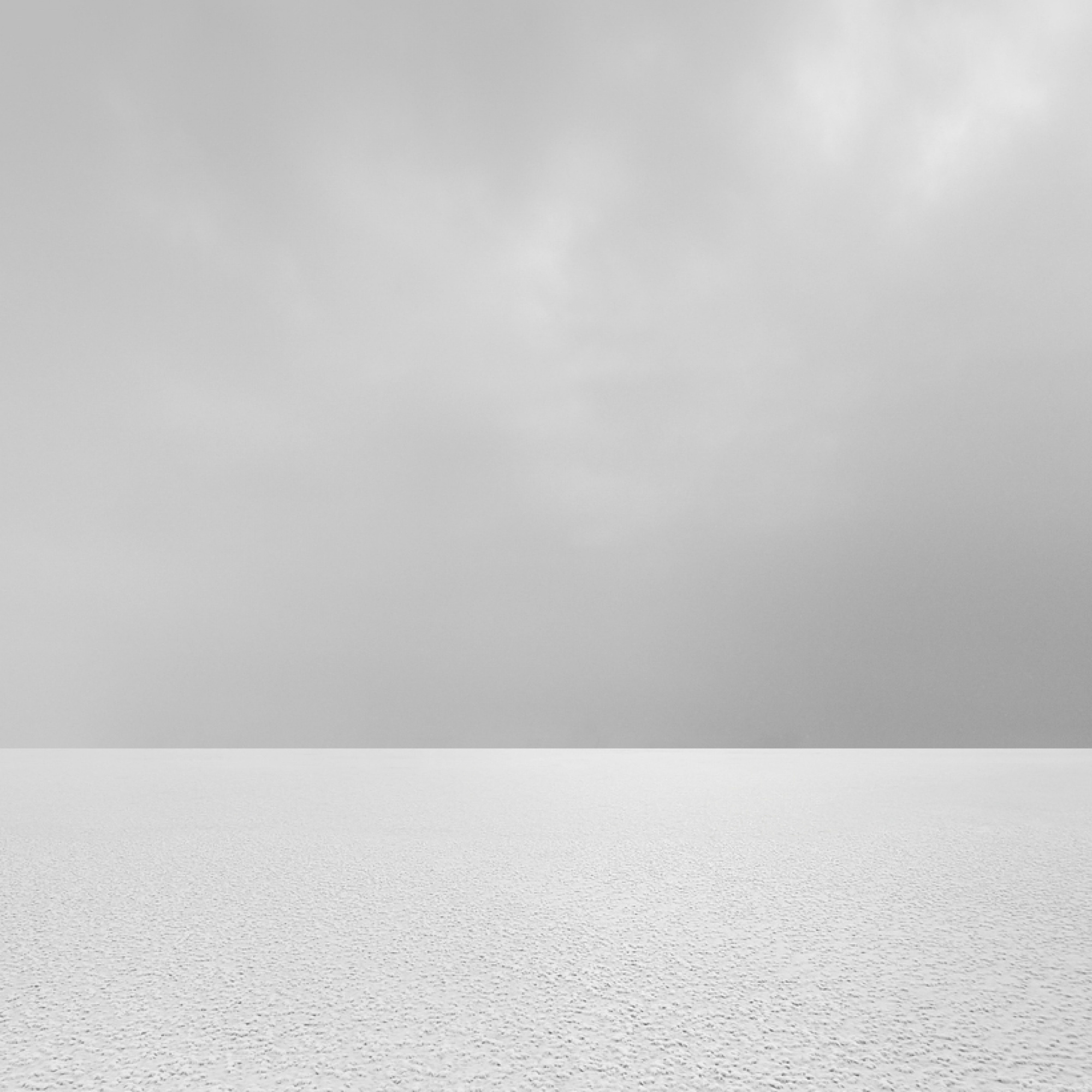
“ARCTIC SILENCE 15” by Patrick Ems
Song: Ryuichi Sakamoto · Bibo no Aozora
Music and images have been keeping each other company for a very long time. Think of the helicopters approaching to the sound of Wagner’s Ride of the Valkyries in Apocalypse Now. Or Louis Armstrong singing What a Wonderful World while Good Morning, Vietnam shows us images of war and destruction.
For me, Underworld’s Born Slippy .NUXX will probably always belong to Trainspotting. I only have to hear the opening notes and the film starts playing somewhere inside my head.
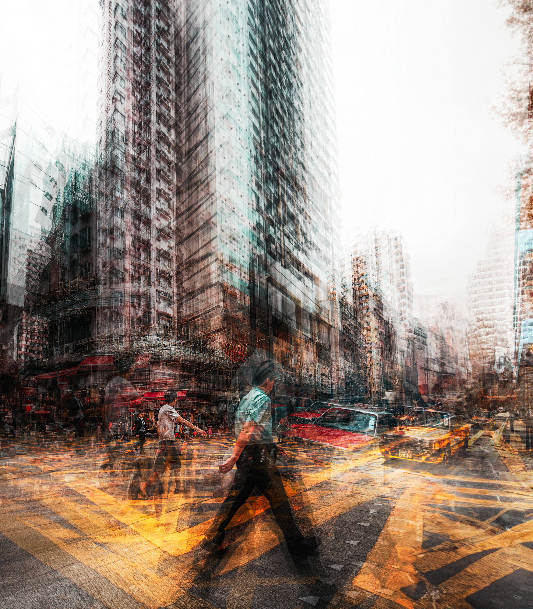
“Another Brick in the Wall” by Carmine Chiriacò
Song: Underworld · Born Slippy .NUXX
In a film, someone has chosen the music for us. But occasionally I look at a photograph, and a particular song simply appears in my mind.
I don’t choose it. It just arrives.
A portrait might remind me of Tom Waits. An empty street might bring back a song I haven’t heard in thirty years. Sometimes the connection is obvious. Sometimes it makes absolutely no sense.
A photograph is never quite the same for two people. The photographer brings something to the picture. The viewer brings something too. And sometimes, without warning, we bring an entire record collection.

“old harburg bridge” by Alexander Schönberg
Song: Nick Drake · River Man
My friend Steven, who kindly read an earlier version of this article, raised a thoughtful objection. Associating a photograph with a particular song, he suggested, might interfere with the viewer’s own interpretation.
He has a point. A photograph should be able to stand on its own, and a song that means everything to one person may mean absolutely nothing to someone else.
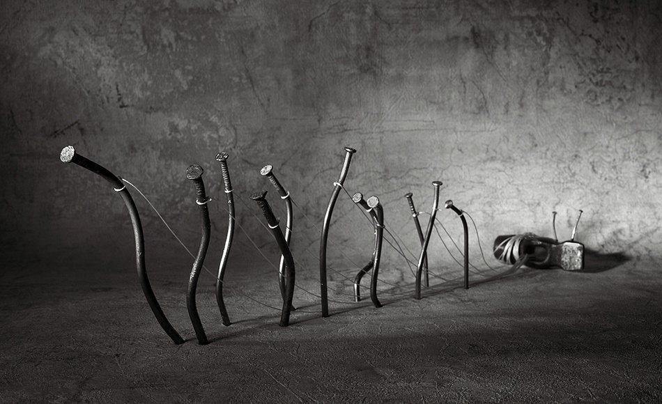
“Barge haulers” by Victoria Ivanova (Glinka)
Song: Tom Waits · Take It with Me
These pairings say something about how I see the photographs. They probably reveal considerably more about me.
I have occasionally used lines from songs as titles for my own photographs. Some people may recognise the reference. Others may discover something entirely different. Or they may simply conclude that I’ve chosen a ridiculous title.
All three possibilities seem perfectly reasonable.

“Grief” by Ton Dirven
Song: Max Richter · On the Nature of Daylight
Sometimes I simply don’t know why a particular photograph reminds me of a particular song. And I rather like leaving that a mystery.
So I shall leave the photographs and the music alone together. They can sort things out between themselves.
Perhaps one of these photographs will remind you of a song I’ve never heard. Perhaps one of the songs will bring back a memory that has nothing whatsoever to do with my own.
That would be wonderful.
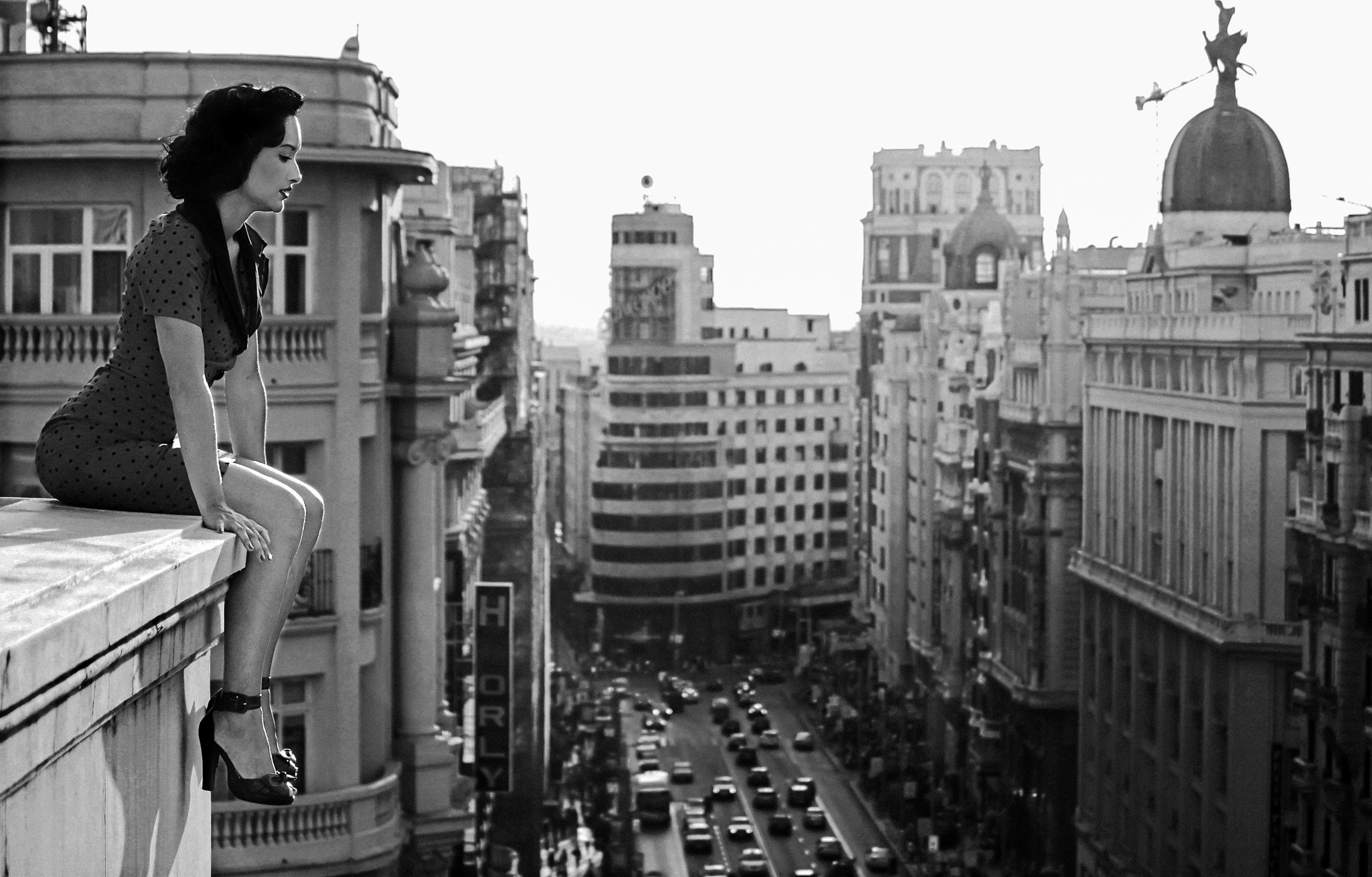
“Mad Madrid” by Alejandro Marcos
Song: Joni Mitchell · Both Sides, Now (2000 orchestral version)
So, about that playlist.
I made it for Hannah out of songs that had accompanied me through different parts of my life. Some remind me of people, some of places, some of moments I’d happily experience again. Others remind me of things I’d rather forget.
I suppose it was another attempt to explain myself through music. A rather long musical letter, assembled from songs written by people who were considerably better at expressing themselves than I am.
I don’t think she’s ever listened to it. Which, considering my earlier experiences with mixtapes, suggests a certain consistency in my life.
But the playlist still exists.
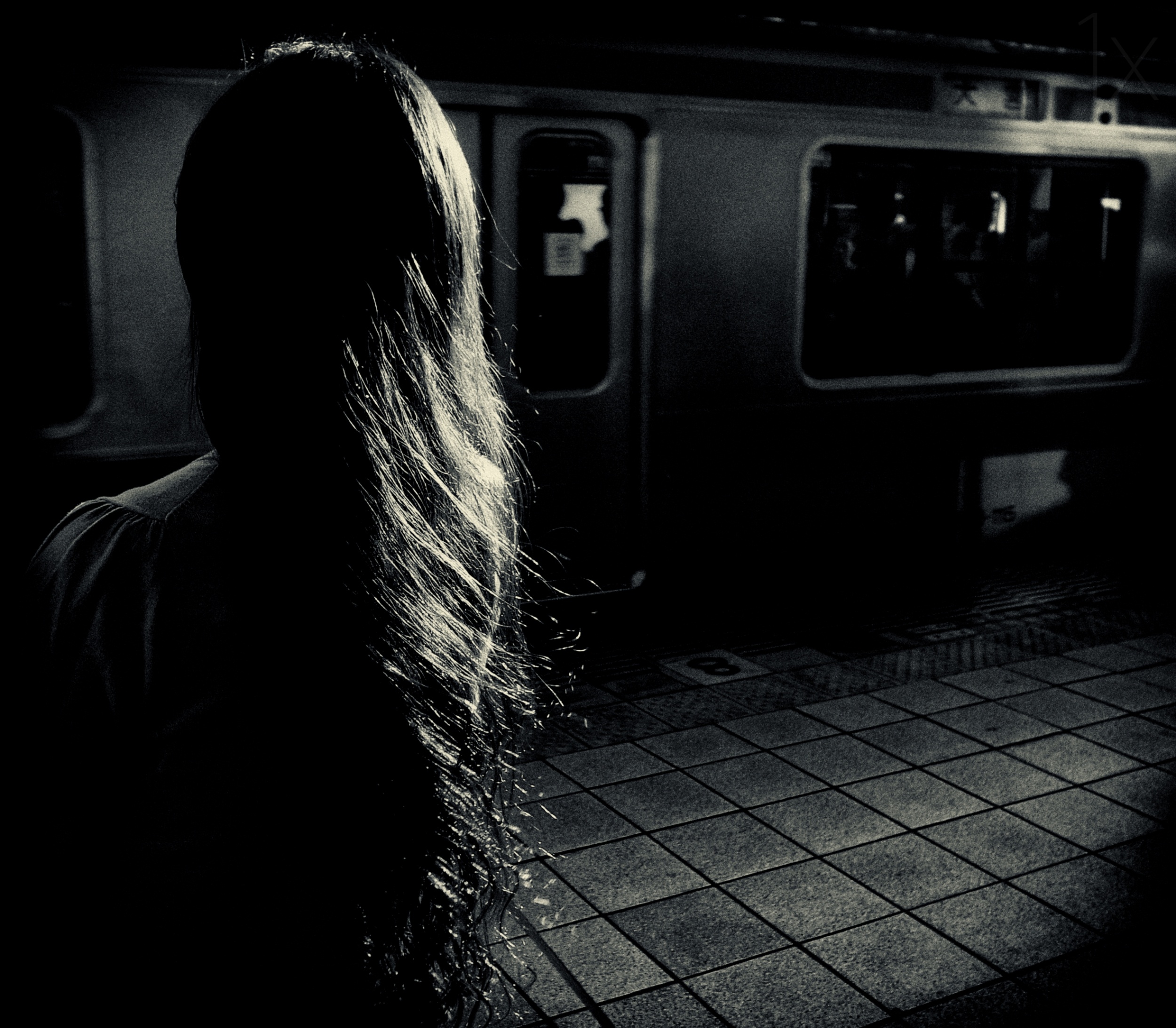
“waiting” by Tatsuo Suzuki
Song: Fred again.. · Kyle (Northern Line)
And if you can make a better mixtape, please send it to Hannah...
|
 | Mike Kreiten CREW Very interesting article, Ralph. Reminds me of our common friend Steven's comments. Since you engage in the Critique forum quite intensely, I think it's a missed chance to refer to photography as a source for emotions, either recall or even receive some without knowing the scene from other's work. If a photo can convey emotions, it's usually good. No matter if just a mood, a smile, envy, desire. |
| Ralph Scylla CREW Hi Mike,
Yes, I can certainly relate to your point about envy. There are quite a few photographs out there that make me positively green with envy!
First of all, thank you very much for your comment. And please forgive me for occasionally trespassing on your territory in the Critique Forum. We've talked about this before, of course, and you did say I was welcome to contribute my two cents from time to time.
And naturally, you're absolutely right: photography is a source of emotion. In fact, I think that is precisely what makes both curation and photographic criticism so incredibly difficult.
How many technically perfect photographs do we see every day that ultimately leave us completely indifferent? That, I must admit, is one of my greatest difficulties when judging photographs.
I might look at an architectural photograph and genuinely admire the amount of work that has gone into it. Someone may have spent three hours correcting converging verticals, carefully refining the tonal variations of the concrete, and making sure every last detail is absolutely perfect. I look at the result and think: Good heavens, what dedication! What technical brilliance! What impeccable craftsmanship!
And yet the photograph does absolutely nothing for me. Nothing at all.
Then I come across a blurred black-and-white photograph of a woman standing beneath a shower, perhaps photographed in deep, low-key lighting, perhaps not even particularly accomplished technically – and suddenly, there is an emotion. An atmosphere, a suggestion of a story, something that reaches me immediately.
Or take the very first photograph in my article, *Analog Dinner*. It instantly takes me back to the days when we fiddled about with music cassettes, painstakingly wound unruly tape back into its casing, and tried to splice broken lengths together. If you remember those delightful little exercises, you'll also remember that they were not particularly delightful at the time! And yet that one photograph brings back an entire world of memories.
Perhaps that is the essential difference between a photograph whose craftsmanship I admire and one that genuinely moves me.
So yes, I agree with you: the ability to evoke an emotional response is, to my mind, an essential ingredient of a truly good photograph. Although that leads us to a rather sobering conclusion: perhaps there aren't quite as many truly good photographs as we like to think.
Incidentally, I'm currently working on another article, this time about the overinterpretation of photographs. And while thinking about it, I noticed something rather peculiar: laughter seems to be virtually forbidden in fine-art nude photography.
Now, I certainly haven't examined every nude photograph under the sun, but I've looked at a fair few. Melancholy, longing, vulnerability, loneliness, desire, suffering – all perfectly acceptable. But a genuine, uninhibited laugh somehow seems to be incompatible with the prevailing aesthetic.
Why on earth should that be? Why is a naked person apparently allowed to express almost every conceivable emotion except sheer, unselfconscious joy?
I find that rather a pity. And perhaps it's another example of just how much our ideas of what constitutes 'good' photography are shaped by convention.
In any case, thank you for setting me thinking. As you can see, your comment has sent me off on quite a few tangents already. And that is precisely why I enjoy our exchanges so much! |
| Mike Kreiten CREW On quite a few, yes, lol. My pleasure. The joy in architectural shots or abstracts is hunting the perfect composition and light. Probably the only emotions they cause are envy and astonishment. Good enough for me, but as you know I "hunt" emotions, too, in other work. I'll proof you wrong... https://www.artsy.net/artwork/russell-james-cindy-smiling-in-bed-cindy-crawford :-) |
 | Nice work Ralph, I really enjoy your writing, and of course your photography. Warmest regards, Patrick |
| Ralph Scylla CREW Thank you so much, Patrick! That really means a lot to me. I'm discovering that writing about photography can be almost as enjoyable as taking photographs — although considerably less expensive, and the models rarely complain. ;-)
Warmest wishes,
Ralph |
 | Izabella Végh PRO Bellissimo articolo, come sempre. Grazie la gentile collaborazione a Tutti Voi! |
| Ralph Scylla CREW Thank you, Izabella! It was a pleasure putting the photographs and music together with Yvette. I’m glad you enjoyed the article.
|
 | Monica Mermoz PRO This is an excellent article! I’ve really enjoyed it.
I have rarely associated a photograph with a piece of music, but from now on, I will certainly keep that in mind much more.
Thank you Ralph and Yvette! |
| Ralph Scylla CREW Thank you, Monica! I’m glad the article gave you a new way to look at photographs. If a piece of music comes to mind the next time you see a photograph you love, I’d be curious to hear what it is. |
| Yvette Depaepe CREW Thanks for your appreciatyion, Monica ... Ralph did a great renewing job here! |
 | Naoaki Miyamoto PRO What a wonderful initiative, Ralph and Yvette!
I think this is a very refreshing way to communicate and share how each of us sees and interprets a photograph.
The wonderful works you selected have such a richness of expression that they allow for a wide range of interpretations.
|
| Ralph Scylla CREW Thank you, Naoaki. That was one of the pleasures of putting this together. Two people can look at the same photograph and hear entirely different music. Some of the photographs we chose could have had a whole playlist of their own. |
| Yvette Depaepe CREW All honours go to Ralph ... Such a fine article! |
 | Jane Lyons CREW Thanks for this Ralph. It's wonderfully original and appreciated very much. |
| Ralph Scylla CREW Thank you, Jane. I had great fun putting this one together, and I’m glad the idea felt fresh to you. |
 | Alfredo Bruzzone PRO very good idea to mix photos and music, at least all is Art!! And congrats t0 the authors |
| Ralph Scylla CREW Thank you, Alfredo! I like the way you put it. It’s all art. Sometimes a piece of music makes you go back to a photograph and notice a detail you missed the first time. I’m glad you gave the photographers a shout-out, too.
|
| | Yvette Depaepe CREW Great article, Ralph! I enjoyed it a lot as well as the choice of images and music. Don't forget that many of our members read the magazine but don't ever comment. I'm sure they like it a lot. Also, our articles are read through social media and by a lot of people outside the 1x community. Unfortunately, non-1x members cannot comment. Cheers, Yvette |
| Ralph Scylla CREW Thank you, Yvette, for publishing the piece and for reminding me how many people read the magazine without leaving a comment. It’s lovely to think the article might reach people beyond 1x as well. I’m glad you enjoyed the pairings. Choosing them was half the fun. |
 | Steven T CREW Thank you, Ralph and Yvette for another interesting article. Excellent photographs and beautiful music - some familiar, and some I did not know. |
| Ralph Scylla CREW Thank you, Steven! I’m particularly pleased that you discovered some music you didn’t know before. I hope you liked it. |
 | Excellent |
| Ralph Scylla CREW Thank you so much, Eduardo! At least now I know that someone has actually read the article. I was beginning to suspect I had written the world’s longest private diary entry. 😄 |
By Editor Miro Susta
Edited and published by Yvette Depaepe, the 16th of November 2026
Much of the time spent on day-to-day photography is devoted to achieving perfect sharpness, controlling noise and selecting the right focal length. However, careful use of colour is a dominant yet often underestimated factor in the successful composition of a picture.
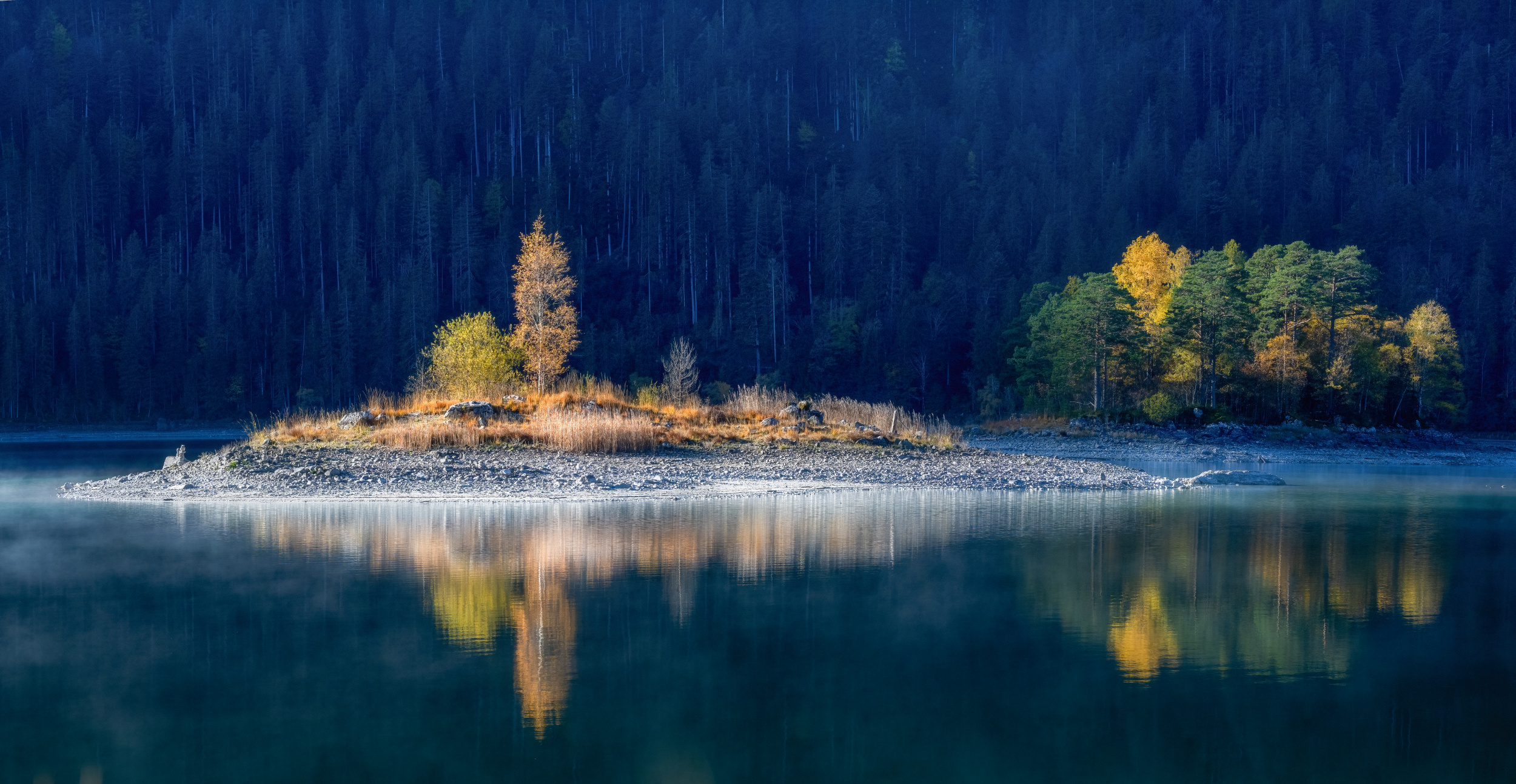
“Autumn at lake Eibsee” by Ulrike Eisenmann
Yellow is the brightest colour in the spectrum and therefore presents a challenge to photographers. It has an enormous visual presence that inevitably draws the viewer’s attention, but there is a risk of overexposure or a one-dimensional appearance.
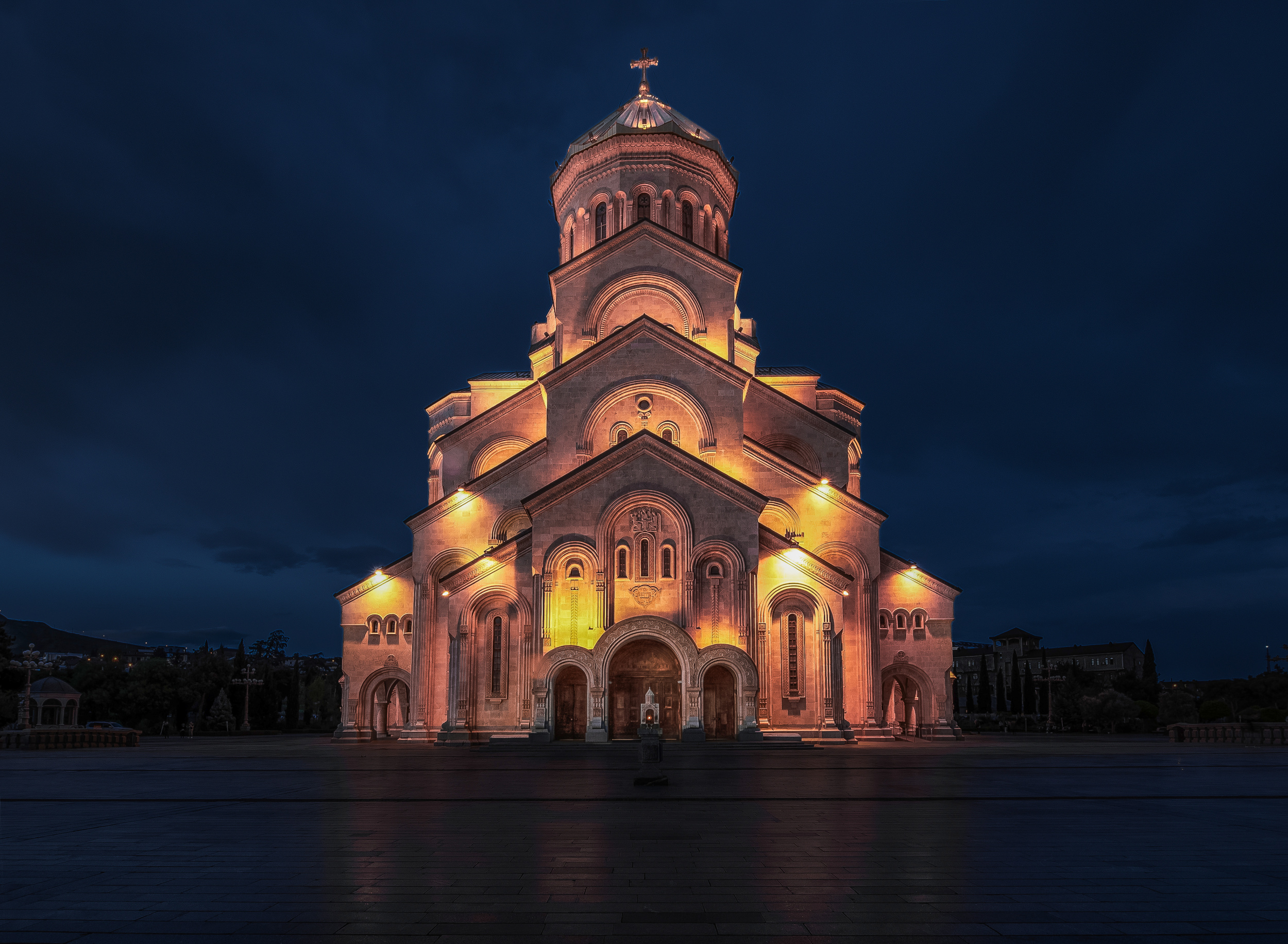
“Glow” by Rana Jabeen
The solution to this design problem lies in the deliberate use of complementary colours that contrast with each other. By placing them strategically, the brightness of yellow can be tempered and used to create depth, tension and emotional impact in the photo.
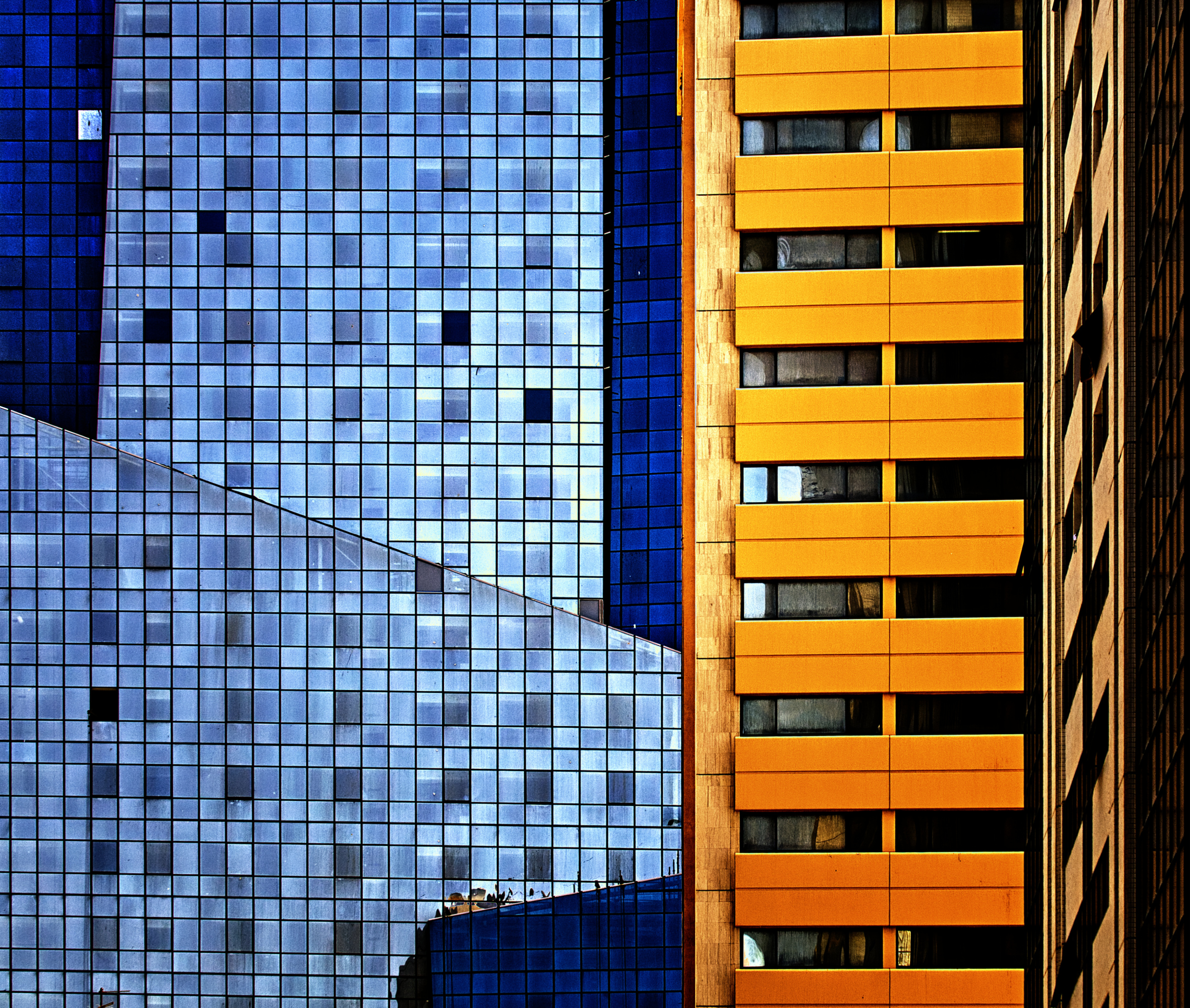
“Abu Dhabi revisited” by Harry Verschelden
Taking a closer look at colour theory reveals two fundamentally different approaches. While the traditional pigment-based system uses the classic light-dark contrast with shades of purple, the additive RGB (red, green, blue) model used by digital sensors creates an effective warm-cool contrast with deep shades of blue.
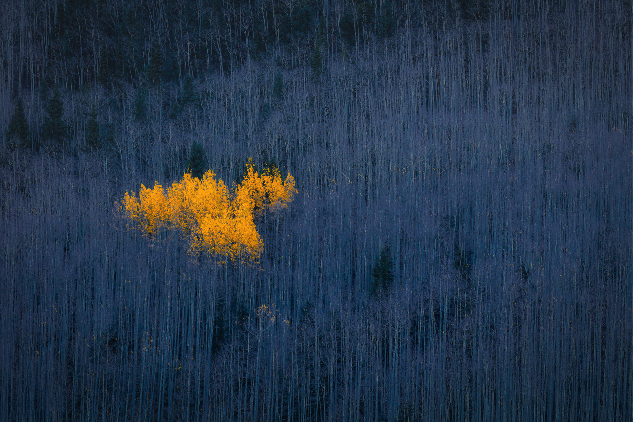
“Heart of Aspens” by Michael Zheng
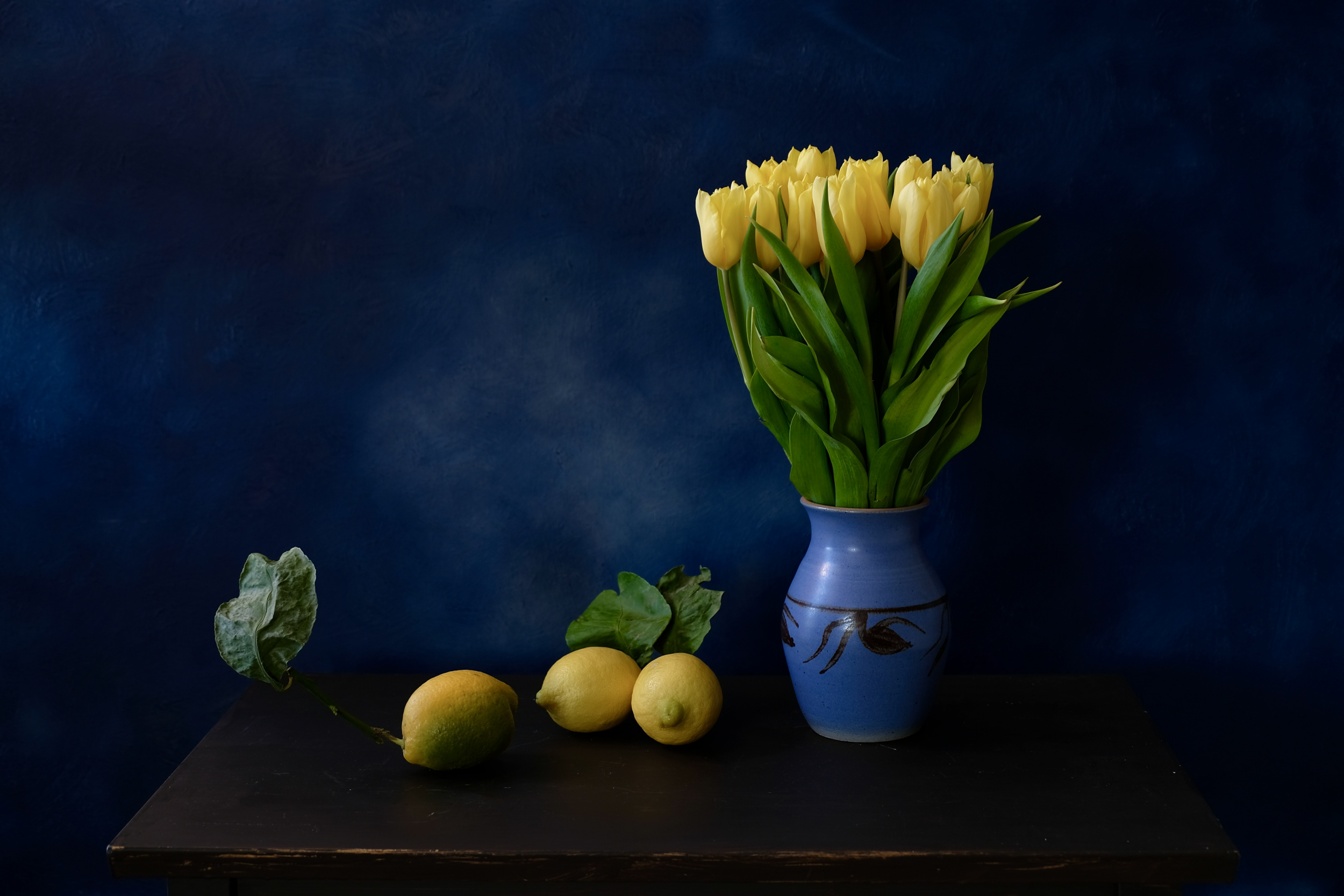
"Playing with colors" by Svetlana Povarova Ree
Black plays a special role in colour classification.
Technically speaking, black is not a part of the visible light spectrum; it is more the absence of light than a specific wavelength within the physical light spectrum. However, it is fully supported as a numerical value in digital RGB systems.
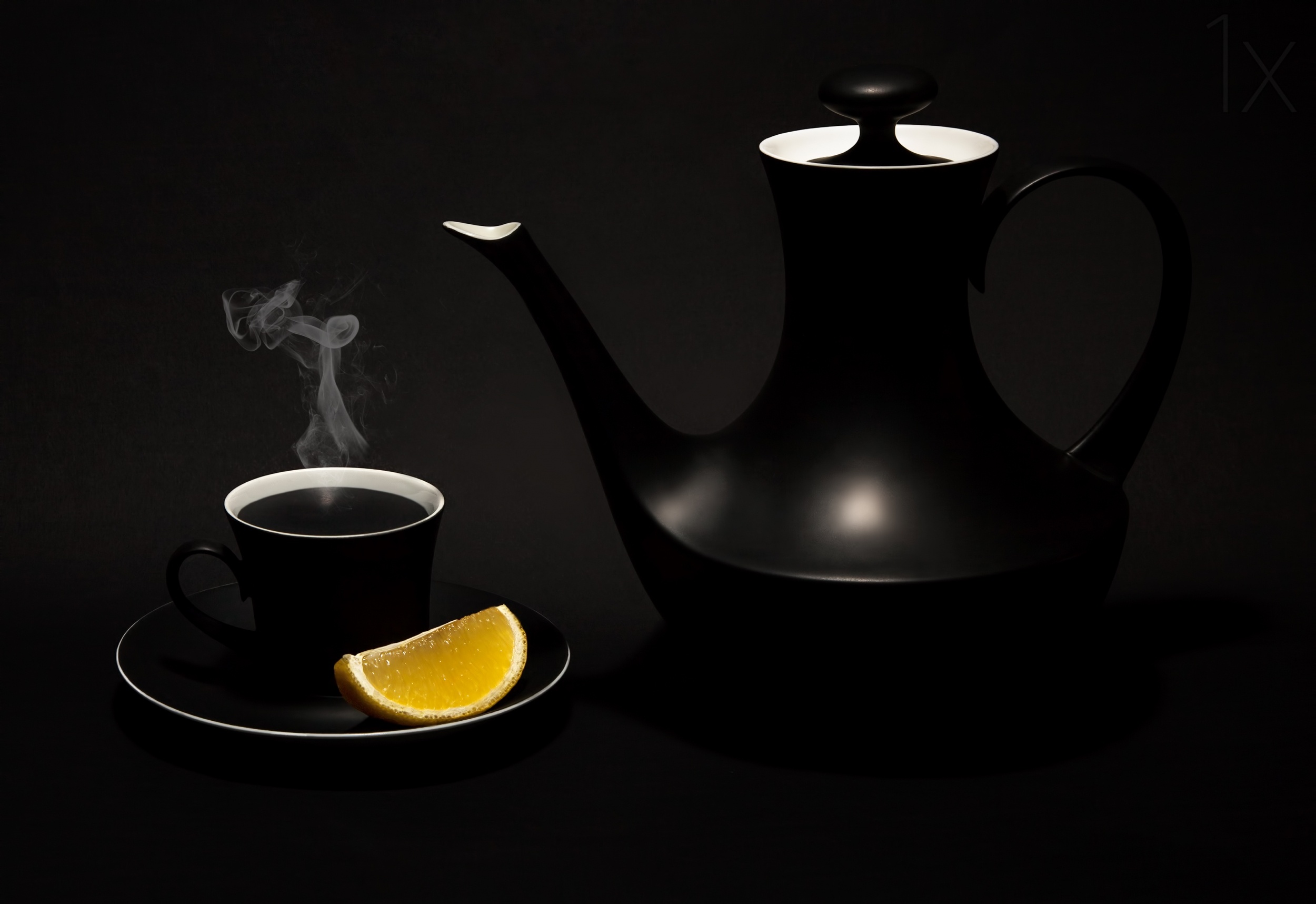
“Black tea with lemon” by Evan Oz

“A Sour Taste” by Lydia Jacobs
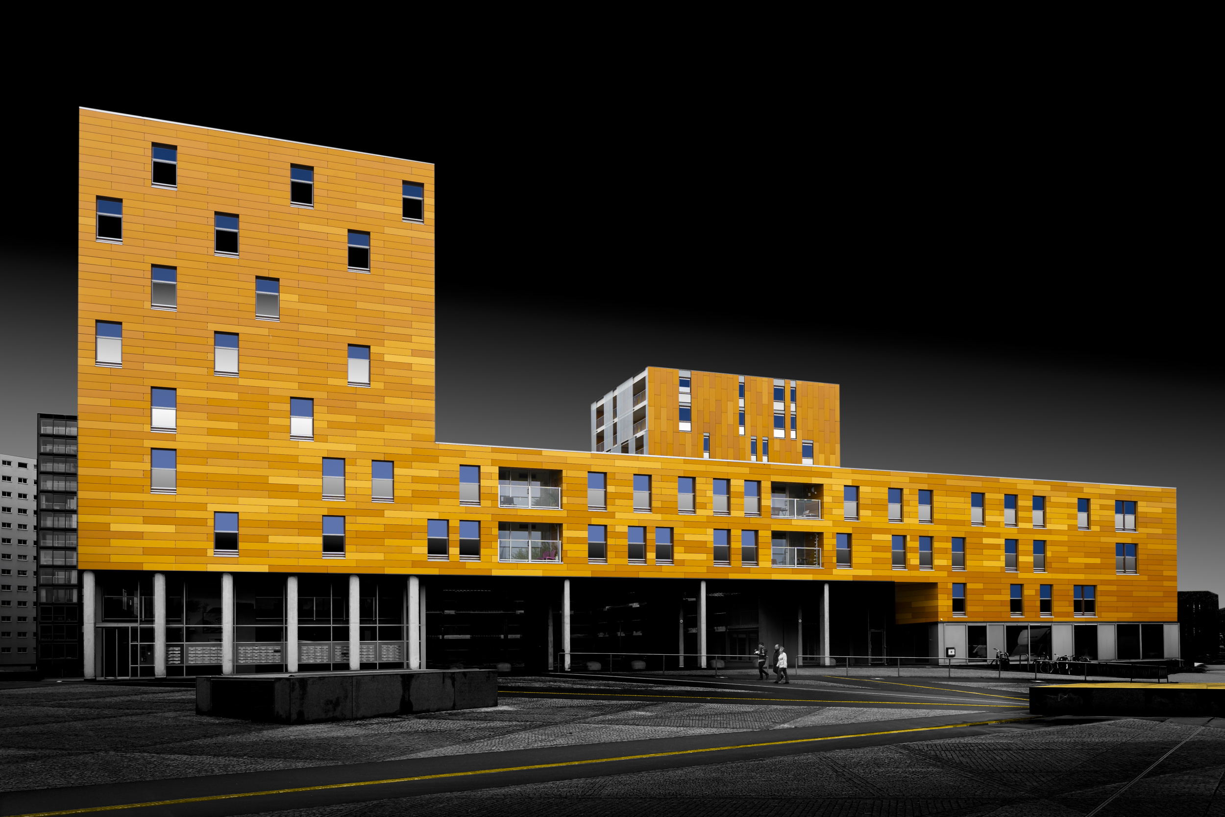
“Follow the Yellow lines” by Greetje van Son
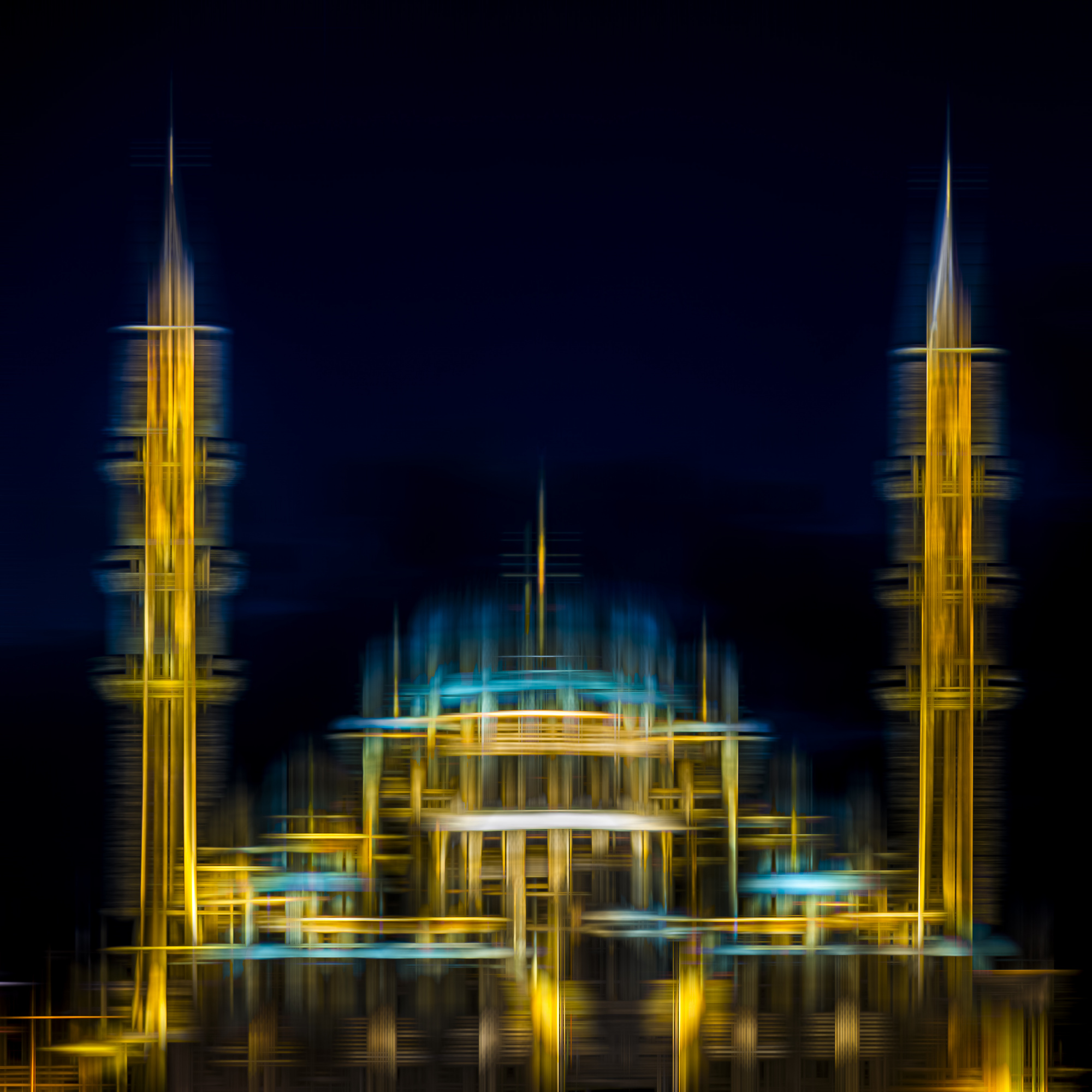
“Mosque abstract” by Dieter Walther
In this article, we analyse the physical and psychological mechanisms behind these colour combinations, using practical examples to demonstrate how complementary colours contrasting with yellow can be employed as a precise tool for image composition.
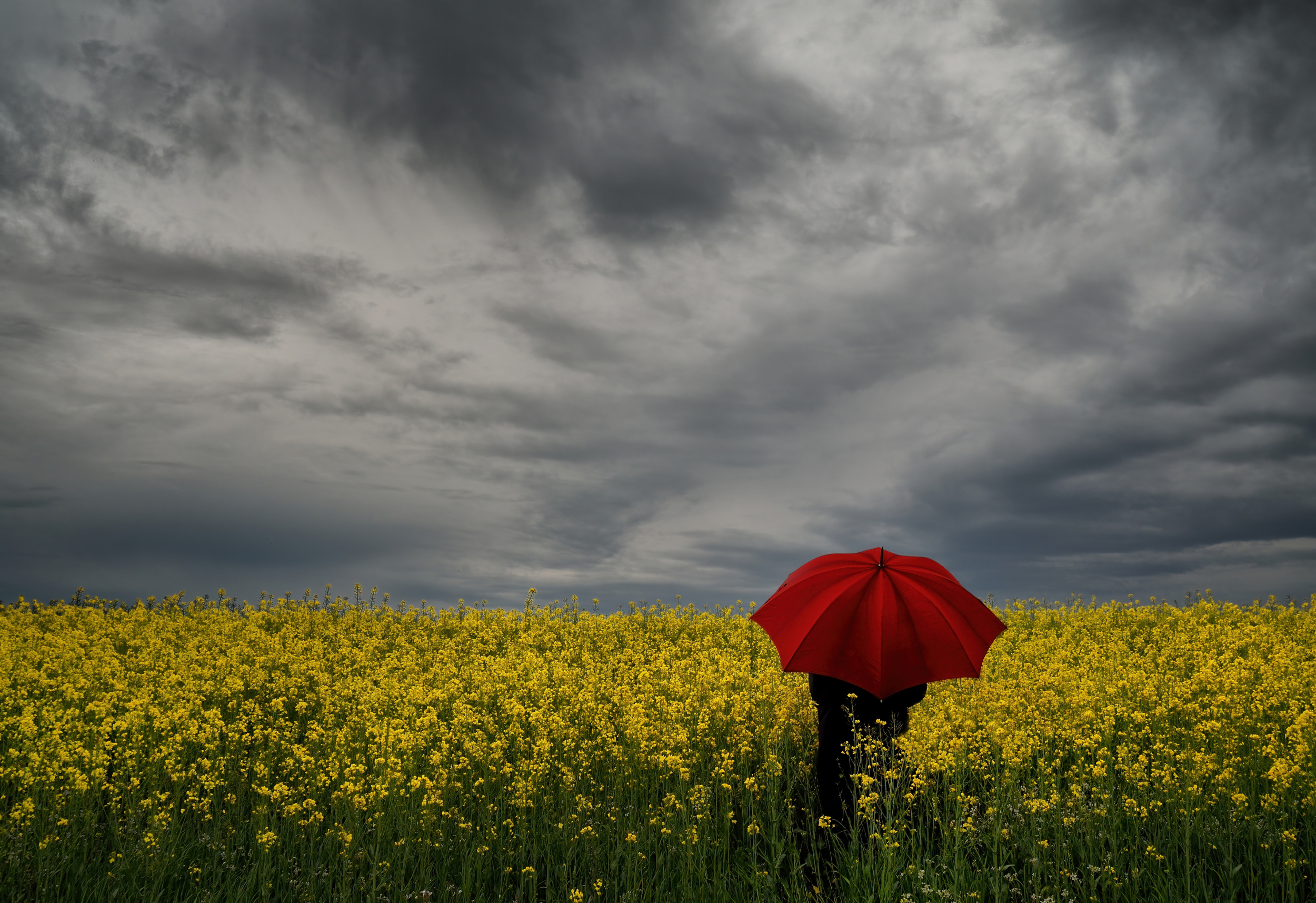
“Woman with a red umbrella” by Claudio Moretti
The artistic contrast: yellow and purple in subtractive colour theory.
The combination of yellow and purple is based on the traditional subtractive colour model developed by Johannes Itten, who was a Swiss painter, art theorist and educator who taught at the Bauhaus school in Weimar, Germany.

“Blue Rays” by Þorsteinn H. Ingibergsson
In photography, the combination of yellow and purple is particularly significant:
it represents the greatest contrast between light and dark in the entire colour spectrum.
As pure yellow has the highest intrinsic brightness of all colours and purple is the darkest spectral colour, using these colours achieves the maximum dynamic range. In classical painting and design, combining pure yellow and pure purple creates the strongest possible light-dark contrast amongst the primary colours. These are also complementary colours, which further maximises the visual impact.
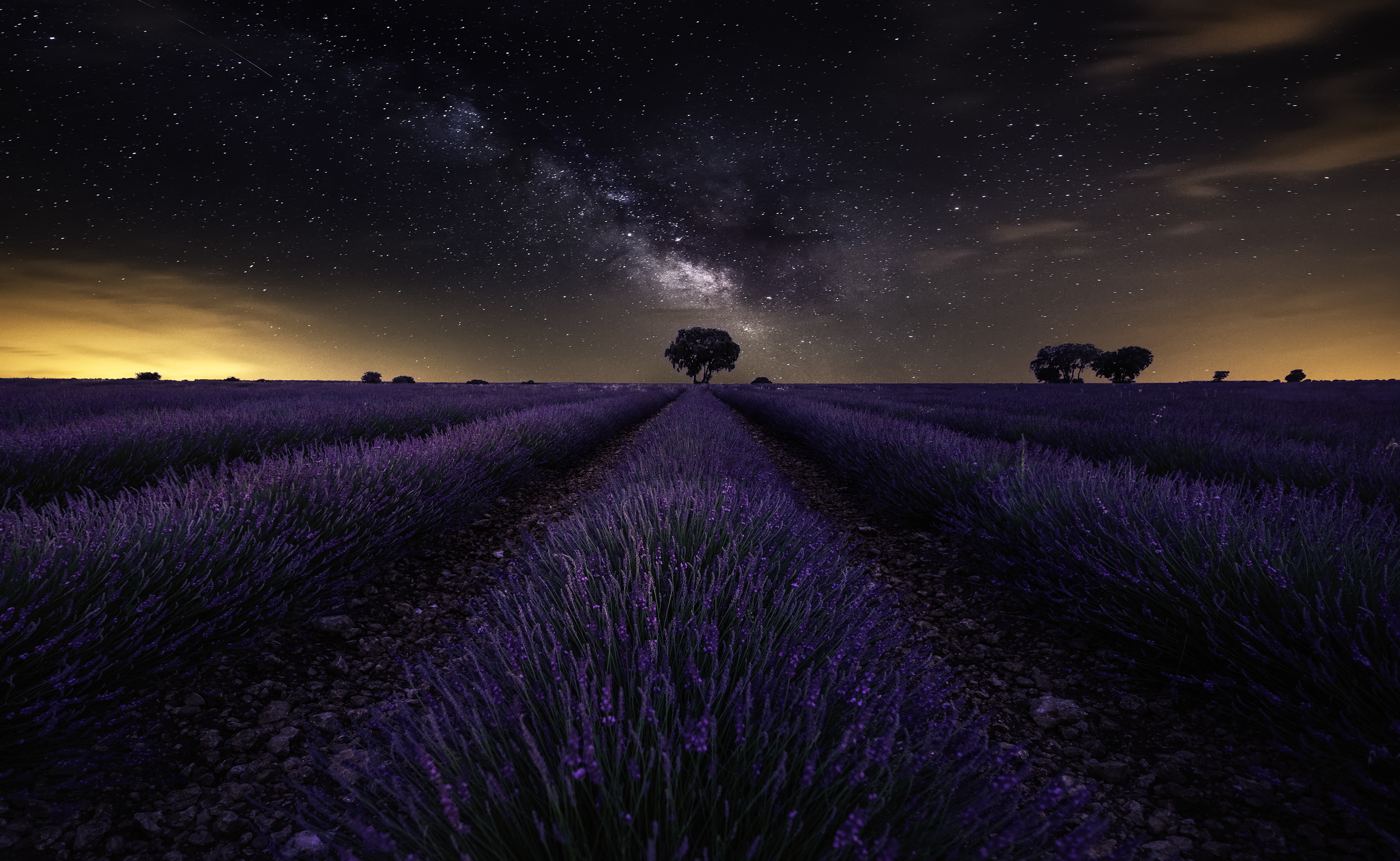
"Fields of Castilla” by Jorge Ruiz Dueso
Visual impact
Purple appears heavy and distant, yet comforting. Yellow, on the other hand, appears light and pushes forward visually. Together, they give the picture an almost mystical depth and elegance. When placed against a purple background, shades of yellow appear not just striking, but also luxurious and three-dimensional.
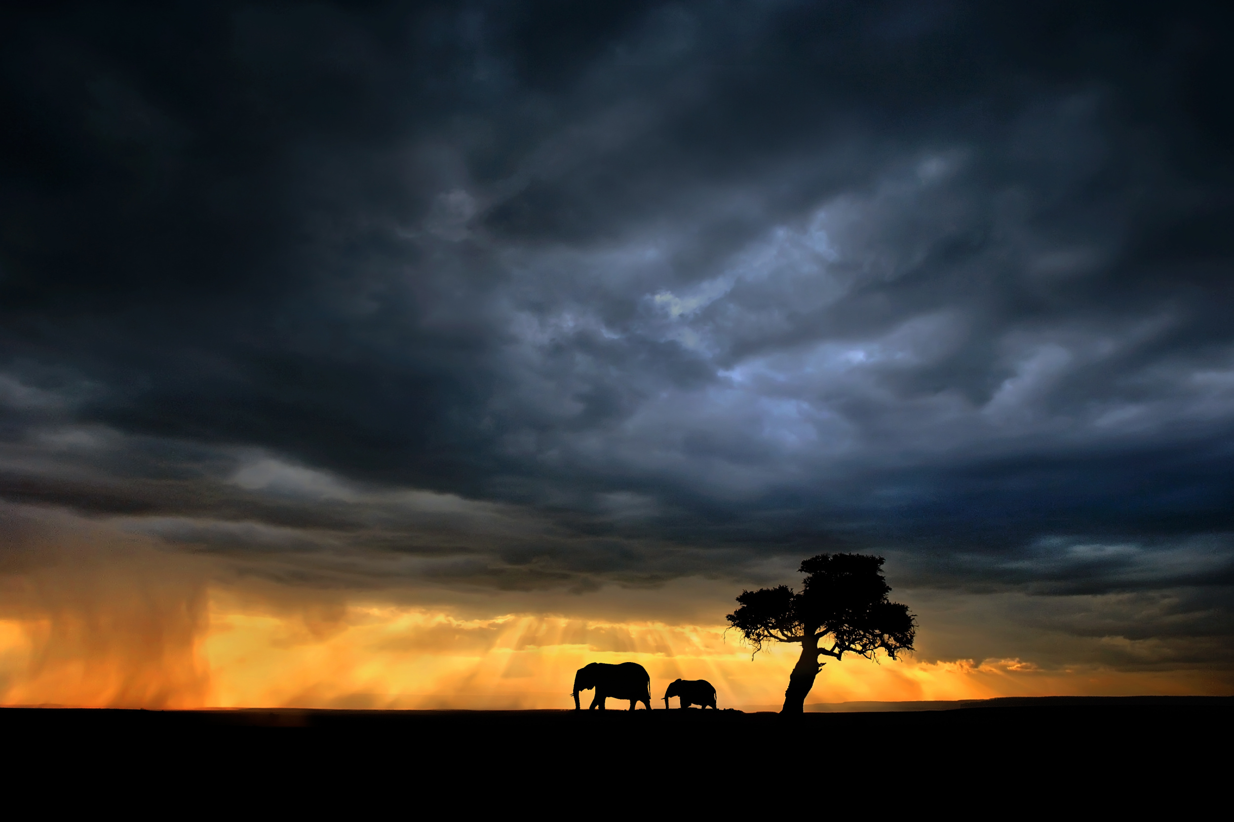
“Elephants on the Mara plains” by Xavier Ortega
Photographic Practice & Motives
In nature and macro photography, this contrast is used automatically. Yellow flowers, such as sunflowers, stand out against purple or blue backgrounds, or against darker purple shadows in the soft light of a sunset.
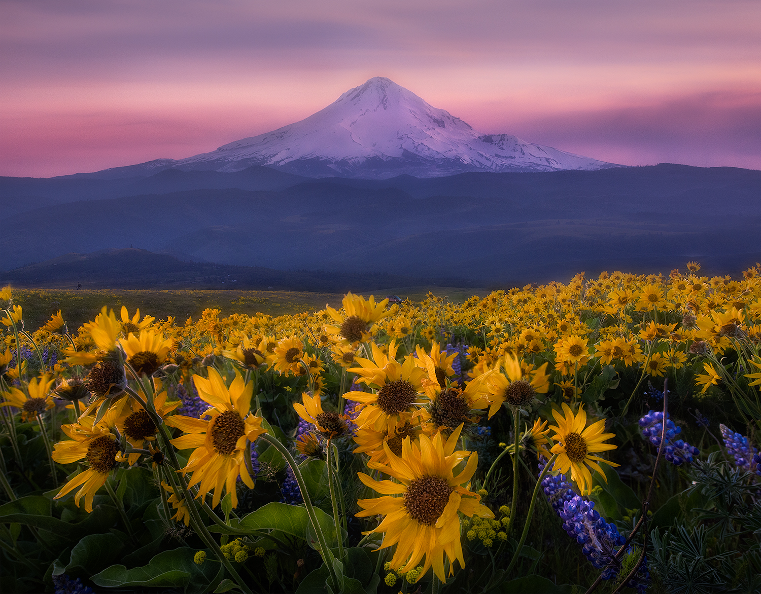
“Mt. Hood” by Johnny Chen

“Flamingos in a lake with a tree” by Bess Hamiti
For fine art portraits in the studio, use a deep purple accent light from behind to emphasise the silhouette of the hair whilst modelling the face with a warm, slightly golden light.
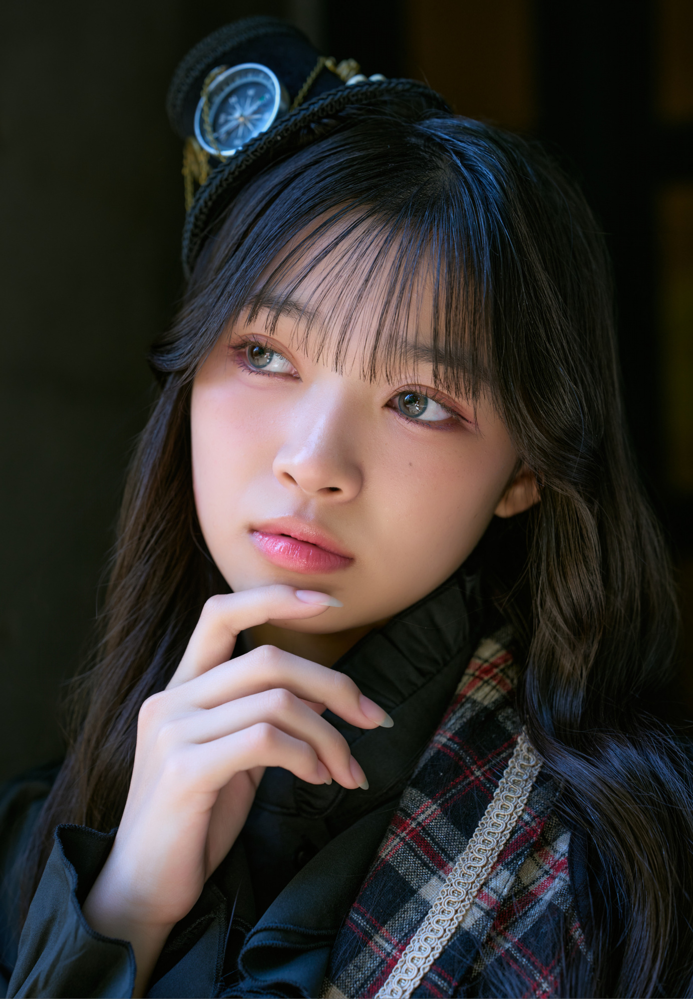
Untitled by Charu Fujiki
Design hint
As yellow is an extremely eye-catching colour, the proportions must be carefully adjusted. According to J. W. von Goethe, the harmonious ratio of yellow to purple should be 1:3, and a small yellow dot against a purple background is sufficient to guide the viewer's eye.
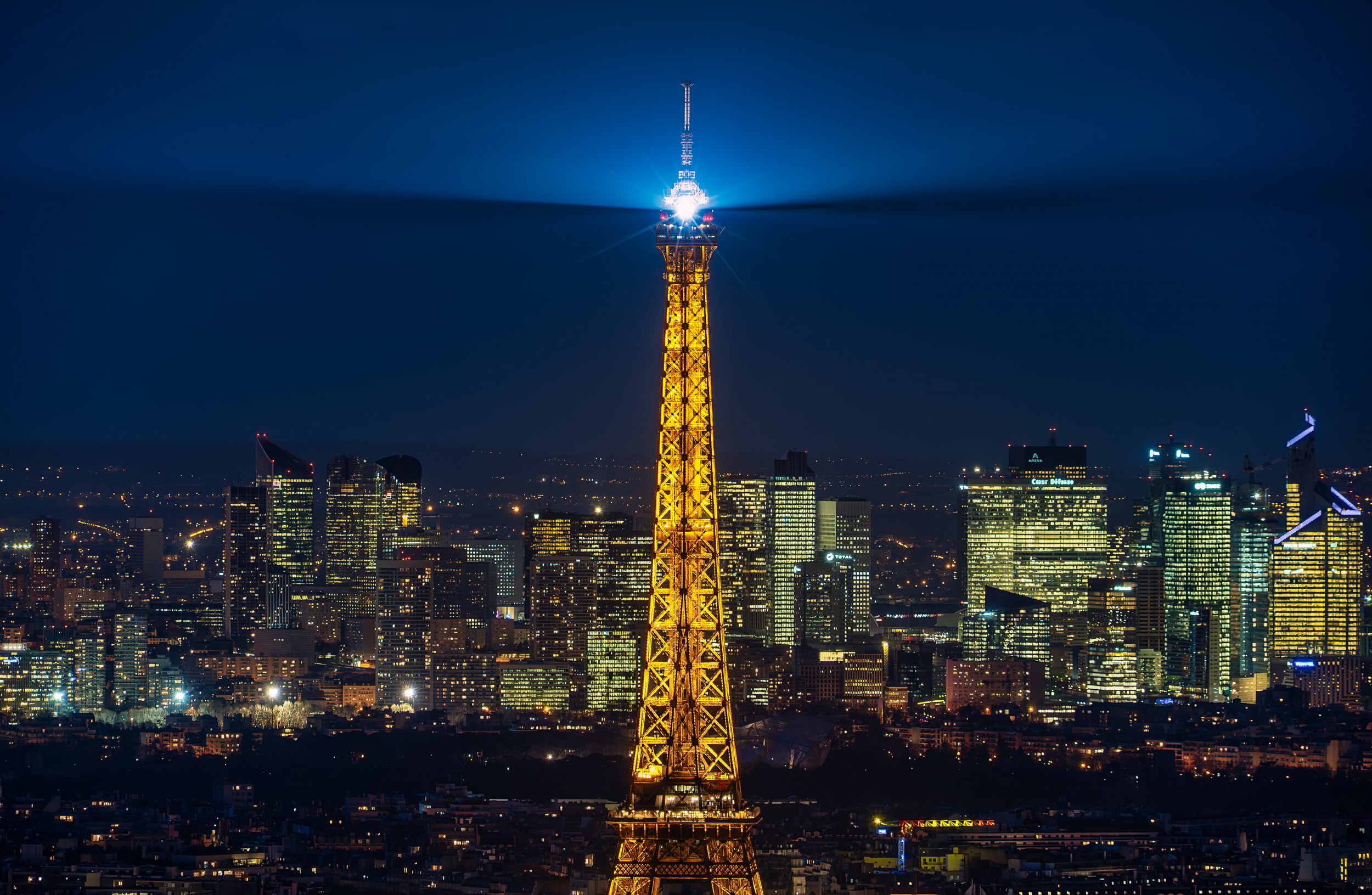
“Paris” by Sus Bogaerts
The physical contrast: yellow and blue in the digital RGB colour space
Shifting our focus from classical painting to modern sensor technology brings the additive RGB colour model (red, green and blue) into effect.
At the pixel level, the exact complementary colour to yellow is pure, saturated blue. In photography, this creates the most striking contrast between cool and warm tones that the human eye can detect.
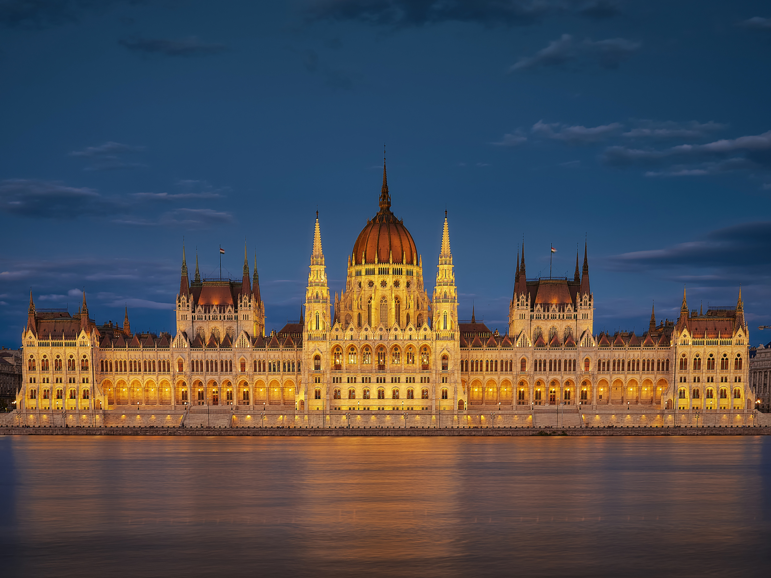
“Hungarian Parliament at night” by Silviu G
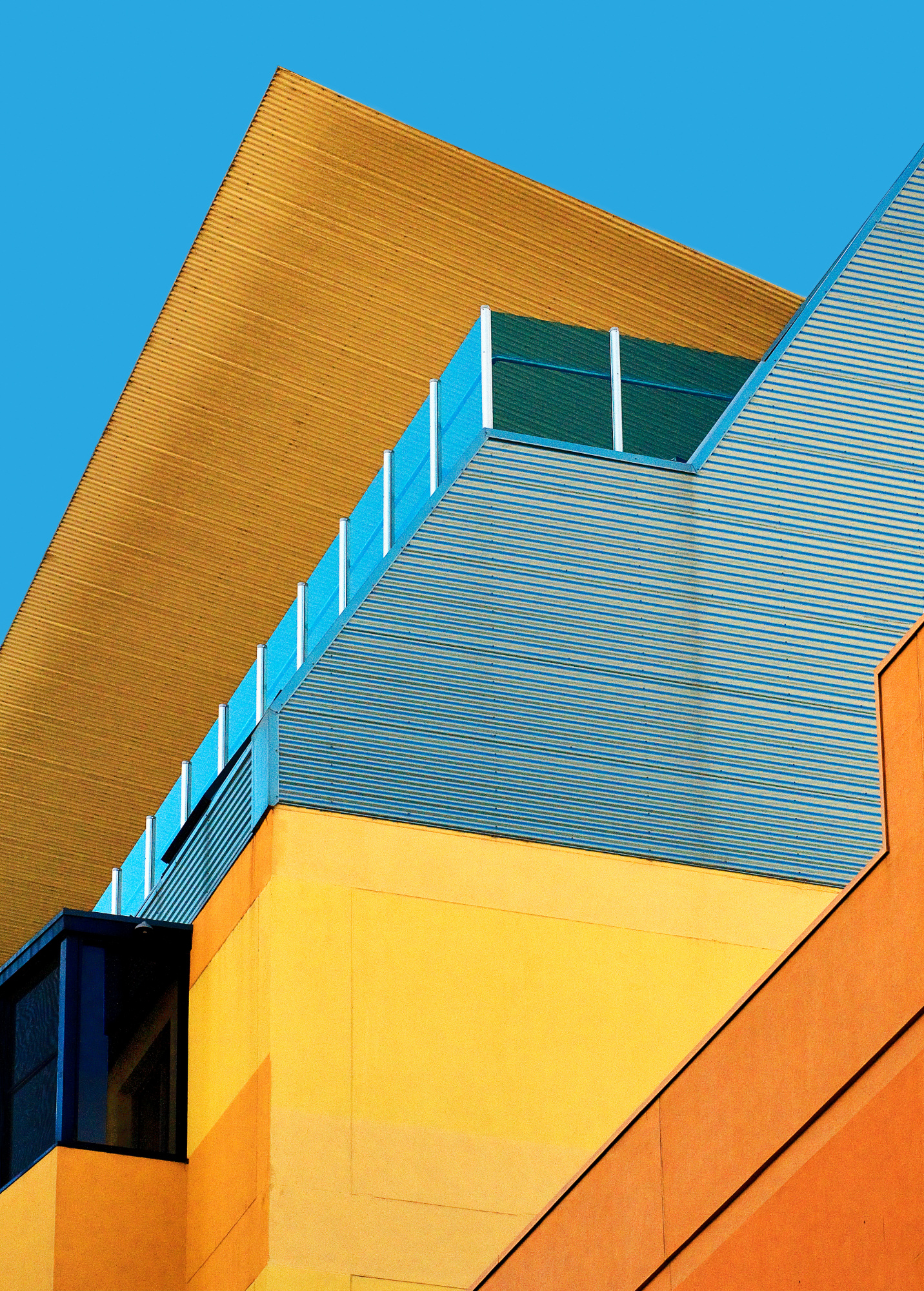
“Sky Art” by Wayne Pearson
Visual effect
Our brain instinctively associates blue with cold, distance and calm (such as shadows, water and the sky), while yellow is linked to warmth, closeness and energy (such as the sun and artificial warm light).
This contrast creates a striking sense of three-dimensional space in the photograph: warm shades of yellow appear to 'move' towards the viewer, while cool shades of blue recede into the distance.
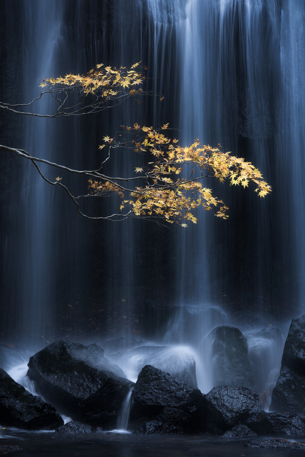
“Yellow Autumn” by Yuki Yatsushima
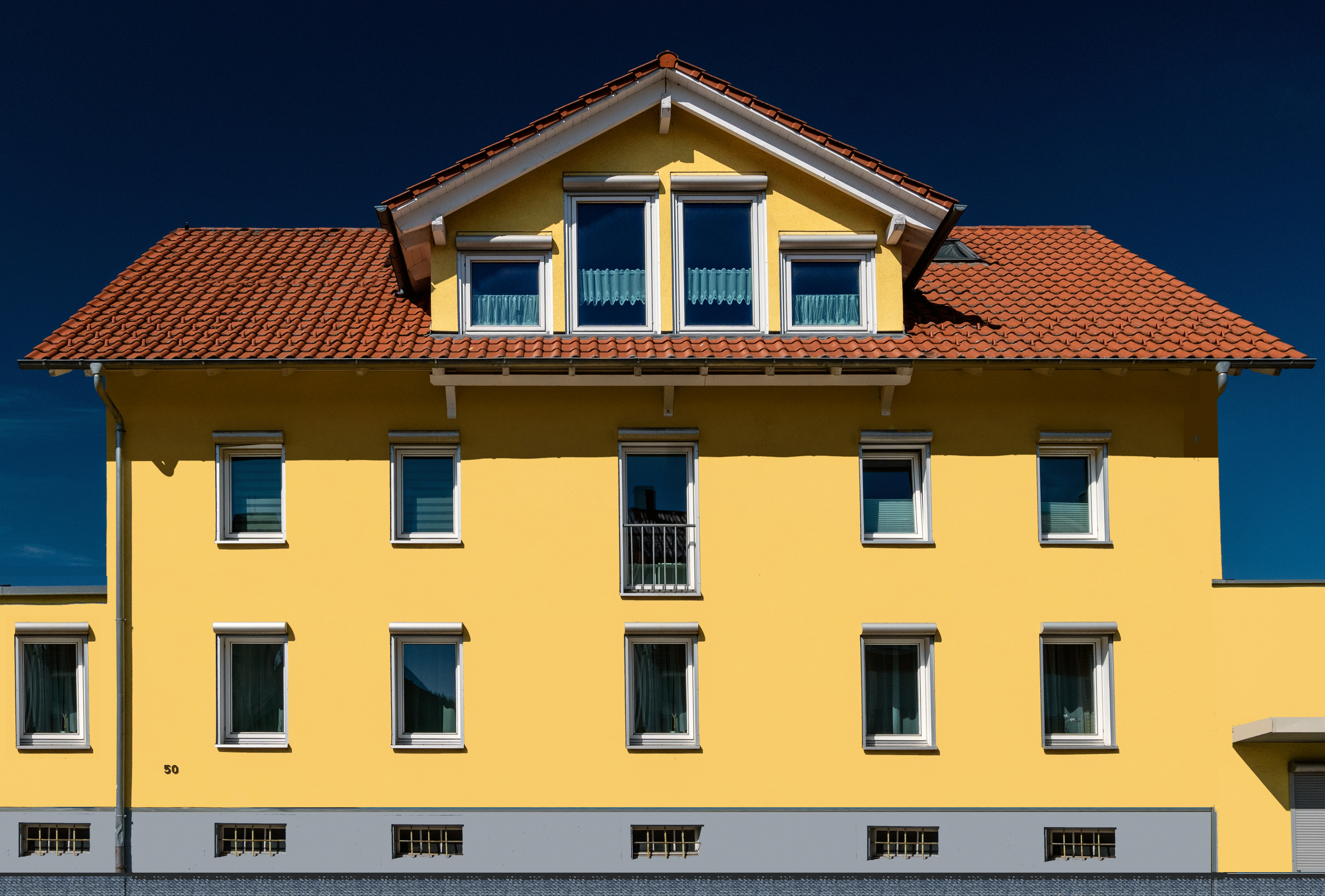
“Somewhere in Switzerland” by Miro Susta
Photographic Practice & Subjects
In architecture and street photography, it is a classic technique to capture the scene during the blue hour or at night. The deep blue of the residual natural light in the sky provides the perfect backdrop for the warm yellow glow of building windows and streetlamps.

“Prague is awakening” by Marcel Rebro
In landscape and astrophotography, the sight of a yellow-lit tent set against a rugged mountain landscape beneath a deep blue night sky instantly evokes a sense of emotional security in the wilderness.
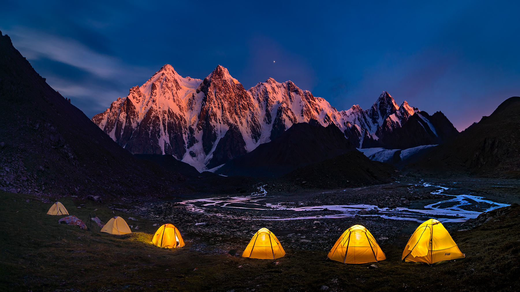
“Camping at Bogda” by Hua Zhu

“Camp Baobab” by Marsel van Oosten
The deliberate use of complementary colours elevates this photograph from mere documentation to a carefully crafted visual composition.
Whether it is the dramatic light-dark contrast with shades of purple, as per classical colour theory, or the deep, spatially evocative warm-cool contrast with blue in the RGB colour space, contrasts create order and a visual hierarchy within an image.

“Lake House sunrise” by Jesús M. García
In practical photography, this means not just accepting colours as they are, but planning them as active compositional elements from the moment you select a subject or step into the studio.
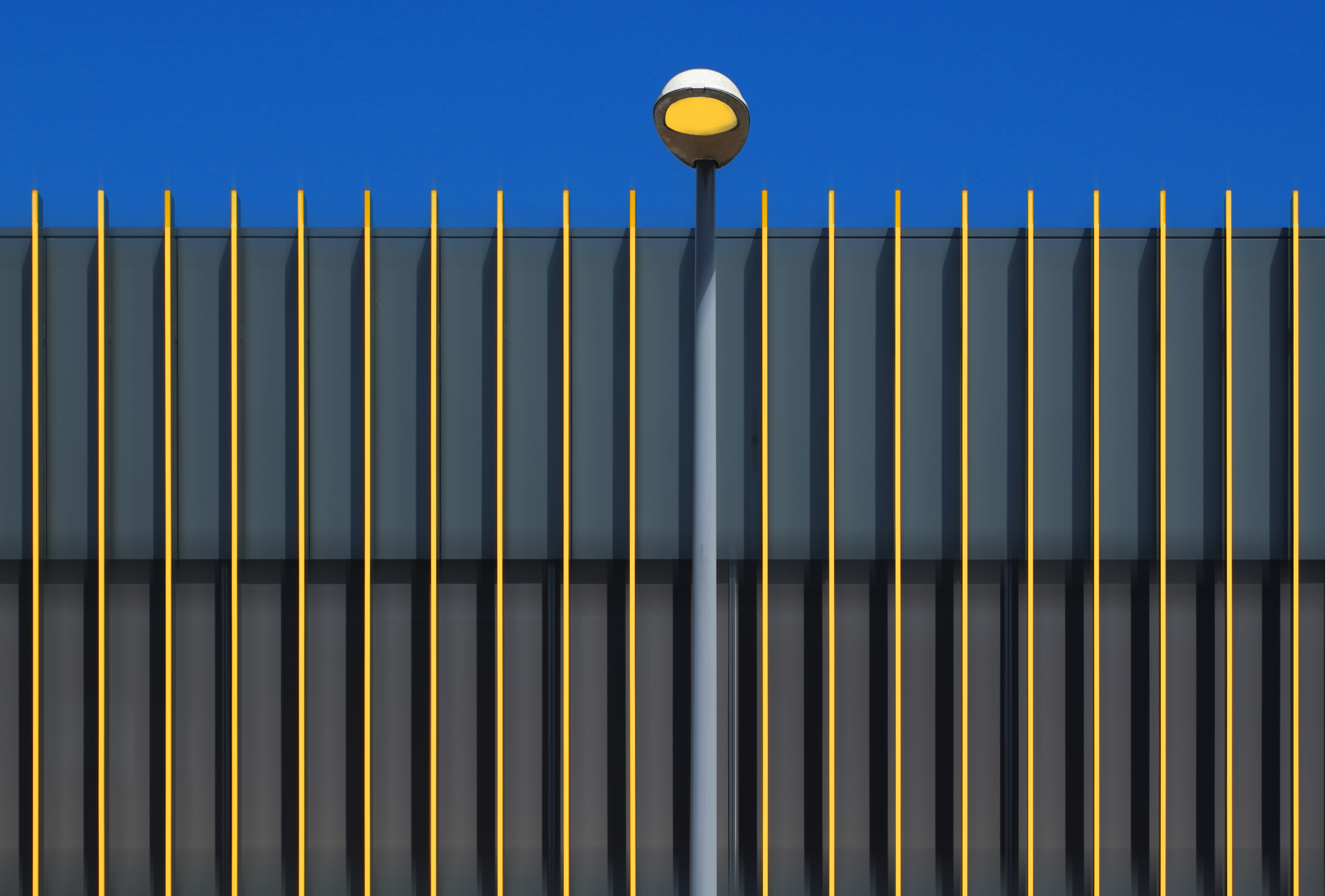
“Yellow Stripes” by Hans-Wolfgang Hawerkamp
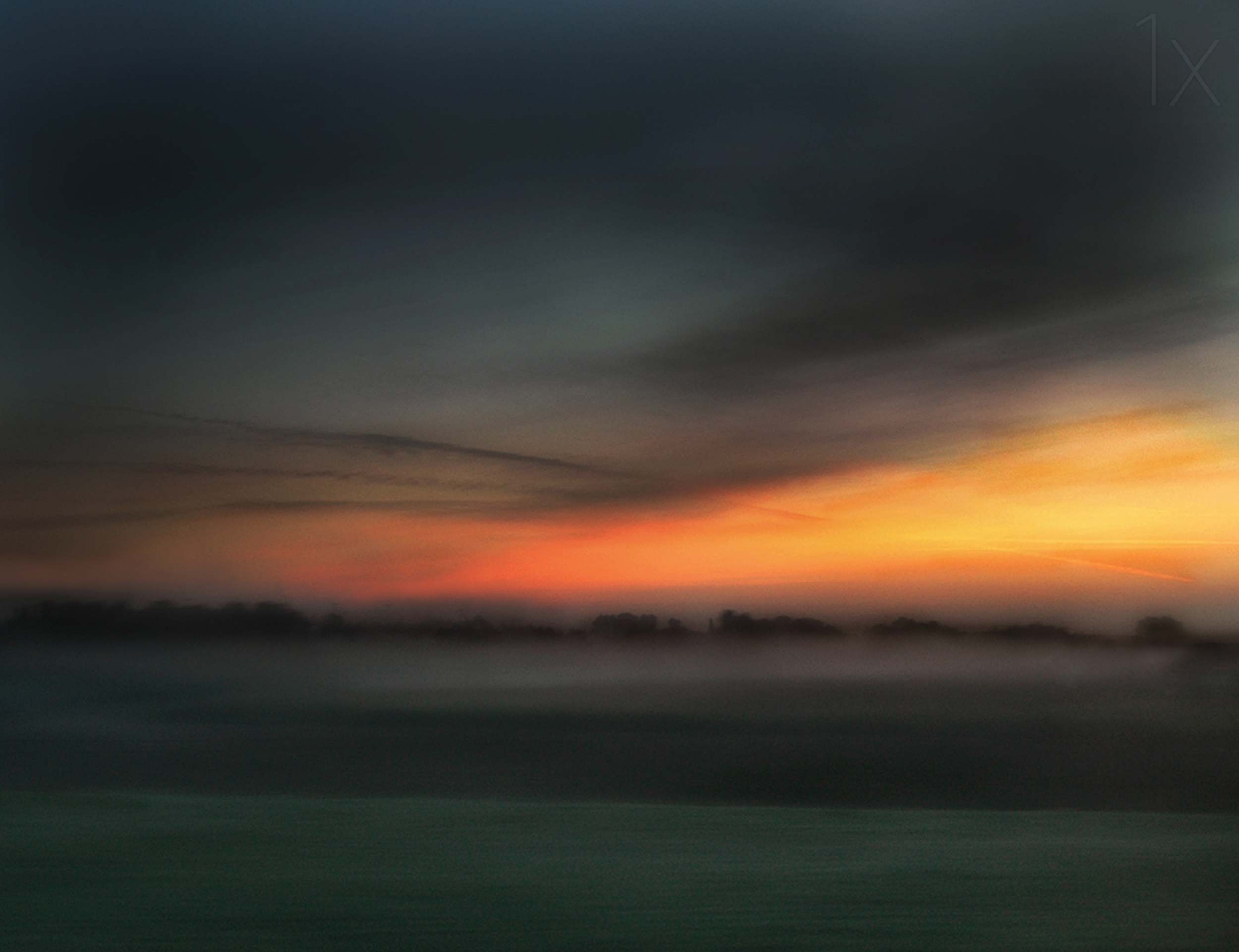
“Dawn's golden hour” by Yvette Depaepe
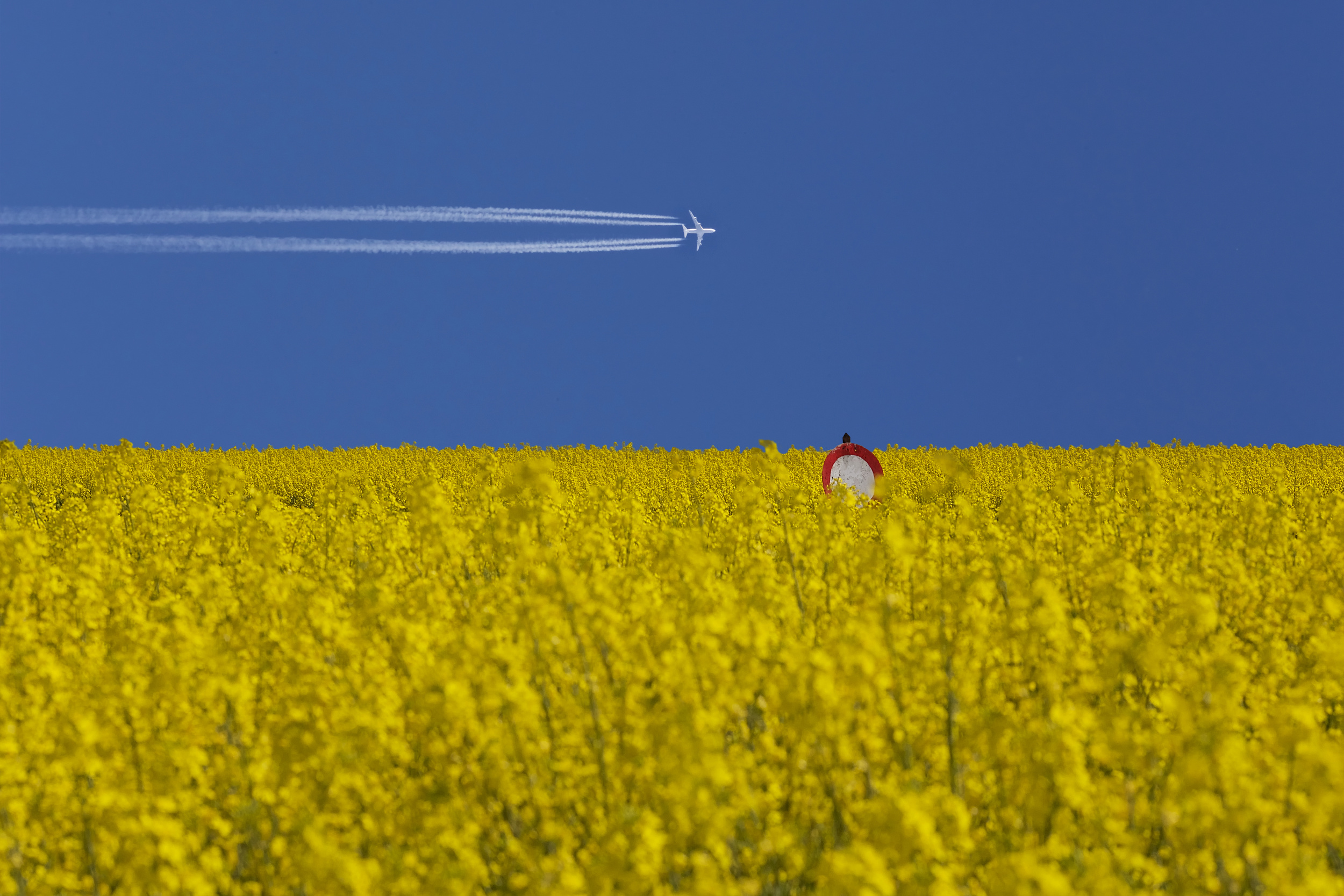
“No landing zone” by Udo Dittmann
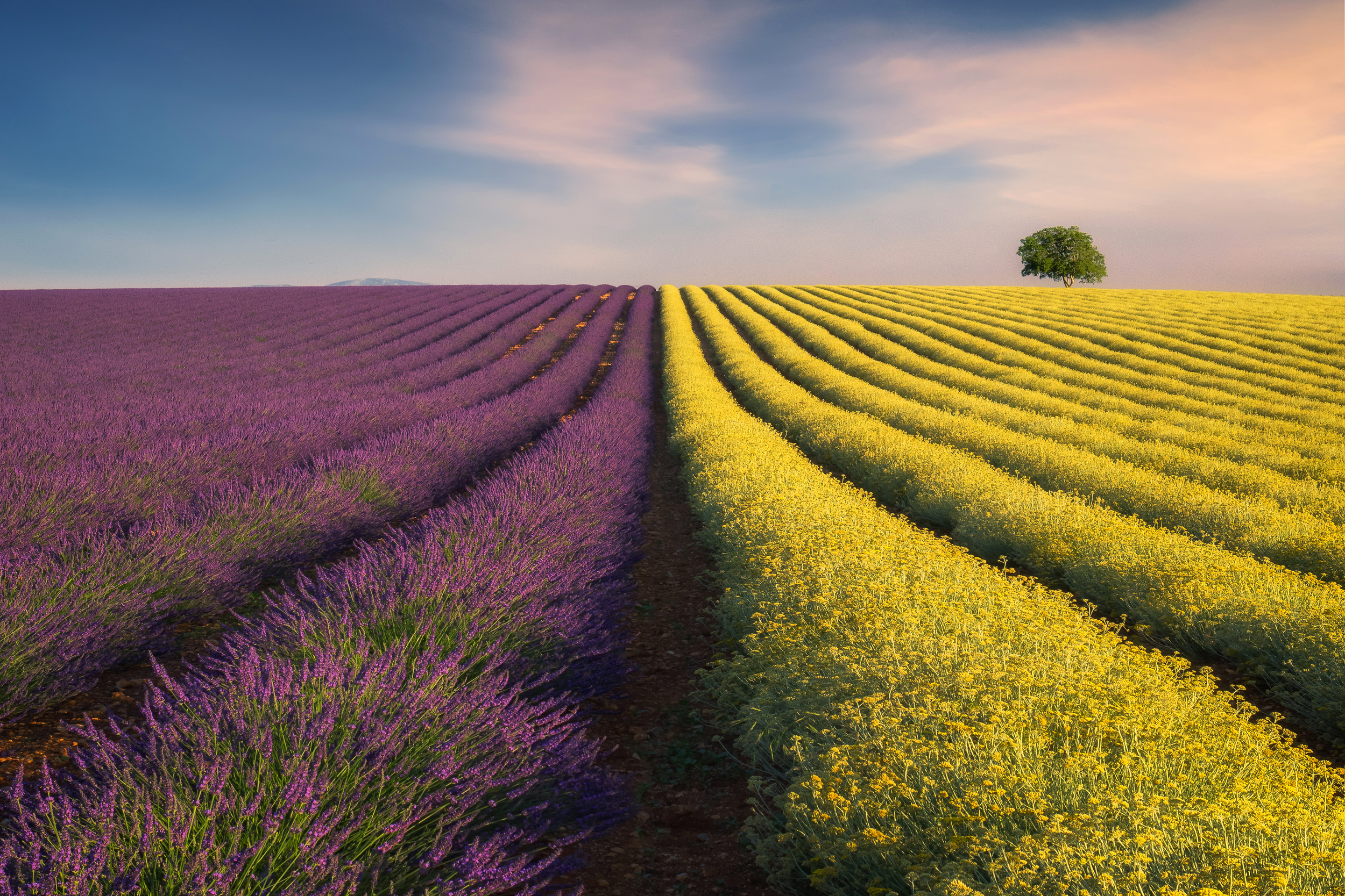
“Violyellow” by Ales Komovec
Ultimately, the harmonious balance of proportions and precise control of the white balance in RAW format ensures that the immense luminosity of the yellow never results in overexposure or chaos. Instead, the natural visual appeal of the yellow is harnessed to guide the viewer’s gaze with the utmost precision.
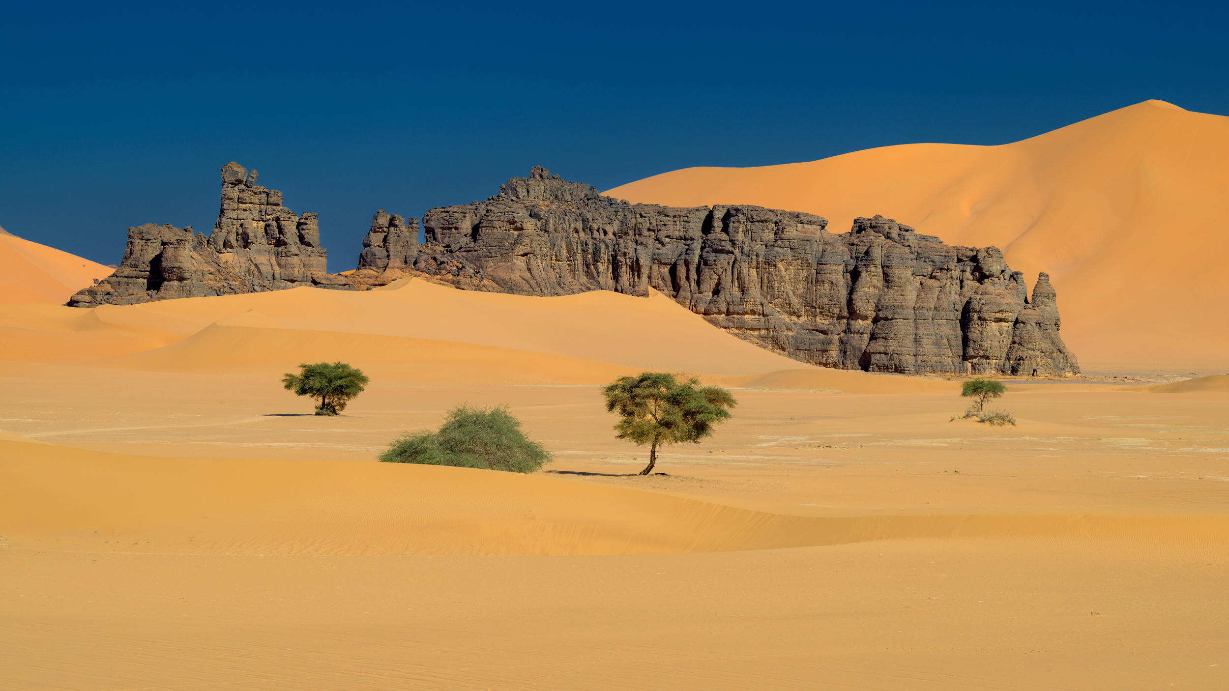
"Tadrard rocks” by Marc Pelissier
Apply your understanding of these complementary dynamics to your next photographic project. Sharpen your eye for the interplay of colours on the colour wheel, as it is often the perfectly placed contrast that transforms a technically sound photograph into a masterfully composed image.
www.mrsphoto.net
[email protected]
|
 | Yaping Zhang PRO 精美绝妙的色彩对比,画廊精彩有趣。令人惊叹不已!祝贺所有入选的摄影师。也 感谢 Yvette 一如既往地付出了你的努力。 |
 | Chris Hamilton PRO Great article and insights many thoughts for new ideas. |
 | Miro Susta CREW Thank you very much Chris |
 | DonnaHom APA PRO A great theme of the exhibition. I always like color contrast. This collection included the variety of subjects, architecture, landscape, wildlife, still life, portraits. Excellent selection. Thank you Miro and Yvette. Congratulations to all authors. |
| Miro Susta CREW Thank you very much for nice words of appreciation dear Donna |
 | Lucie Côté PRO Superbes photos !!!! Merci ! |
| Miro Susta CREW Many thanks Lucie |
 | Rana Jabeen PRO A fascinating exploration of how complementary colours bring a sense of harmony and contrast as well dear Miro. I like how well the images illustrate the highlights of the article. Compliments Miro and thank you Yvette for your work as always |
| Miro Susta CREW Dear Rana many thanks for nice comment and words of appreciation |
 | Dieter Walther PRO thanks a lot for featuring my photo in this article! |
| Miro Susta CREW You are most welcome Dieter |
 | Udo Dittmann PRO I' am honored to have one of my photos featured in the article. Many thanks to the editorial team, and congratulations to all the other participants as well.
warm regards
Udo |
| Miro Susta CREW You are most welcome Udo |
 | Cristiano Giani PRO Interesting text and fantastic gallery. Many thanks.... |
| Miro Susta CREW You are most welcome Cristiano |
 | Marc Pelissier PRO Thanks a lot Miro and Yvette for that color harvesting and great article and publication. As often I’m happily surprised to get a picture with so many other amazing pictures .. I really enjoyed a lot going through the text and the images and further to visit the authors |
| Yvette Depaepe CREW All credits go to Miro ... Glad you enjoy this article, Marc ;-) |
| Miro Susta CREW Dear Mark thank you very much for your wonderful words of encouragement |
 | A very interesting and inspiring article, with in-depth research, dear Miro! It showcases some wonderful works in which photographers use yellow in combination with other colours in very creative and varied ways. Thank you so much – it’s a great honour to have my photo included in this collection. A huge thank you to Miro, Yvette and the whole 1x team. |
| Yvette Depaepe CREW Thanks for your appreciation, dear Svetlana ;-) |
| Miro Susta CREW Great thanks for your wonderful words of praise dear Svetlana |
| | thanks a lot Miro for this great honour to be featured again with an image. It´s a much interesting article with a great inspiring factor. Thanks also to Yvette for her work. |
| Yvette Depaepe CREW Thank you for your appreciation, Hans-Wolfgang ;-) |
| Miro Susta CREW Many thanks for your praise, be assured that your wonderful photos are always most welcome |
 | Lydia Jacobs CREW Such an insightful and inspiring article! Thank you, Miro, Yvette and the 1x team, for featuring my work. It’s truly an honor to be included alongside so many talented photographers! |
| Miro Susta CREW You are most welcome dear Lydia, and many thanks for nice comment |
 | Very interesting article Miro!
Thanks for including my photo in your article. |
| Miro Susta CREW Thank you very much Harry |
 | Wanghan Li PRO Excellent article plus beautiful collection of the wonderful works! Thanks a lot! |
| Miro Susta CREW Thank you very much Wanghan |
| | Yvette Depaepe CREW Most captivating article, Miro ... I'll look differently from now on to the colour yellow and the dynamics of combining it with other colours.
My compliments, dear friend! |
| Miro Susta CREW Many thanks dear Yvette for your very nice comment |
| | Greetje van Son PRO What a wonderfull and interesting Article Miro. With much pleasure I looked at the beautifull photo's. Thanks a lot to choose one of my work for this article. And thanks to Yvette for publishing. |
| Yvette Depaepe CREW My pleasure, Greetje ... |
| Miro Susta CREW Thank you dear Greetje, your wonderful photos are always welcome |
by Editor Jane Lyons
Edited and published by Yvette Depaepe, the 13th of November 2026
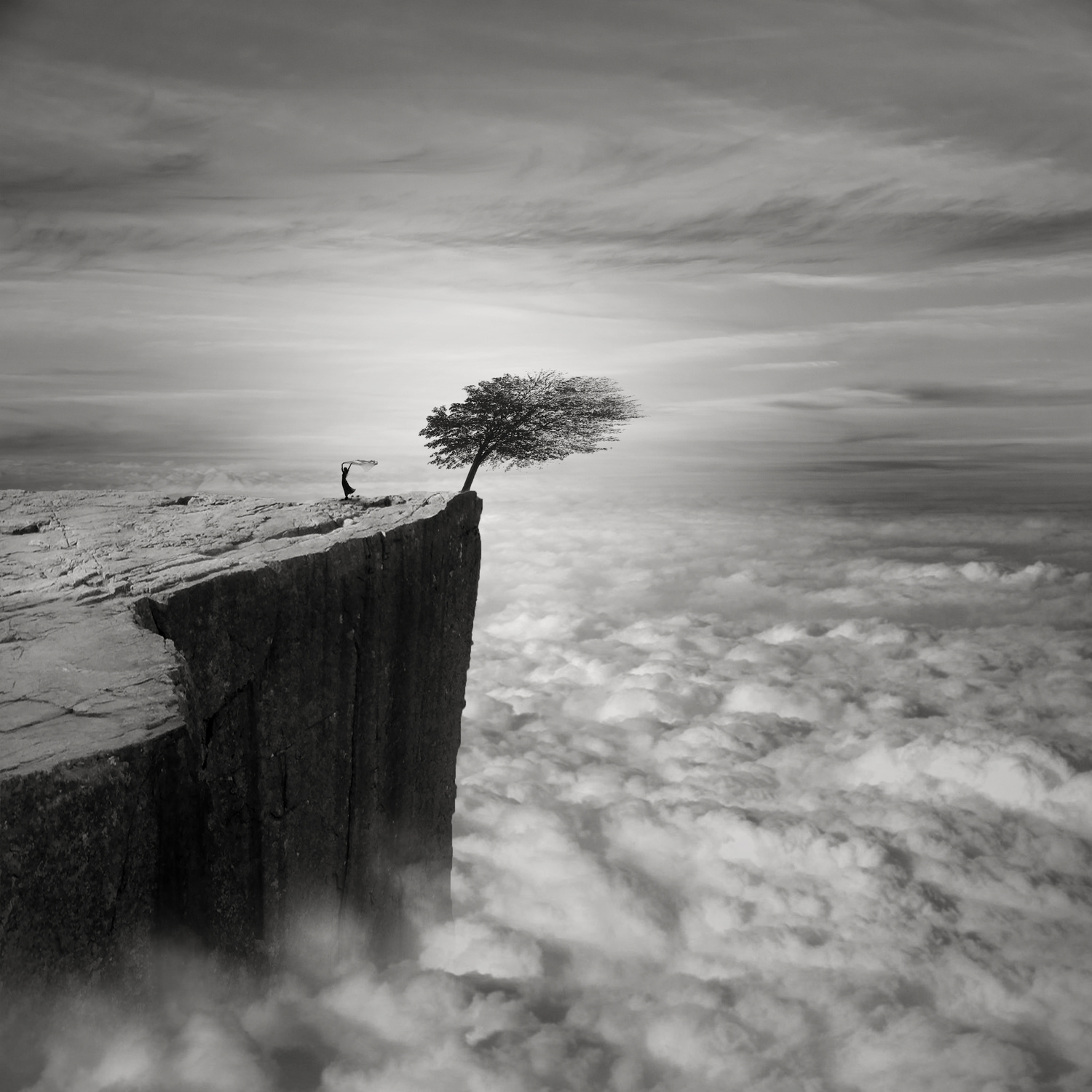
“Above the clouds”
As we all know, art is subjective. If ten people were asked to select their twenty favorite photographs from AGNIRIBE’S extensive portfolio, the results would undoubtedly be very different. This edit is not meant to be definitive. It is simply a reading of AGNIRIBE’S body of work through one set of eyes.
AGNIRIBE’s photography is wonderfully unpredictable. One moment, we find ourselves at the end of an impossible landscape; the next, we encounter a solitary figure in a deserted city, a dancer escaping the darkness, and then a group of people playing basketball.
Working across portraiture, architecture, landscapes, and surreal imagery, this French photographer creates images that encourage us to look beyond what is immediately visible. Her compositions are often theatrical and mysterious, frequently touched by a sense of the unexpected.
Perhaps most striking is her recurring use of the human figure, which is often alone and sometimes appears to be lost within the surrounding space yet is somehow essential to the story. These are photographs that leave room for our imagination to roam.
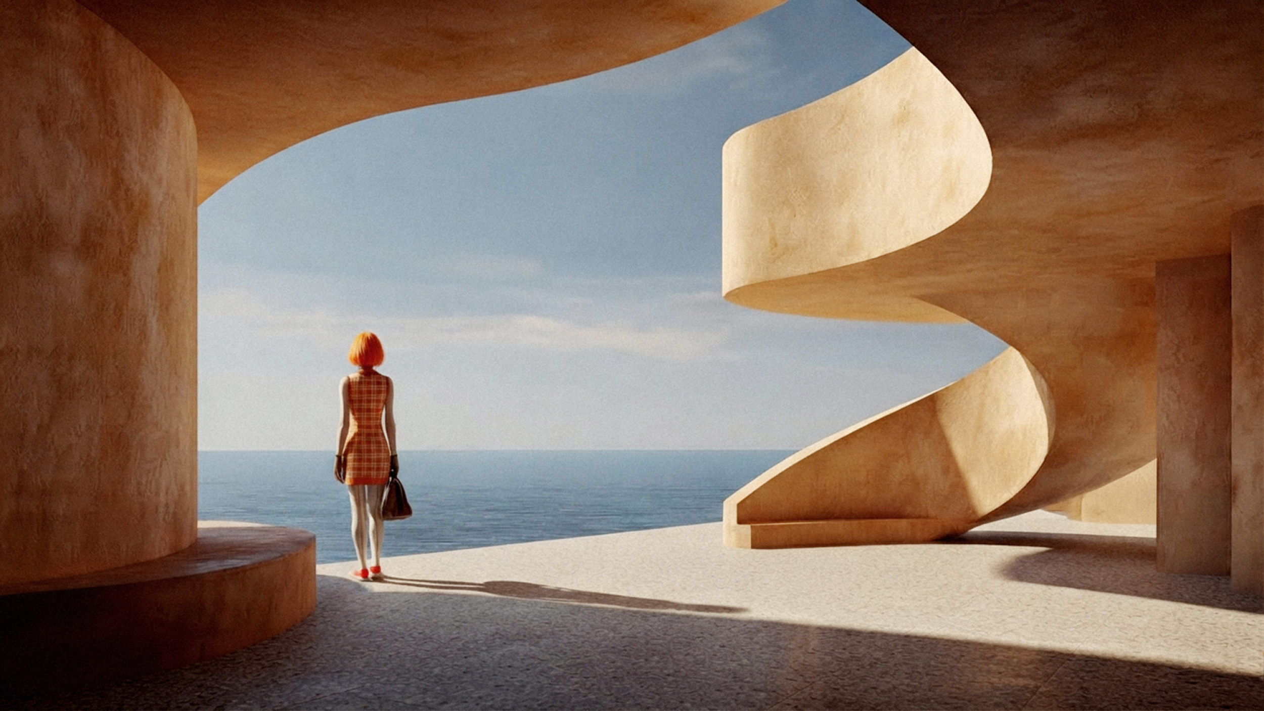
Another characteristic of Agniribe’s work is her use of the colour orange. While most of her work is in black and white, when she does work in colour, it is always orange, in varying hues and depths.
“Lonelyness”
“Untitled”
“Horizon”
“The Appointment”
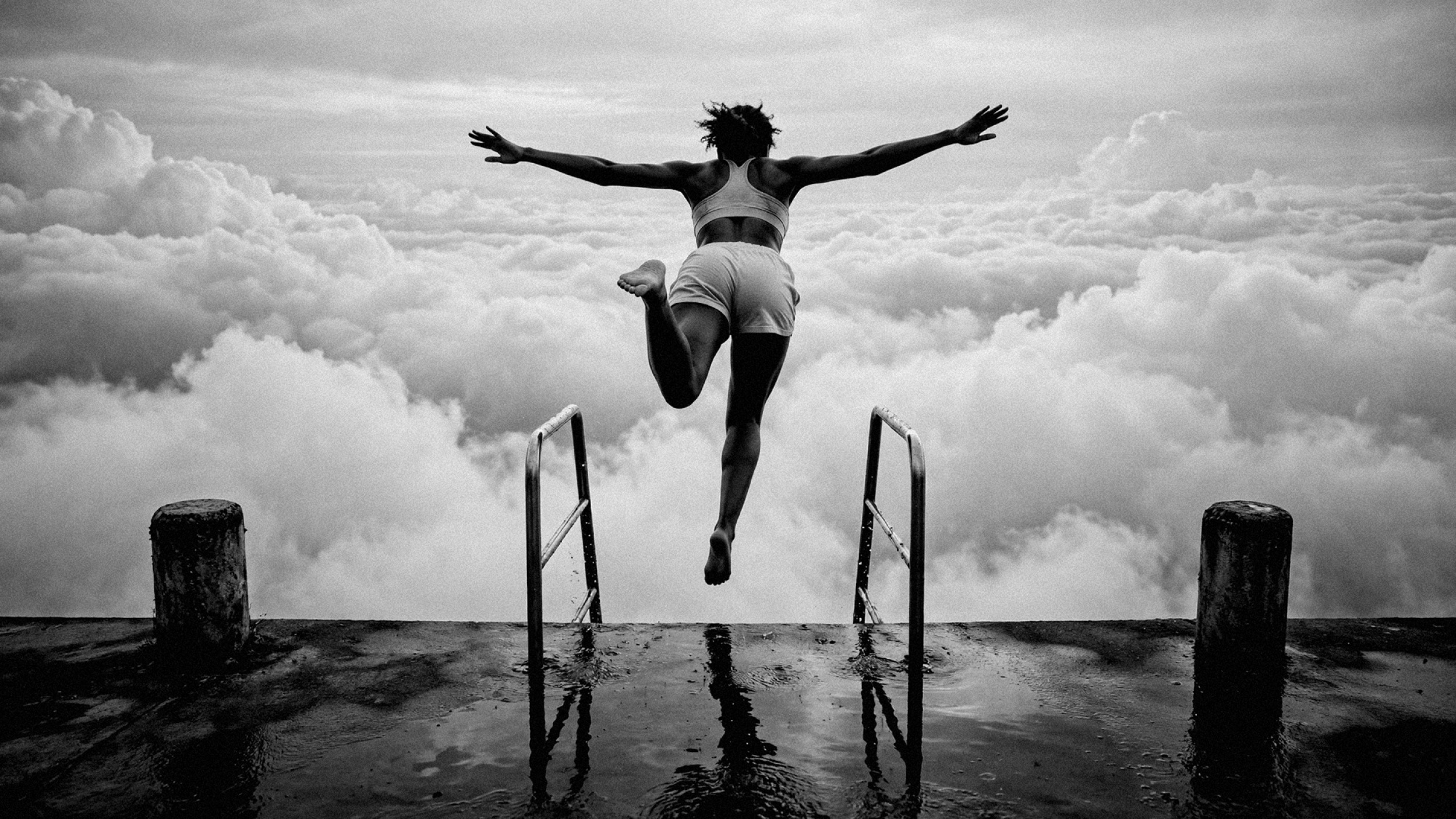
“Jump”
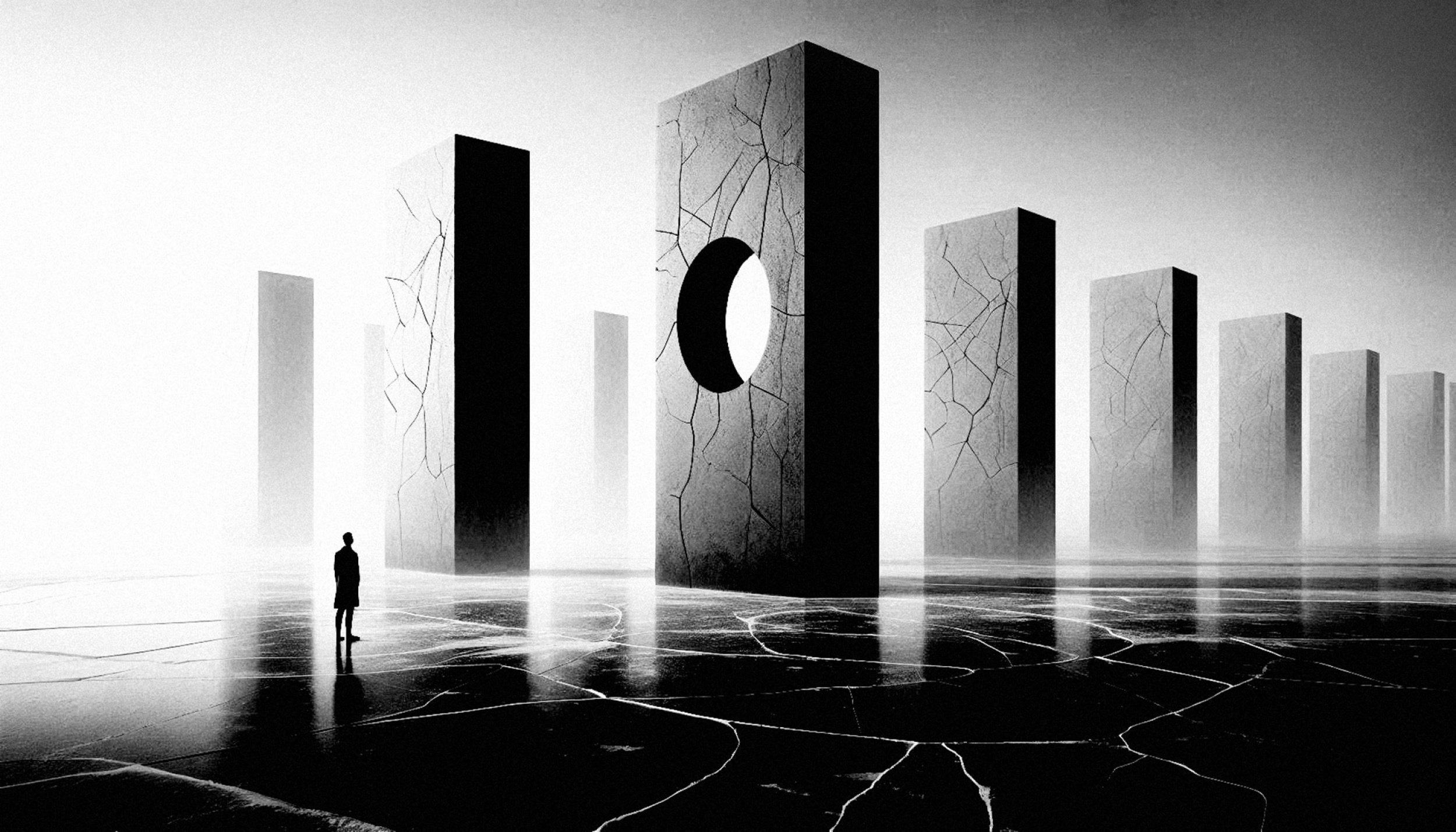
“Last Hope”
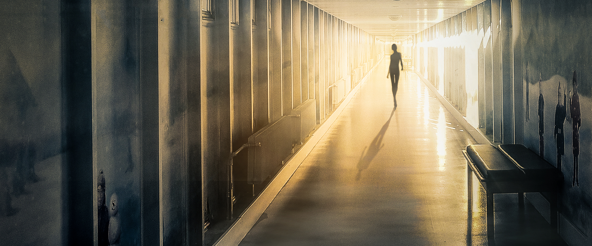
Time and again, AGNIRIBE places a solitary figure in a setting that seems almost too vast to comprehend. Sometimes this is a windswept landscape, at others an empty corridor, a monumental structure or a city at night.
The figures are often small, yet never insignificant. Their presence gives scale to the surroundings and introduces an element of mystery. Are they searching, escaping, waiting or simply passing through? AGNIRIBE rarely provides an answer. Instead, she allows the viewer to form their own interpretation.
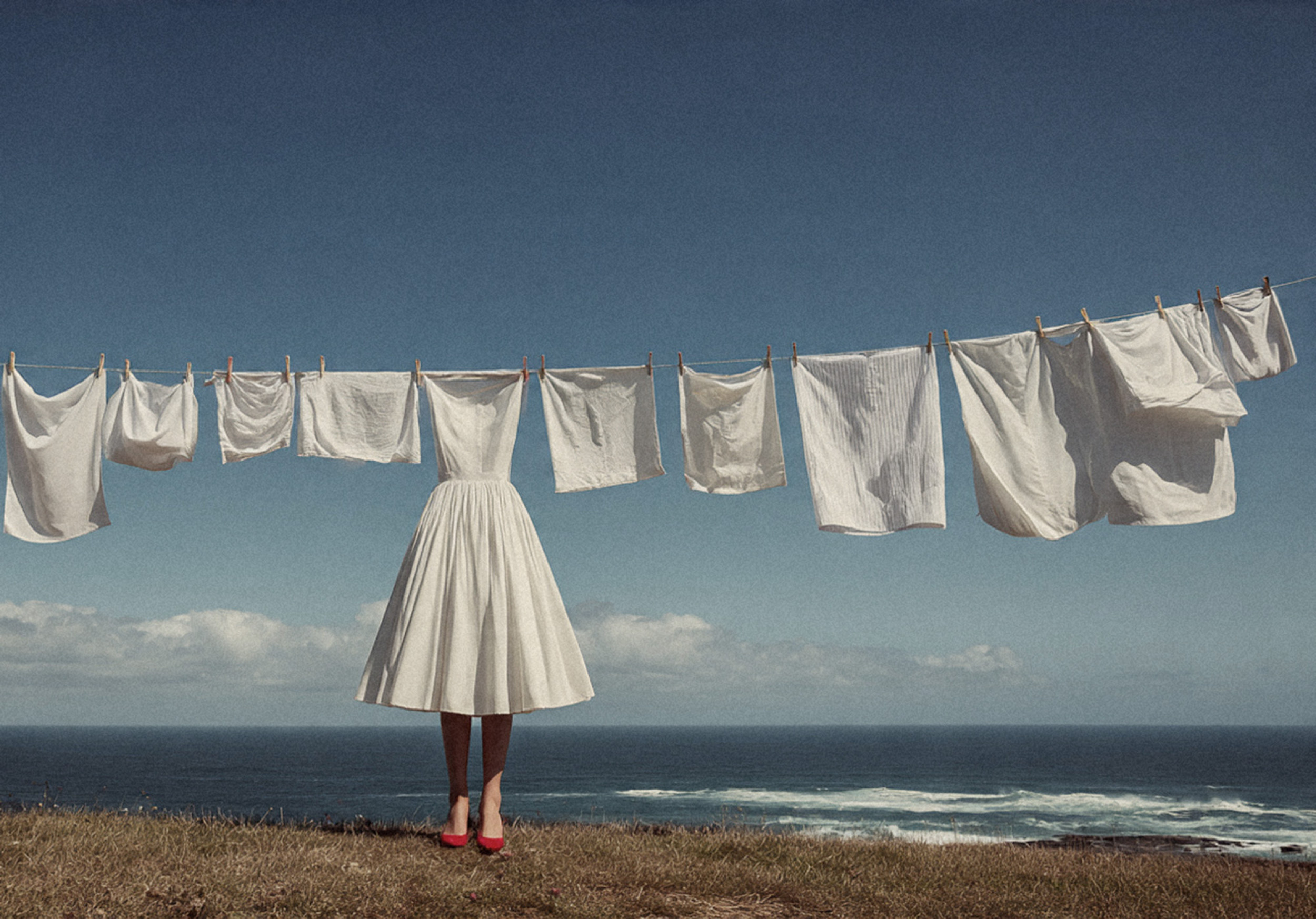
“White clothes”

“Game”
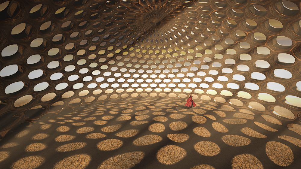
“Mirage”
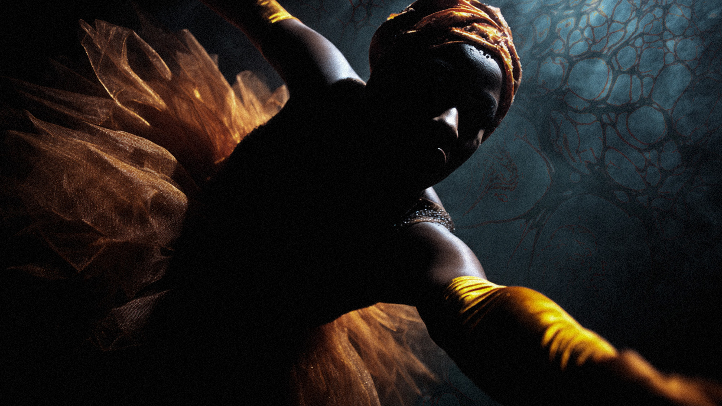
“Dancer”
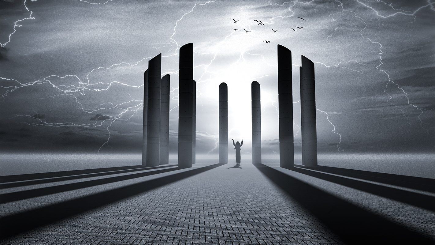
“Incantation”
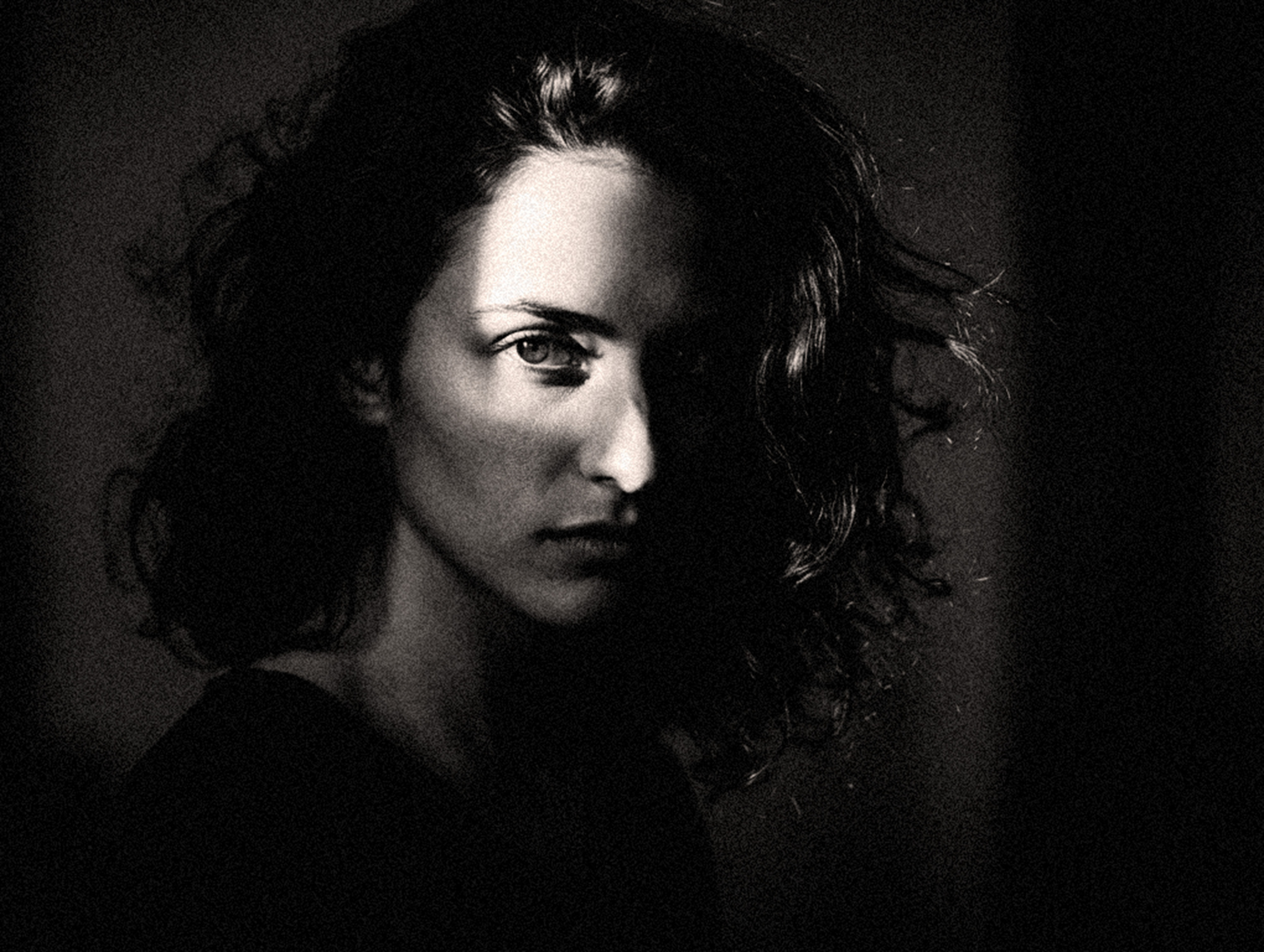
“Elegance”
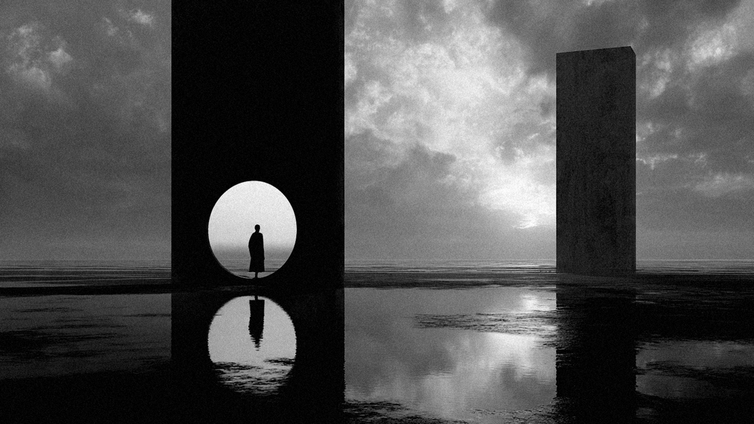
“Last Gate”
AGNIRIBE's photography has another side to it: it is whimsical, energetic and occasionally extravagant. A young girl stands among scattered basketballs; a dancer emerges from the shadows; and a figure appears suspended between earth and sky.
Movement is a powerful element in these compositions. Even when the action is frozen, we sense the moment before or after. Elsewhere, dramatic lighting, unexpected colours and unusual perspectives transform ordinary subjects into something closer to fantasy.
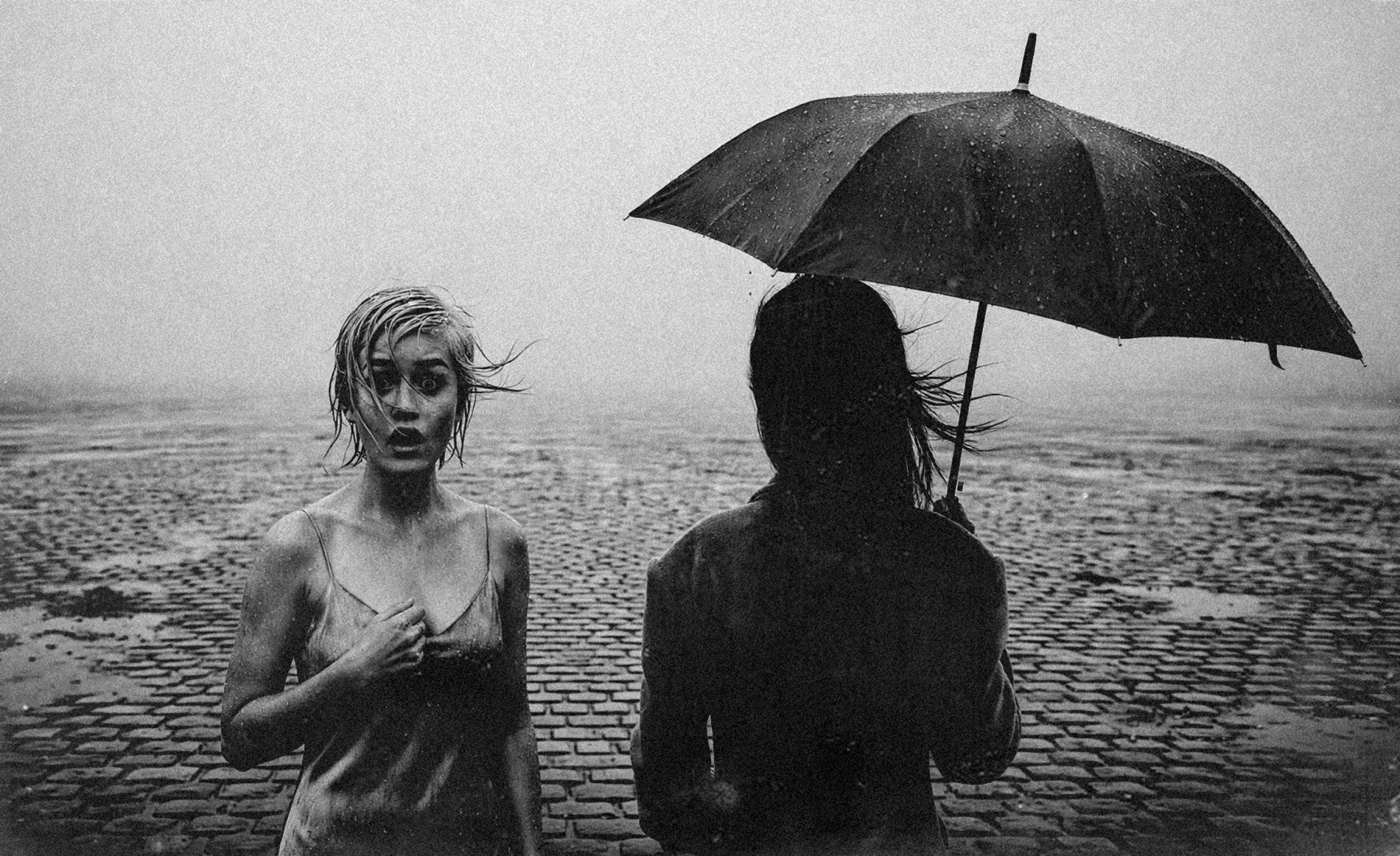
“Rain”
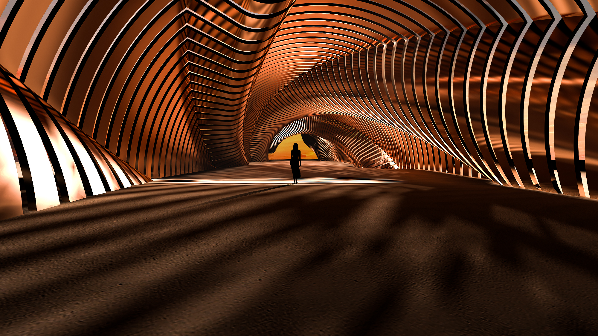
“The Path”
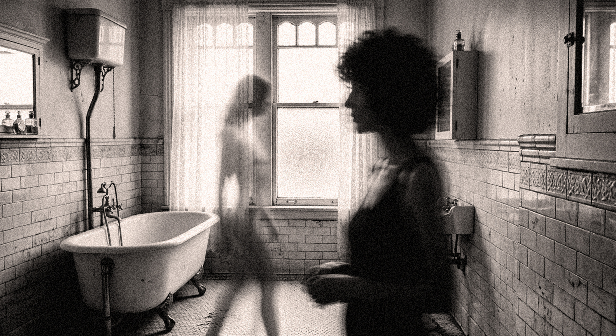
“Ghost”
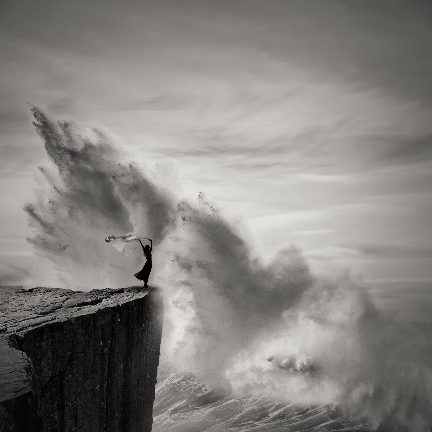
“Braving the Storm”
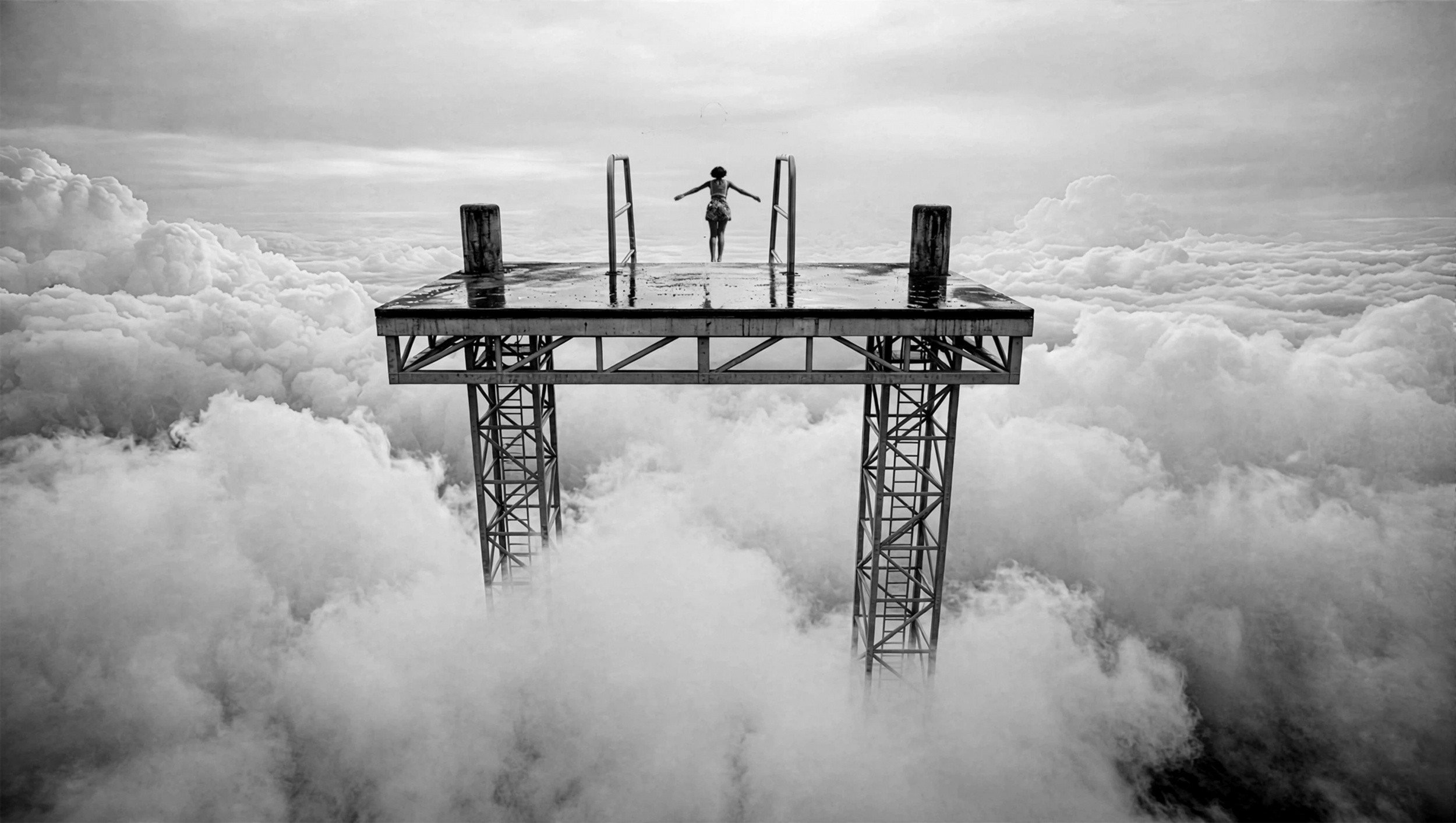
“Jump into unknown”
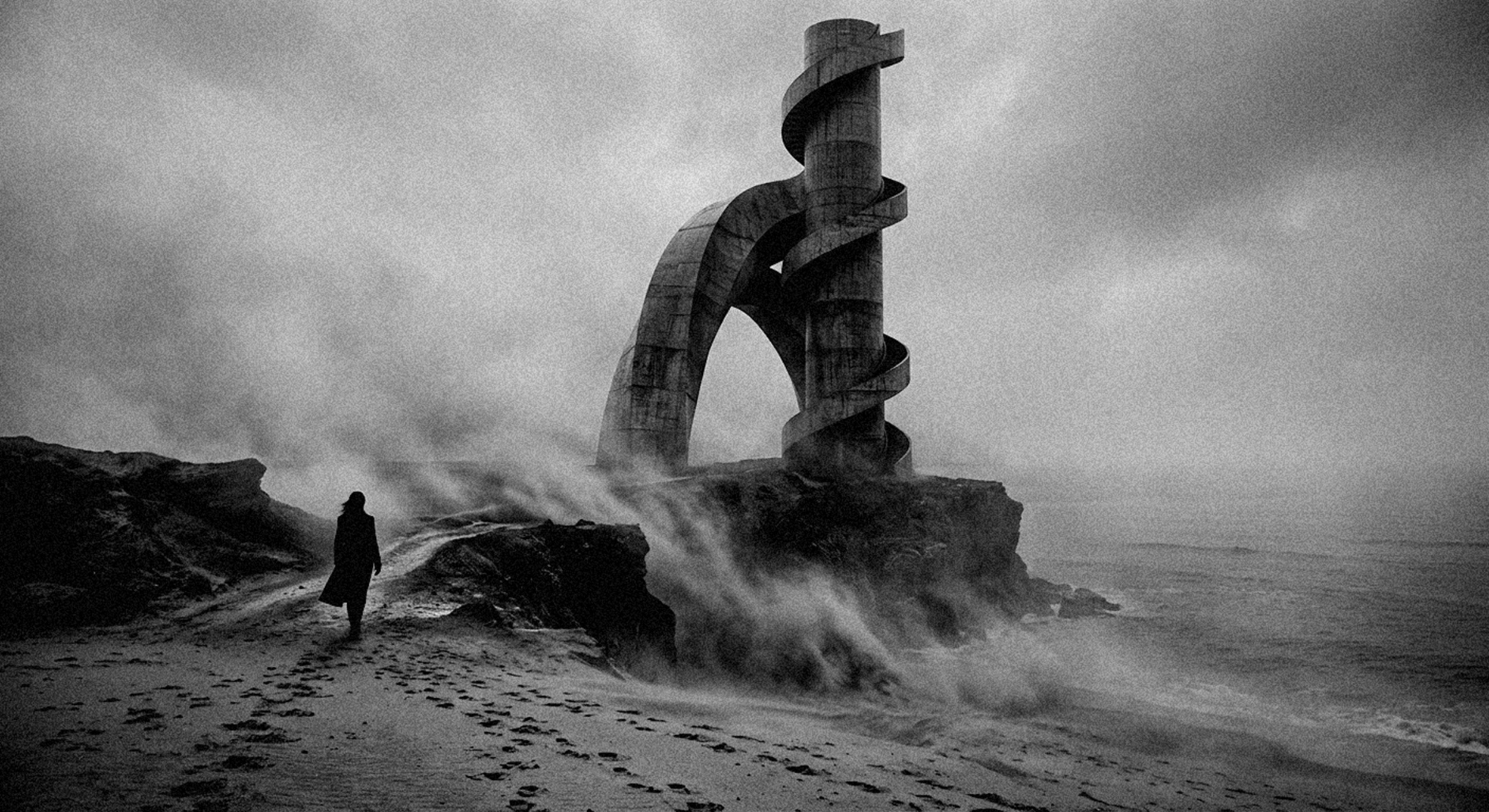
“Archi,3D”
Some of AGNIRIBE's most memorable photographs exist somewhere between the familiar and the impossible. Architectural forms take on a dreamlike quality, figures appear in unexpected places and ordinary spaces feel unsettlingly strange.
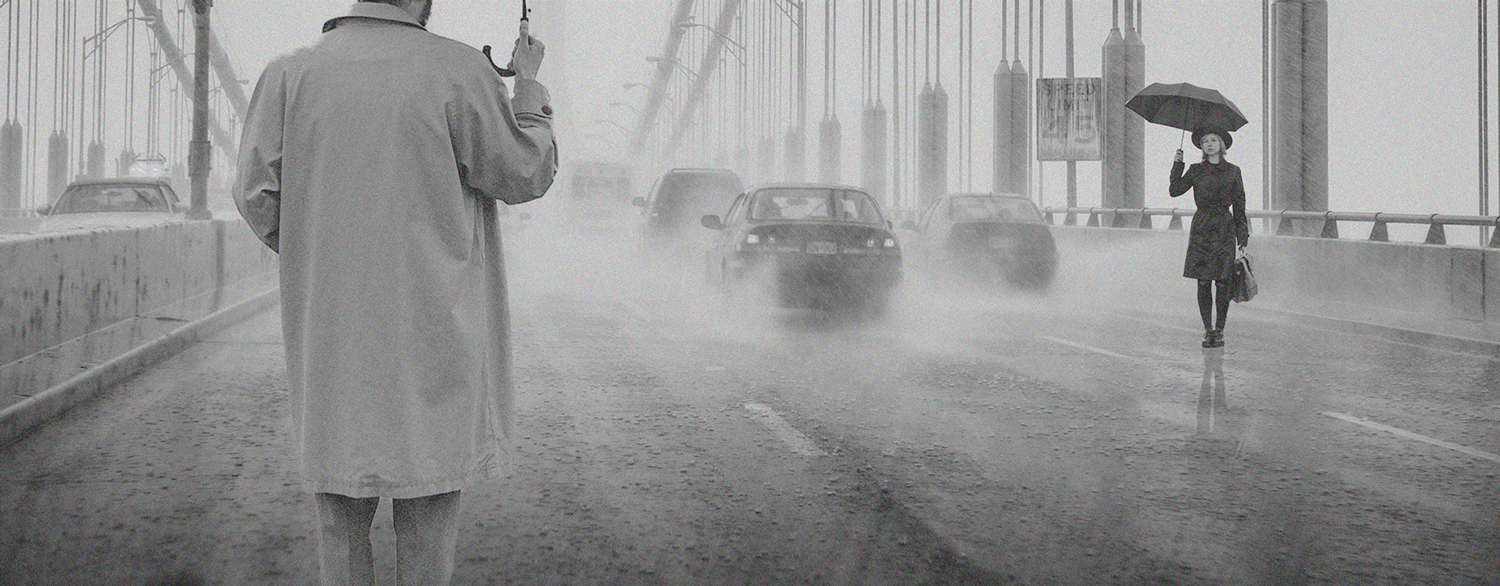
Yet there are also moments of tenderness and human connection. In Rain, the presence of two figures creates a different kind of tension, reminding us how rarely her compositions rely on encounters between people.
Perhaps that is what makes her photography so compelling. Whether playful, mysterious, intimate or monumental, her images resist easy explanations. They suggest stories without finishing them, leaving us with the pleasure of imagining what might happen next. Finding a balance between elegance, humour, and incredible visual drama is a difficult feat, and we are delighted that AGNIRIBE has chosen 1x to showcase her work. Thank you!
|
| | Chris Hamilton PRO Great images like the energy contained within them. |
 | AGNIRIBE PRO Thank you all for yours friendly comments, a special thanks for Jane and Yvette |
 | Radomir Gill PRO Stunning, unconventional photographs that leave me stirred—they are exciting and full of imagination. |
| Jane Lyons CREW Radomir, thank you for your appreciation ! |
| | Miro Susta CREW Excellent inspiring photographs congratulations Agniribe, many thanks Jane for introduction write up and thanks to Yvette for publishing it |
| Jane Lyons CREW Hi Miro..thank you! |
 | Angelika Vogel PRO Congratulations on this marvellous Portfolio! |
| Jane Lyons CREW Angelikia, thank you for your comment. |
 | Yanny Liu PRO Excellent collections of creativity, congratulations! |
| Jane Lyons CREW Hi Yannny..thanks for your comment! |
| | Dear AGNIRIBE
Congratulations on this beautiful feature. Your work reminds me why photography can be so much more than documentation: it can be a quiet invitation to wonder. The solitary figures in your images, always small yet essential, carry a sense of poetry that stays with the viewer long after the image is gone.
Thank you for creating work that leaves room for imagination and for inspiring photographers like me.
With sincere admiration and gratitude. 🙏 |
| Jane Lyons CREW Hi Hadi, thanks so much for taking the time to comment. I am sure Agniribe really appreciates your comments. |
| | Thrilling and spectacular |
| | Wanghan Li PRO Excellent article, beautiful and inspiring works! Wow! Appreciate very much all of these! Learning! |
 | Jo Chaney PRO Wow! What haunting and evocative images. Very thought provoking and beautifully executed. A special thanks to the artist and to you, Jane, for another excellent presentation of a body of photographs. |
| Jane Lyons CREW Thanks so much Jo! Your time is appreciated. |
| | Sokol Priftaj PRO This work is truly inspiring |
| Jane Lyons CREW Thanks for commenting Sokol. It is appreciated. |
| | Yvette Depaepe CREW Dear friend, your work is so distinctively yours: soulful and renewing in its own way. We are glad to have you in our community and in the magazine. With lots of admiration and friendship,
Yvette |
 | joanaduenas PRO A special collection of images showcasing the artist's talent. Thank you very much for sharing them. As always, our thanks go to Ivette for selecting and conducting the interview. |
| Jane Lyons CREW Thanks for commenting Joan. We appreciate it. |
| | Absolutely beautiful! Both the images and the poetic description of them are inspirational. Thank you, AGNIRIBE and Jane! |
| Jane Lyons CREW Thanks so much for checking in Christine. We appreciate your appreciation ! |
| | AGNIRIBE PRO Thank you very much to plublish my work and comment it. Je suis vraiment touché par vos mots. Encore un grand merci pour vos texts et analyse. |
| Jane Lyons CREW You are so welcome, Agniribe. Your work deserves attention. Thank you! |
by Yvette Depaepe
Published the 11th of October 2026
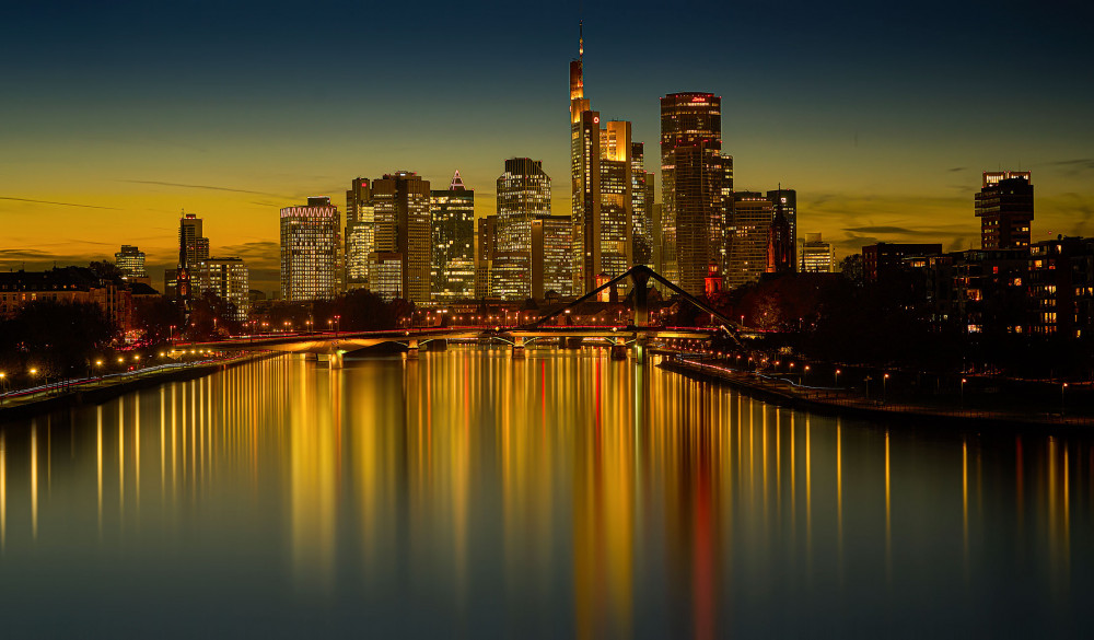
'Dusk Photography'
Dusk shots result in excellent photography because of the unique combination of natural light and deep shadows it produces, making beautiful pictures. This time occurs shortly after sunset, when soft, spread-out light illuminates all the colors and details.
Admire the best of the many dusk images submitted.
The winners with the most votes are:
1st place : Martin Fleckenstein
2nd place: Luciano Caturegli
3rd place : Eriks Zilbalodis
Congratulations to the winners and honourable mentions.
Thanks to all the participants in the contest 'Dusk Photography'
Current contest theme is 'Arrows as Art Objects'
Despite its simplicity, its graphic power and iconic form it can create movement, suggest direction and introduce a dynamic shape that has the power to transform an ordinary photograph into something extraordinary. Get inspired by the images in the gallery of this article: https://1x.com/magazine/permalink/10131
This contest will end on Sunday the 22nd of November at midnight.
The sooner you upload your submission the more chance you have to gather the most votes.
If you haven't uploaded your photo yet, click here.
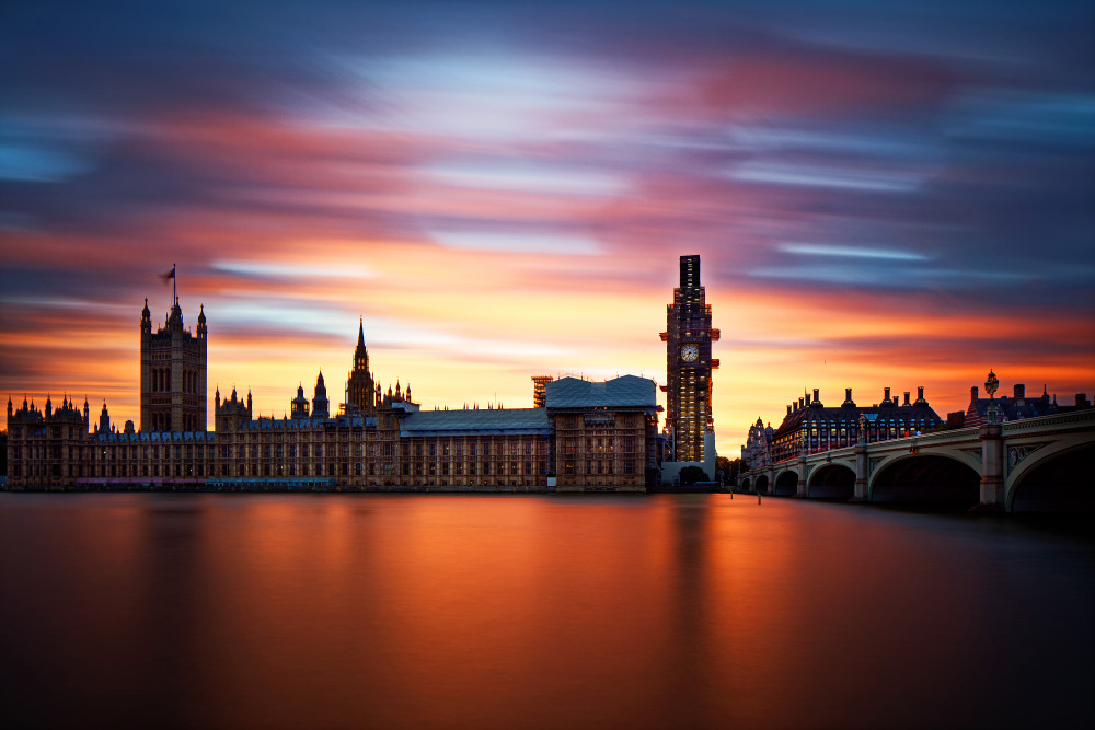
1st place: by Martin Fleckenstein
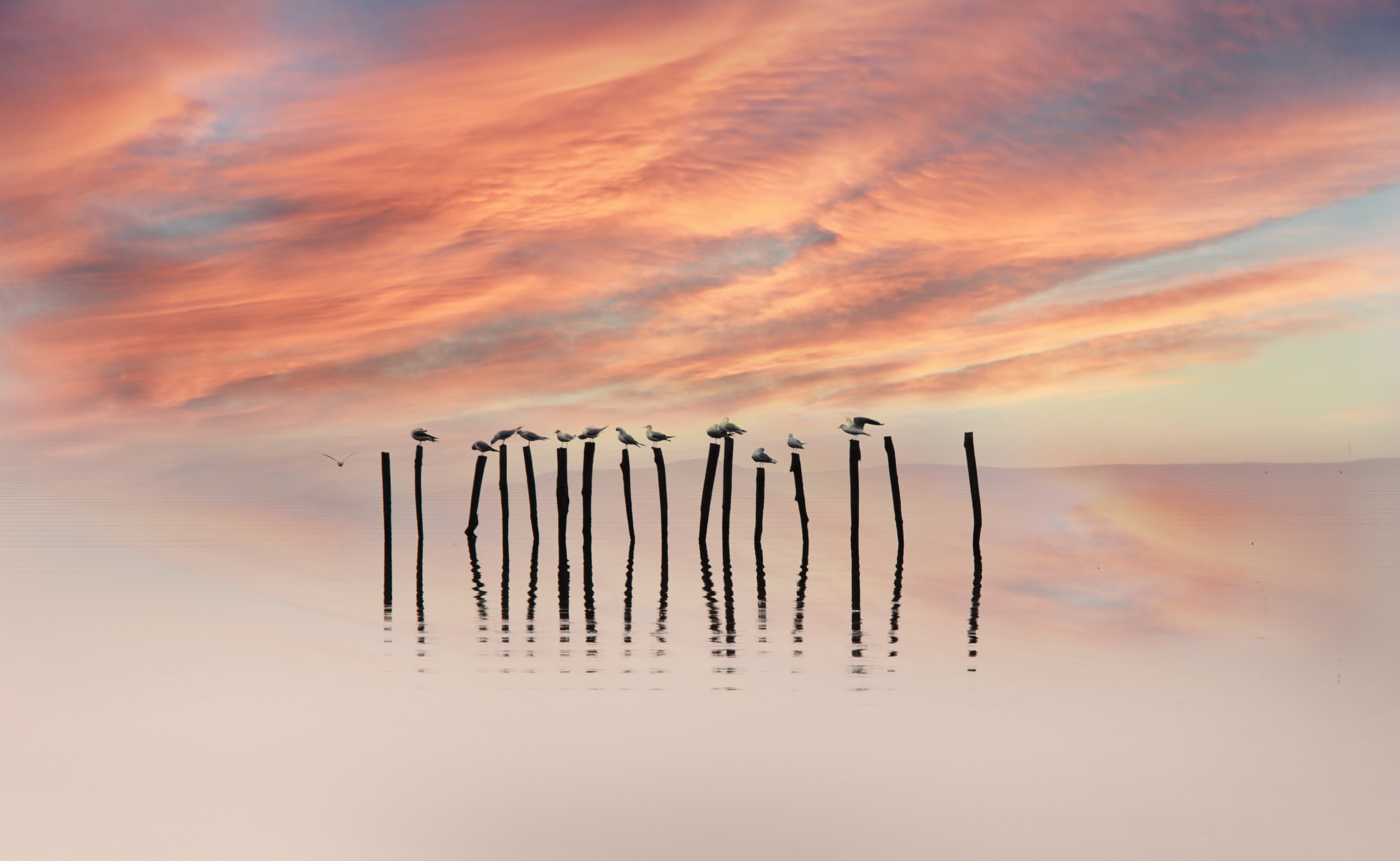
2nd place: by Luciano Caturegli
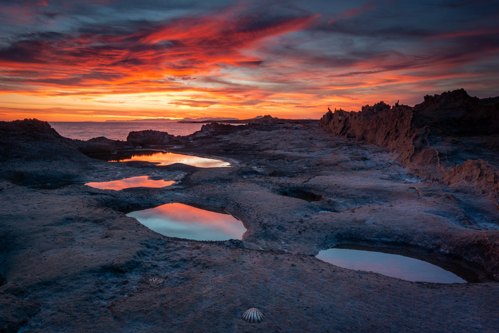
3rd place: by Eriks Zilbalodis
HONOURABLE MENTIONS
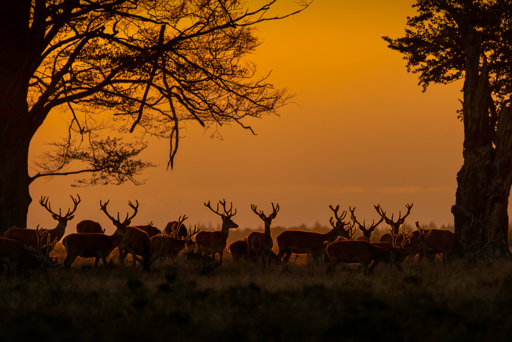
by Piet Haaksma

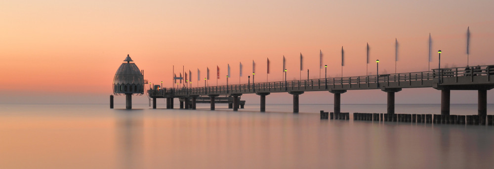
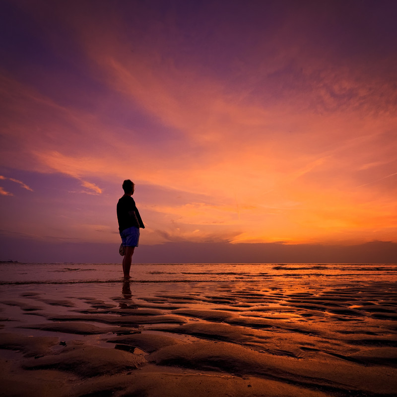
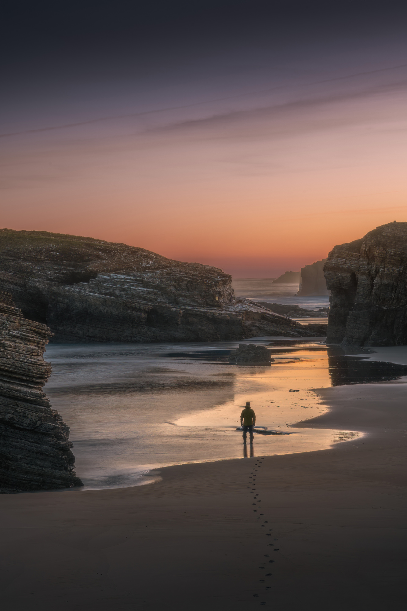 by Stefano Caccia
 by Boris Bekelman
 by Yongnan Li
|
| | Excellent |