
|
|
|
|
by Editor Miro Susta
Edited and published by Yvette Depaepe, the 21st of August 2026
Blue is one of the primary colours of the spectrum. In general, blue is considered a cool colour.
However, this need not be a negative characteristic.
It evokes positive associations with clear skies and water in nature, which is precisely why it has a calming effect.
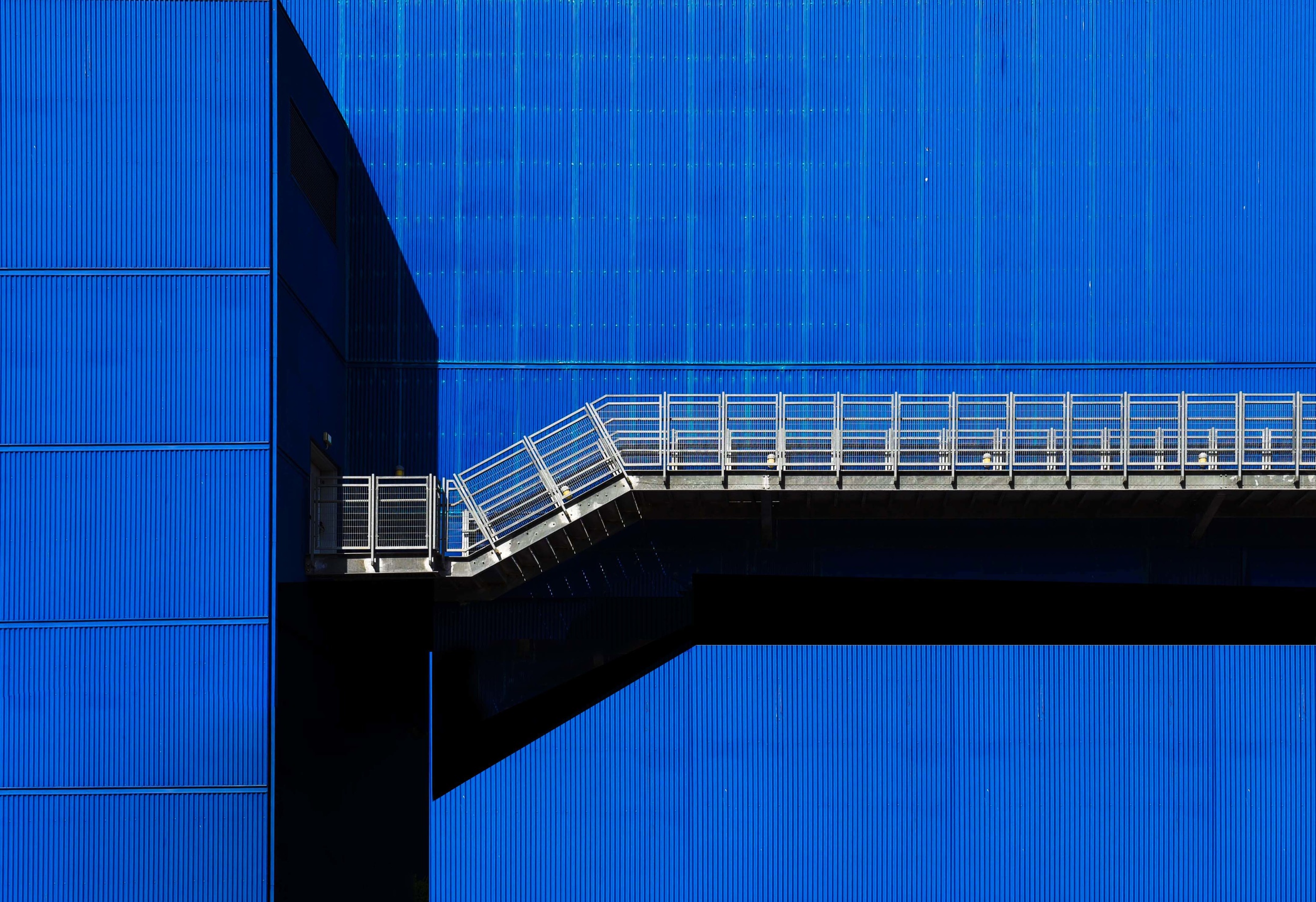
‘Blue on Blue’ by Arnon Orbach
In photography, the colour blue is a cool tone that visually recedes into the background. However, it evokes feelings of calmness, stability, coldness and emotional balance in viewers.
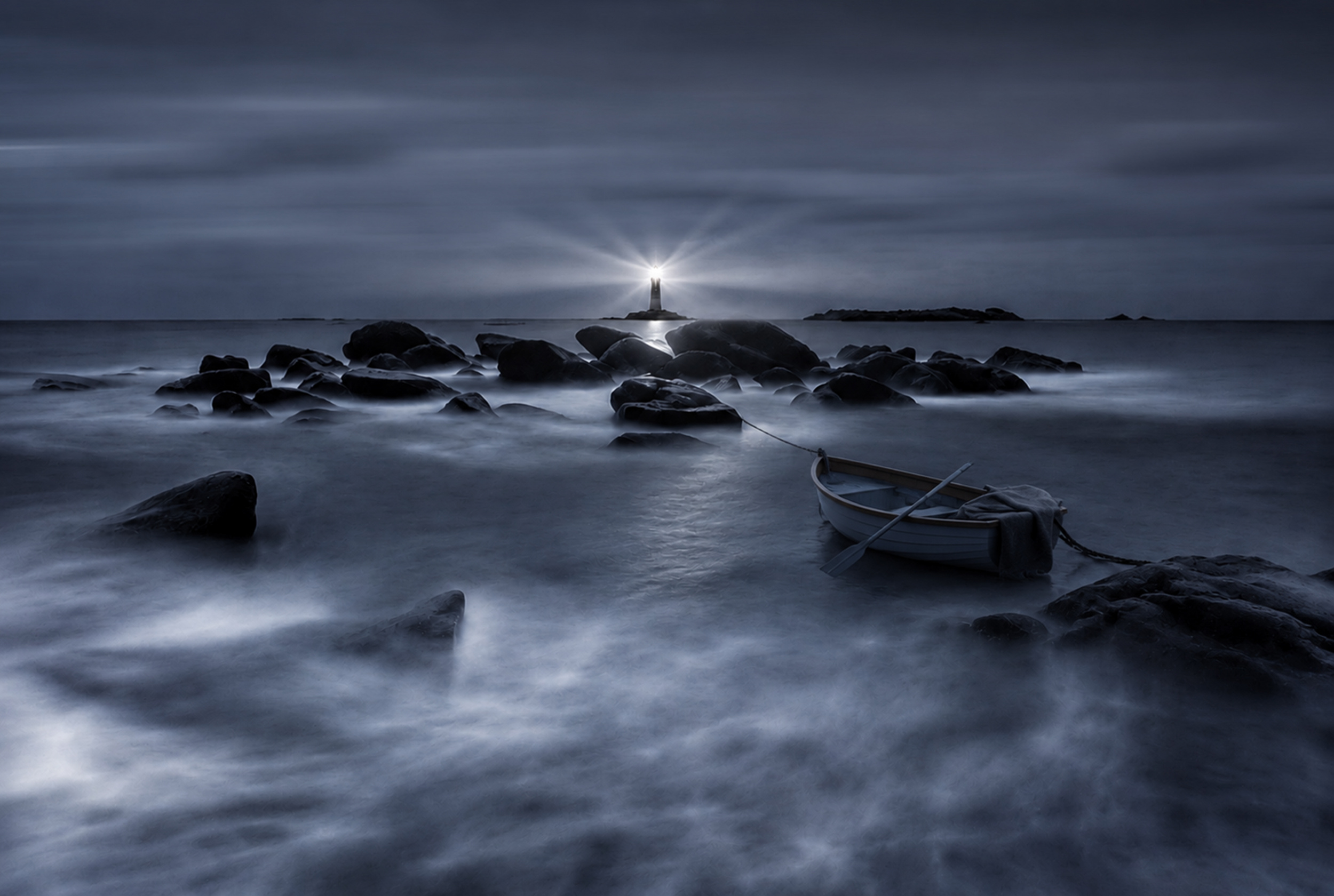
‘Beacon of our hearts ...’ by Yvette Depaepe
Calmness
Blue, or 'relaxing blue'. It symbolises stability, trust and inner balance.
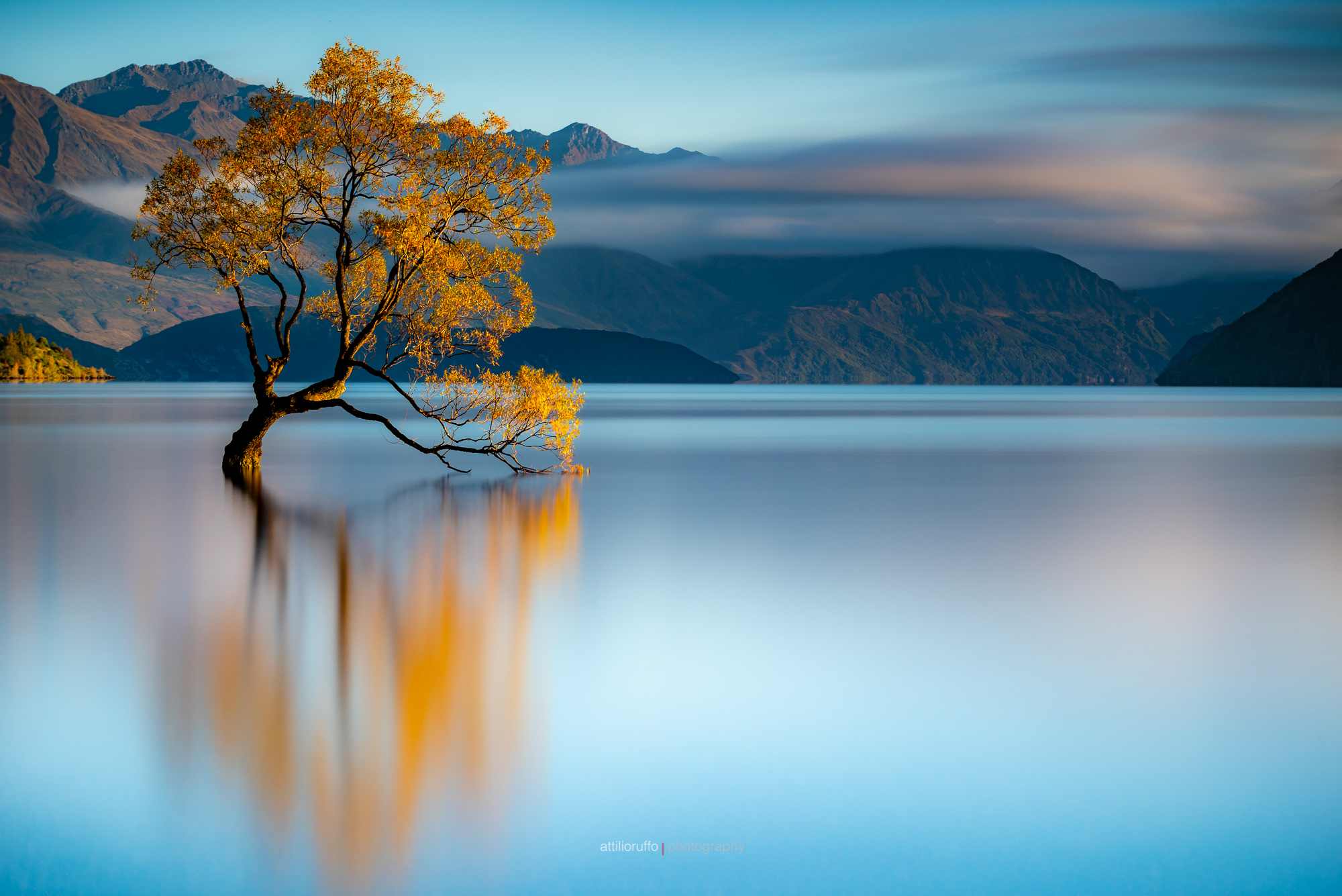
‘Wanaka 3186’ by Attilio Ruffo
Stability
In colour psychology, the colour blue symbolizes stability and evokes feelings of certainty, safety, reliability, emotional well-being and loyalty.
Coldness
The visual and psychological sensation associated with the colour blue, which evokes a sense of coolness, is known as the perceived or psychological temperature of colours. In both psychology and art, blue is considered one of the primary cool tones.
Emotional Balance
The colour blue is associated with emotions and the mental state, and is linked to feelings of inner peace and serenity. Blue acts as a natural stress reliever and symbolizes harmony.
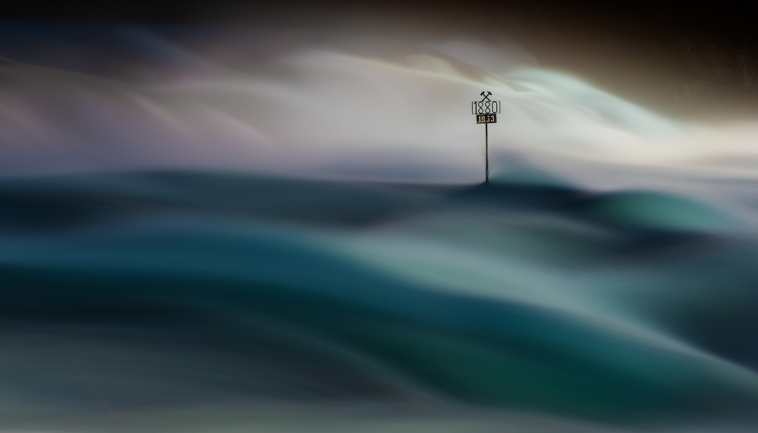
‘The Marker’ by Andreas Agazzi
Blue pairs best with neutral shades (white, beige and grey), natural tones (brown and green) and complementary colours (yellow, orange and red). However, the right combination depends on the shade of blue and the intended overall impression.
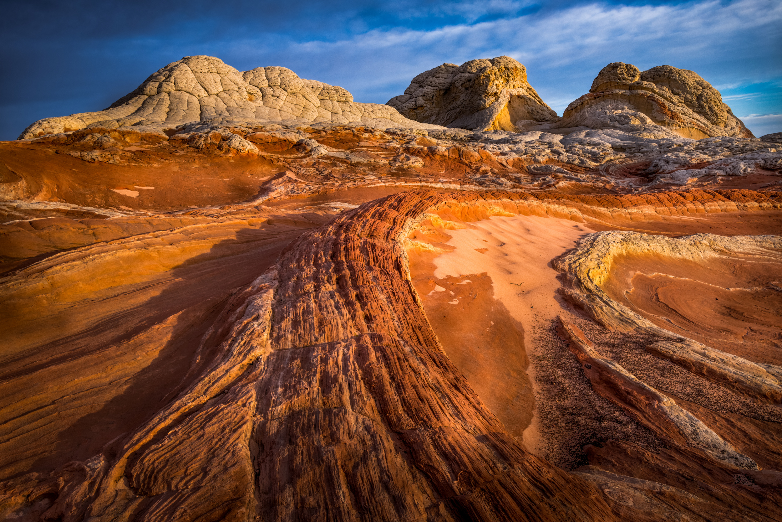
‘White Pocket – Utah’ by Wanghan Li
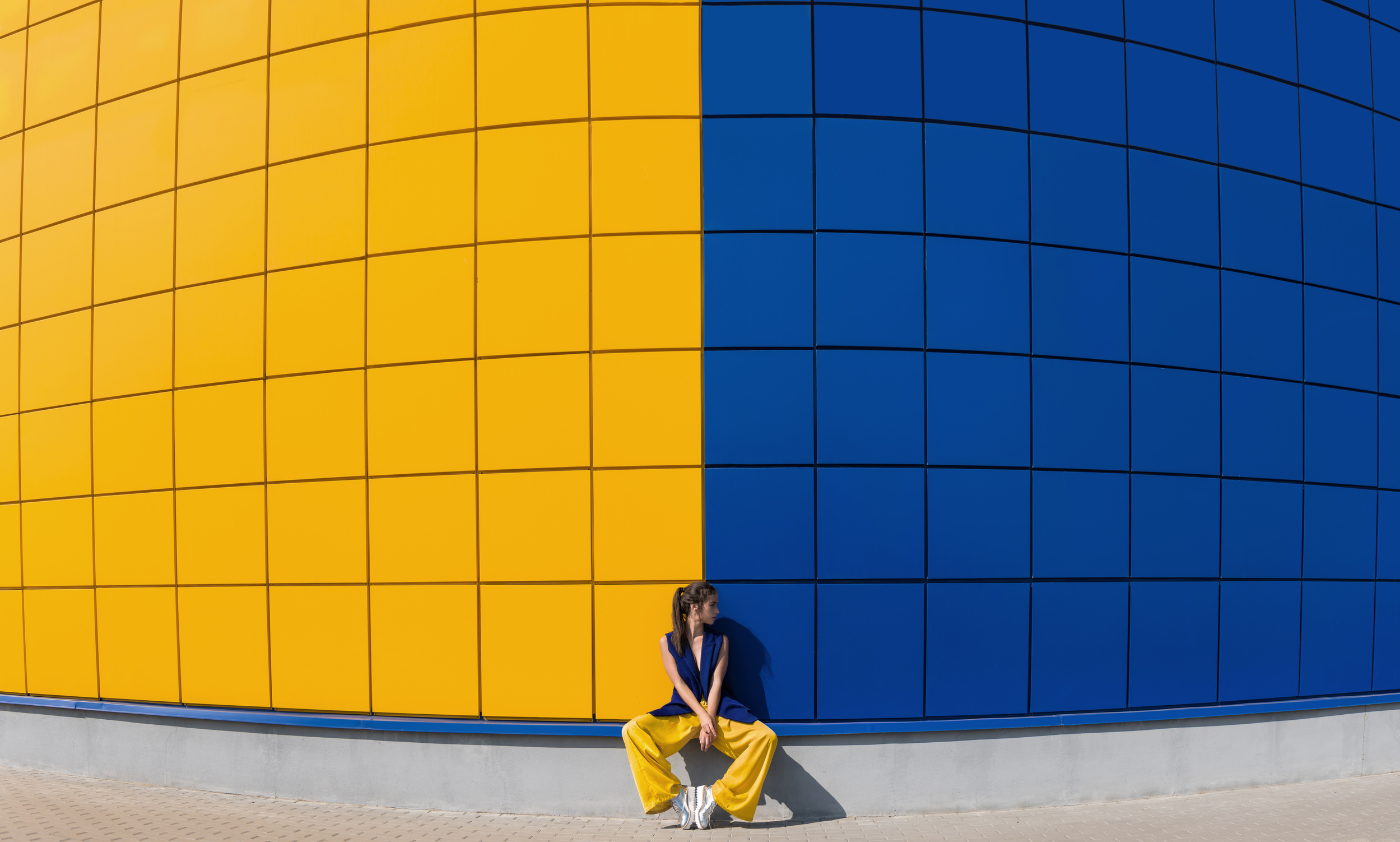
‘yellow and blue’ by Anna
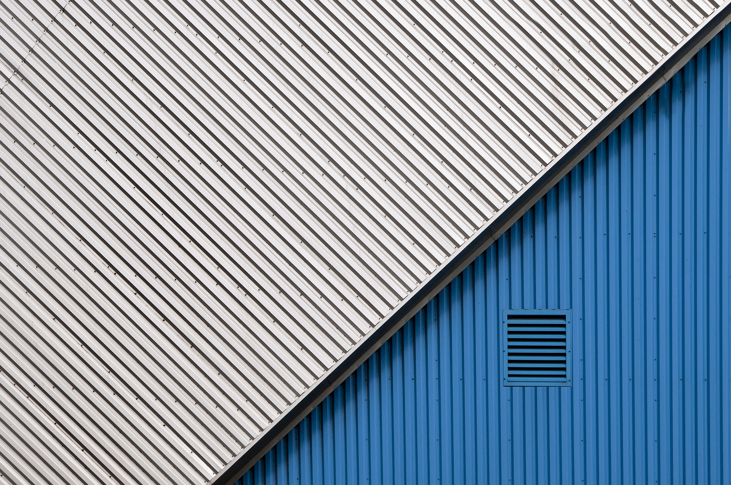
In the blue corner by Linda Wride
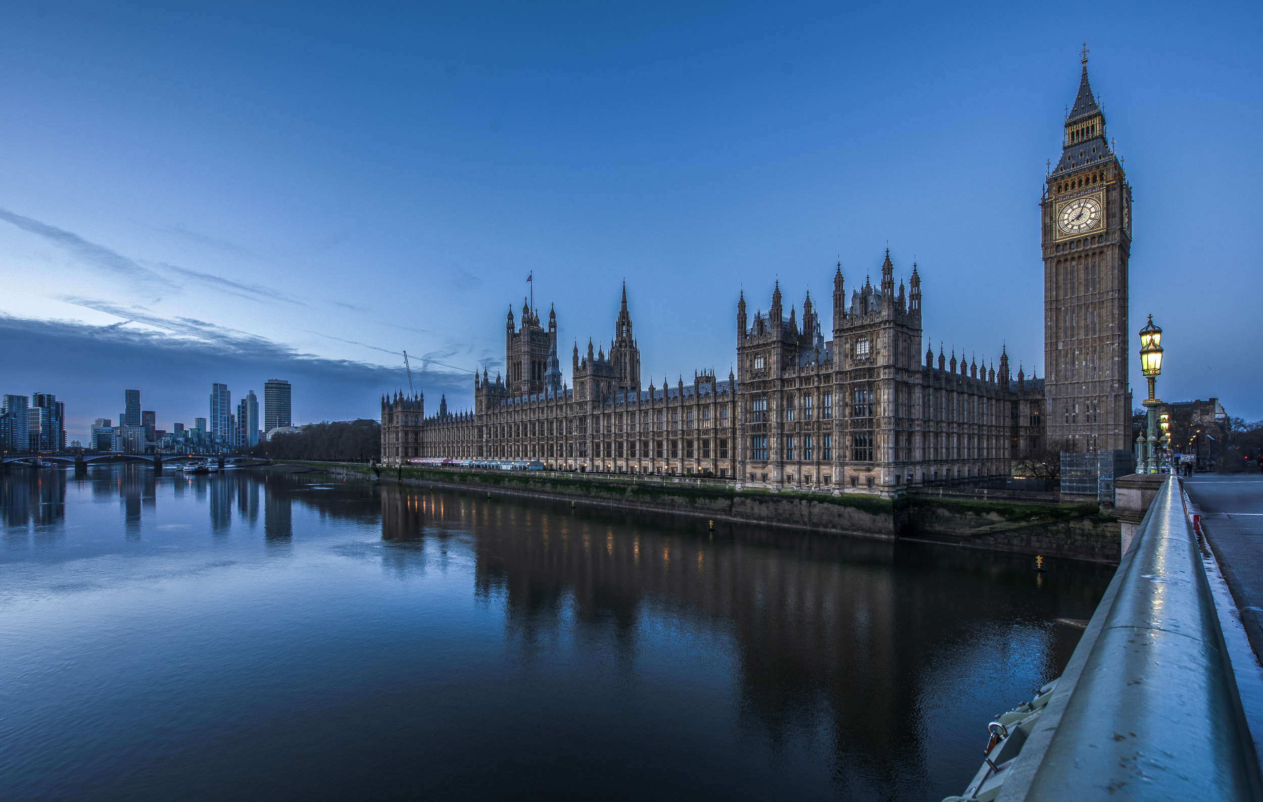
‘Blue hour mood’ by Rana Jabeen
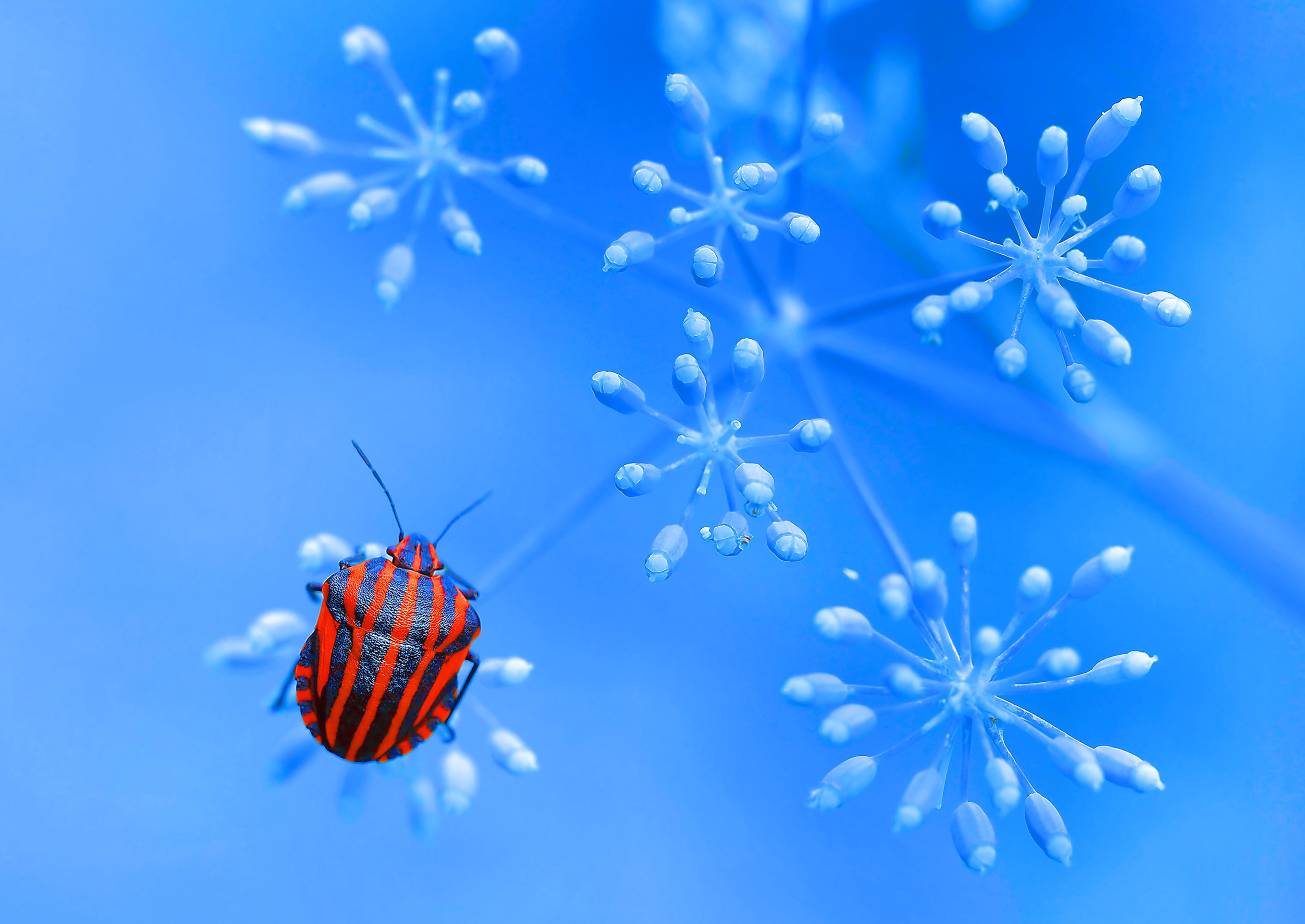
‘Red Bug Blue Bloom’ by Thierry Dufour
White and Cream:
Create a clean, fresh, and timeless nautical style.
Beige and Brown:
Ideal for softening the look and creating an elegant, warm impression.
Yellow, Red and Orange:
Bold, complementary colours work well together, often seen in the landscape at sunrise or sunset.Yellow adds a cheerful and playful touch to blue.
Gray and Silver:
A modern and sophisticated combination that creates a balanced look.
Gold:
A wonderful choice for dark blue (royal or navy) shades, adding a touch of luxury.
When coordinating colours in general, a basic rule of optics applies: blue is a cool colour, so it should be balanced depending on the desired mood. Contrasting and energetic combinations with complementary colours immediately catch the eye and create a dynamic effect.
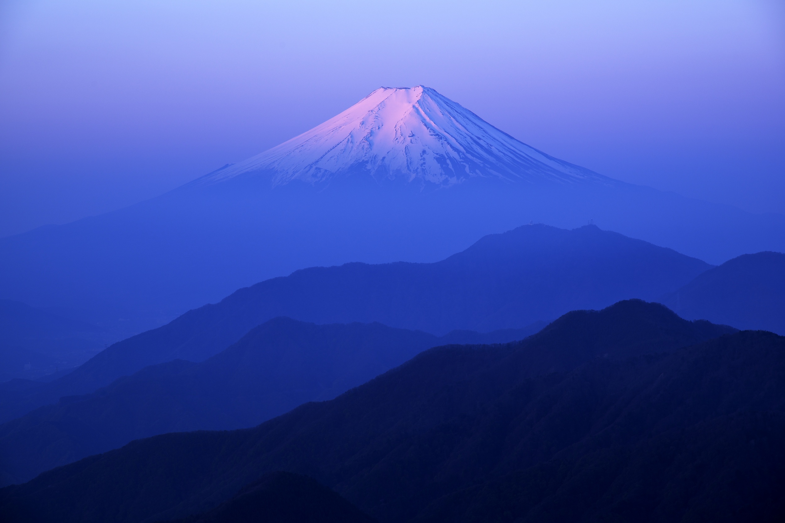
‘Glory’ by Takashi
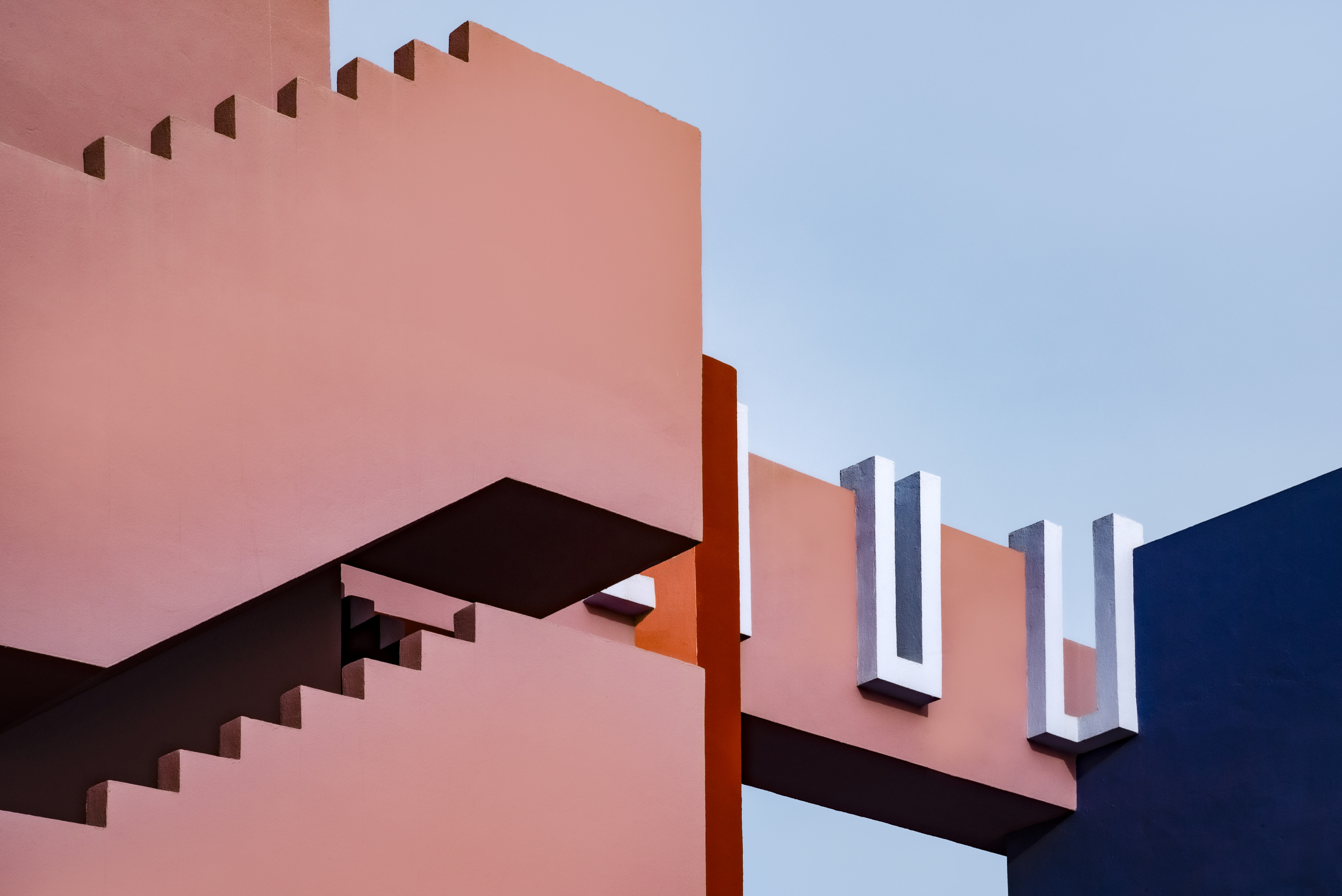
‘Muralla Roja #22’ by Linda Wride
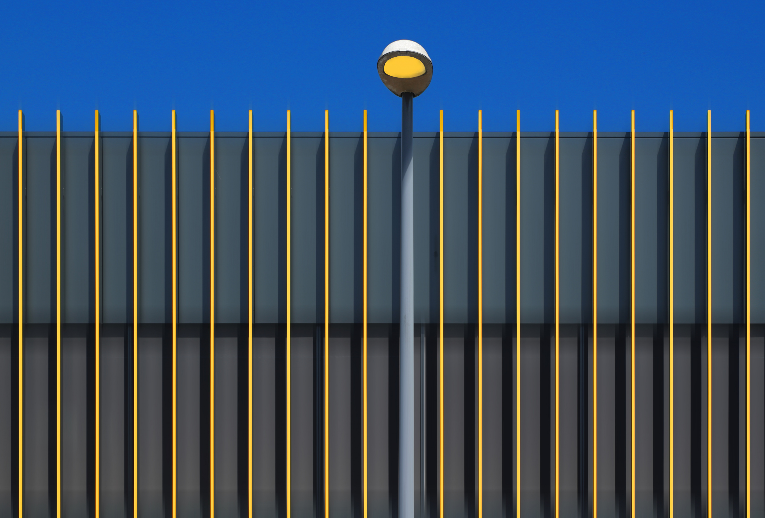
‘Yellow Stripes’ by Hans-Wolfgang Hawerkamp
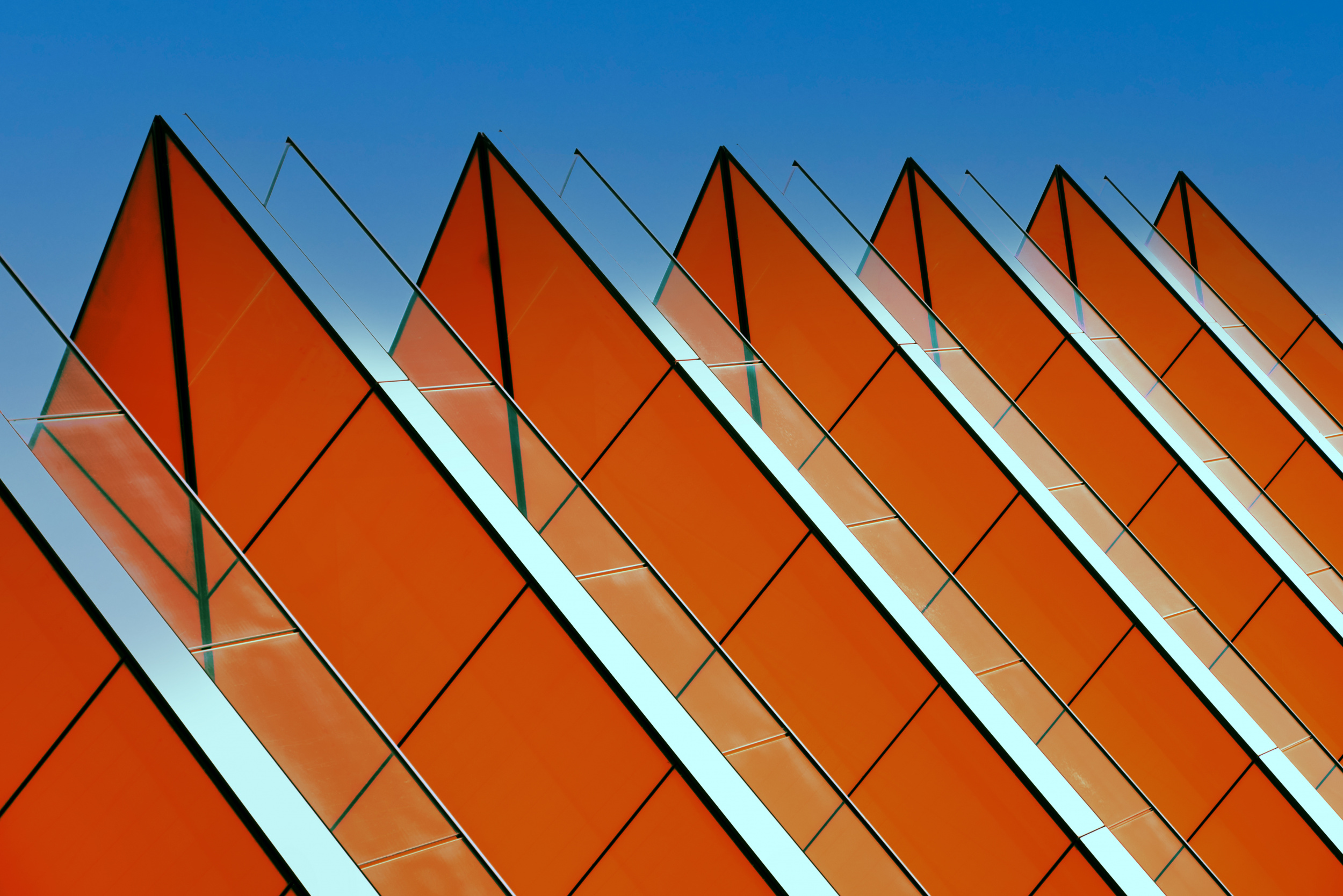
‘Triangulation’ by Chris Hamilton
Orange
The direct opposite of blue on the colour wheel. It creates the strongest and most vivid contrast.
Yellow
It has a cheerful, sunny feel and brightens even dark shades of blue.
Pink
A modern, fresh combination with a touch of the exotic.
The following colours offset the coolness of the blue, giving the overall look a cosy, luxurious feel.
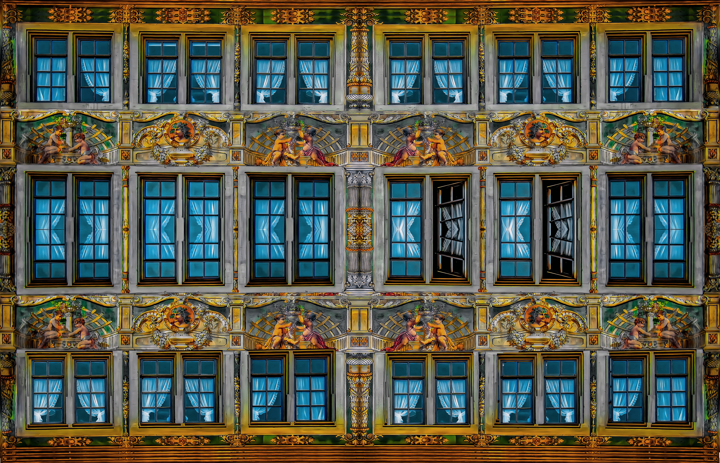
‘Old beauty’ by Miro Susta
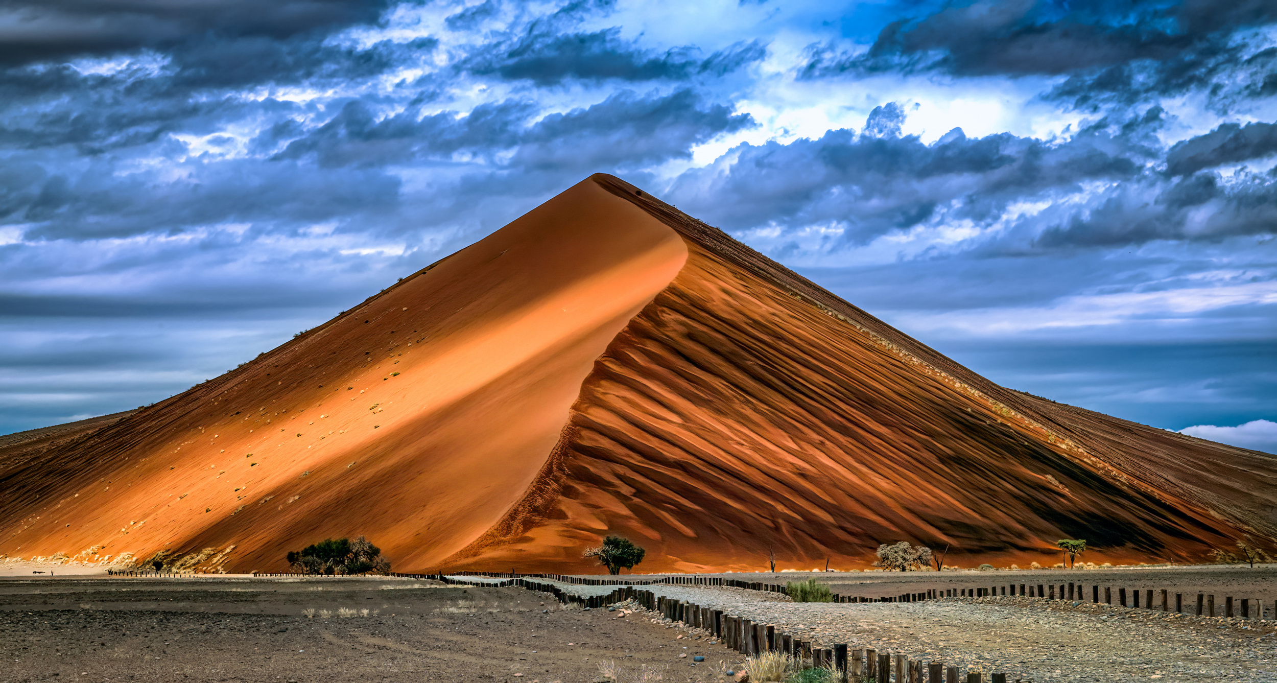
‘No.40’ by Sherry Huang

‘The cyclist’ by Anette Ohlendorf
Brown
Combining blue with chocolate or leather brown creates a stable, mature look.
Beige and Sand (Light Cream to Golden Beige)
These colours soften the blue and create a harmonious, calming impression.
Mustard (Dark Yellow)
A less bold alternative to bright yellow that adds a retro touch.
Neutral and minimalist combinations are a safe choice that never goes out of style, creating a clean look.
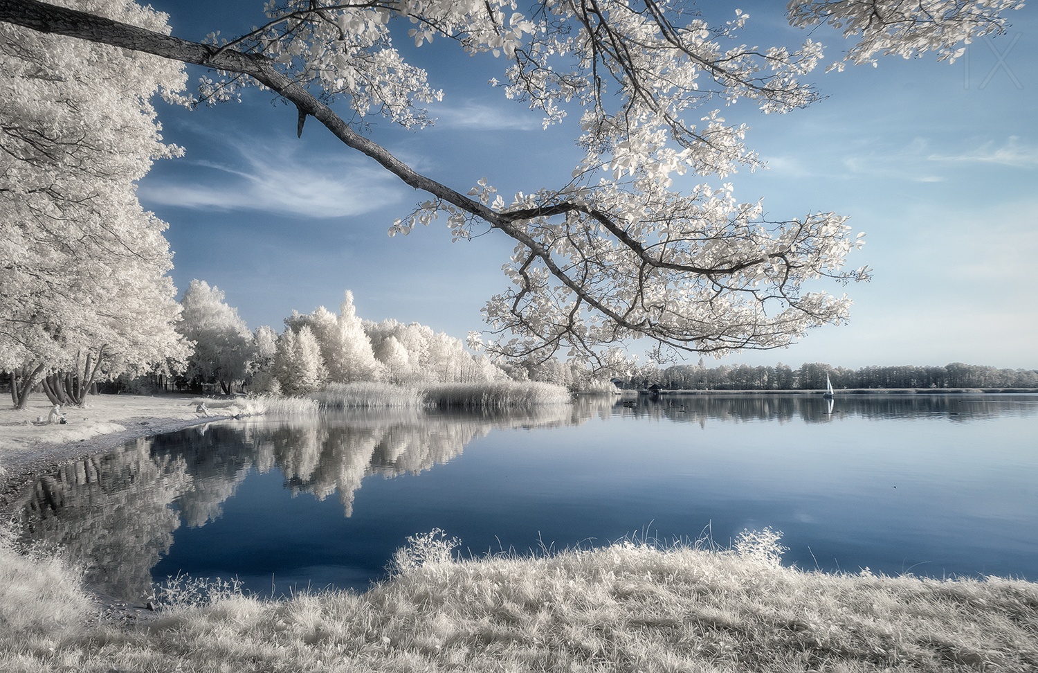
‘IRenkowo’ by Piotr Krol (Bax)
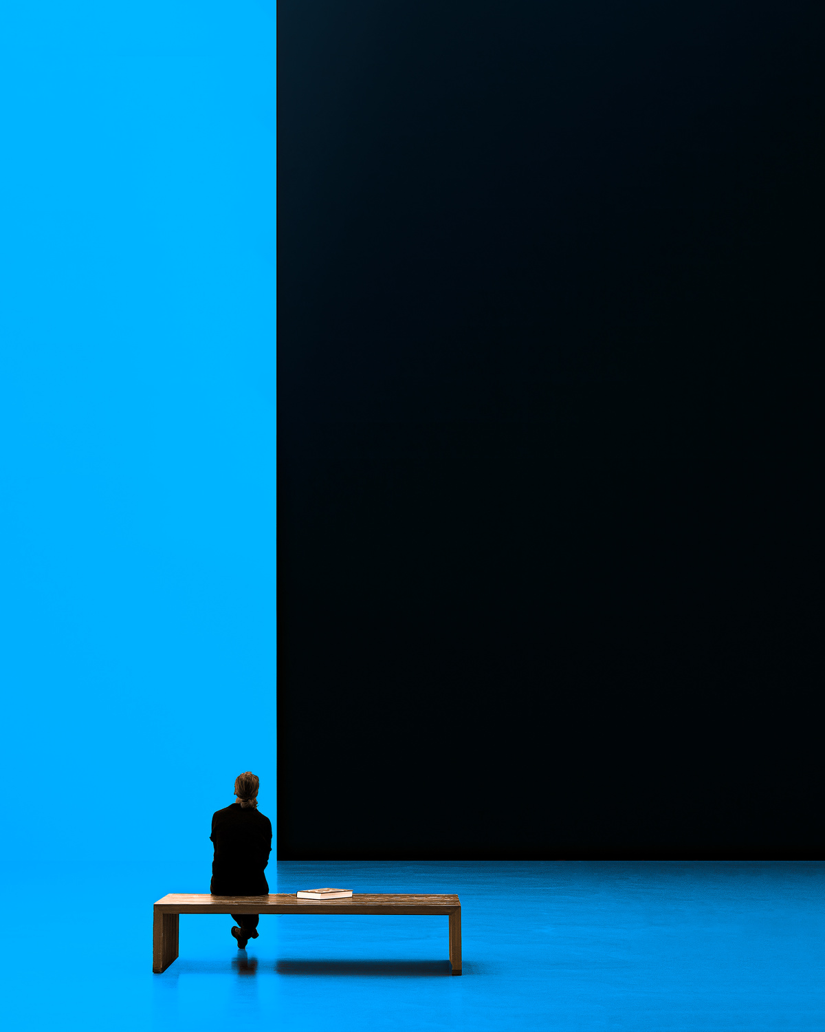
‘Woman on bench’ by Inge Schuster
White
An absolute classic - it evokes a sense of the sea, purity, and spaciousness.
Gray
From light to graphite - paired with blue, it creates a modern, industrial, or formal look.
Black
Adds depth and drama to blue - ideal with royal blue or light blue.
Yellow
Adds an excellent eye-catching contrast.
Harmonious combinations of contrast colours that sit adjacent to each other together with blue on the colour wheel; therefore, they do not clash and appear natural.
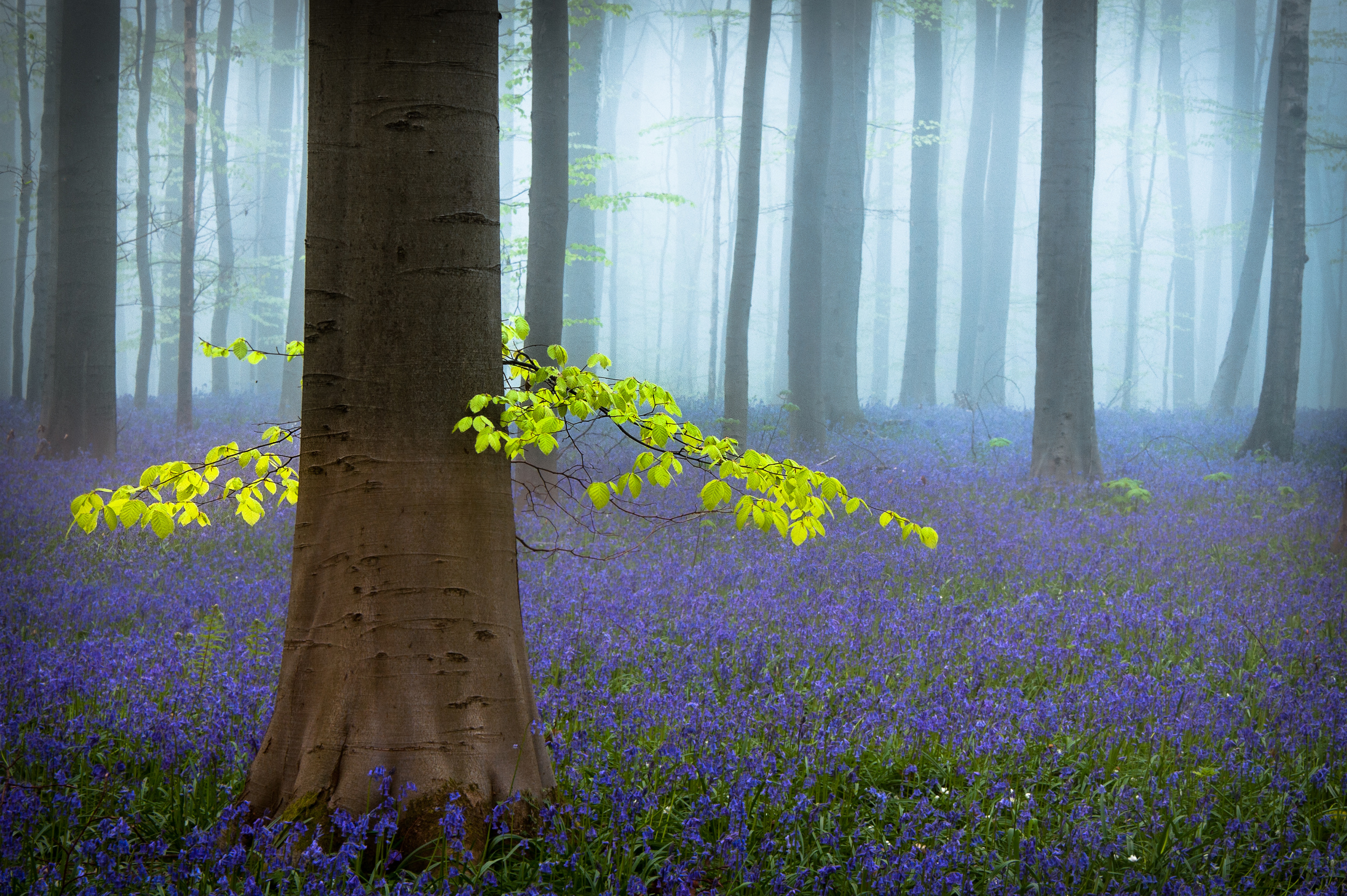
‘Spring...........’ by Piet Haaksma
Green (including Emerald and Olive)
Evokes nature, forests, and water. It has a calming effect.
Purple
When combined with blue, it creates a mystical, cool, and deep impression.
The following five multi-colour combinations are specific and balanced, and are categorised by the style and mood they create.
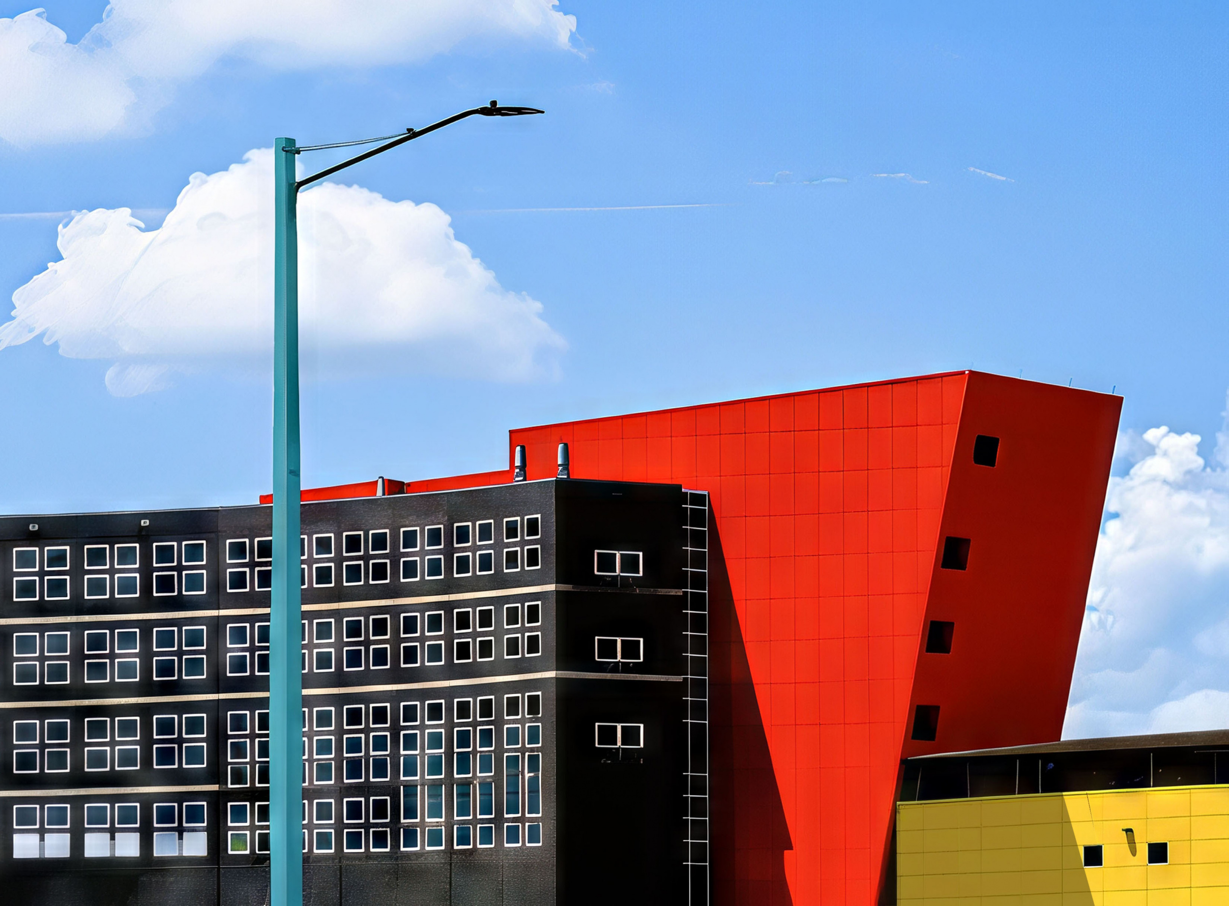
‘modern Architecture - Orlando Hospital, Florida’ by Arnon Orbach
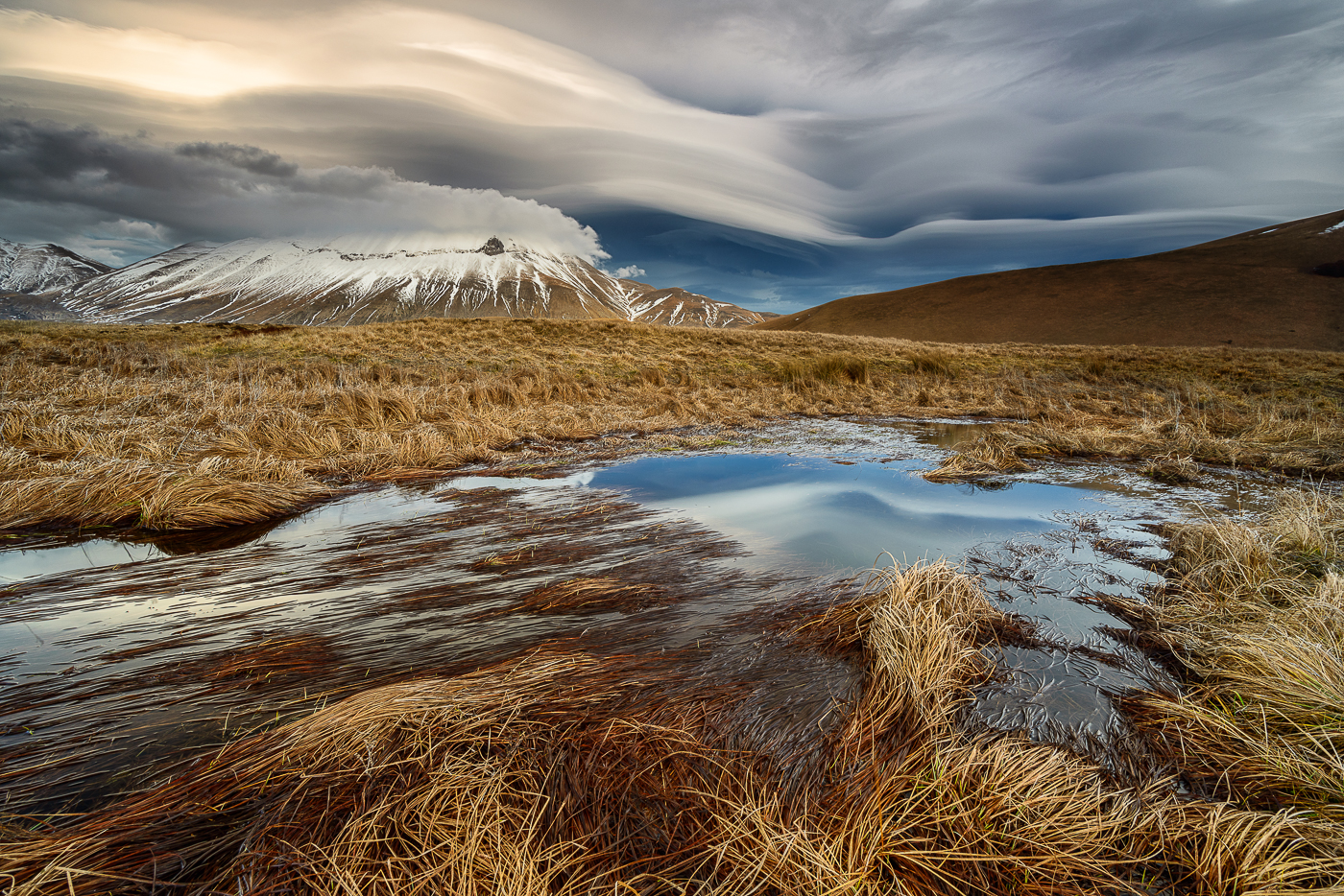
‘Roundness clouds’ by Riccardo Lucidi
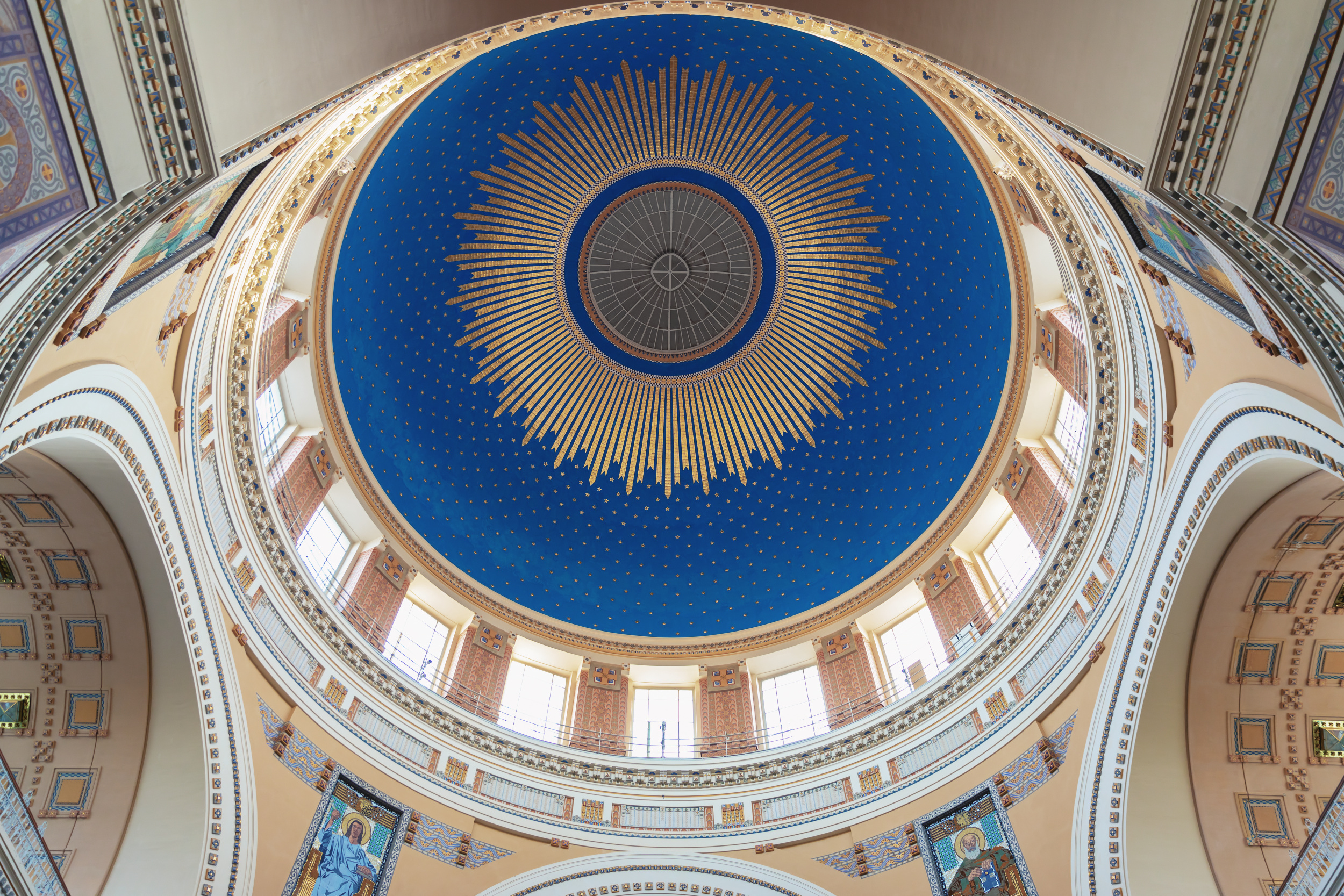
‘Ceiling of a church’ by Roswitha Schleicher-Schwarz
Just Contrast – Blue + Yellow + Red + Black
The yellow, red and black create an excellent contrast with the blue colour of the clean sky in the background.
Seaside Elegance - Blue + Beige + White
White reflects light, beige evokes the warmth of sand, and blue adds depth. This timeless combination visually enlarges the space and creates a clean look.
Modern Luxury - Dark Blue + Mustard Yellow + Gray
Gray provides a neutral base, while dark blue (navy) adds a sense of authority. Mustard yellow, on the other hand, serves as a vibrant accent, breathing life and modern flair into the entire combination.
Natural Harmony - Light Blue + Brown + Olive Green
This combination mirrors nature, with shades of the sky, earth and forest. The brown softens the coolness of the light blue perfectly, while the olive green brings these two colours together to create a harmonious and relaxing whole.
Bold Contrast - Royal Blue + Coral Orange + Cream
Royal blue and coral orange are complementary colours that stand out when placed next to each other. Cream (broken white) plays a key role in softening this sharp contrast, ensuring the final result is not too aggressive.
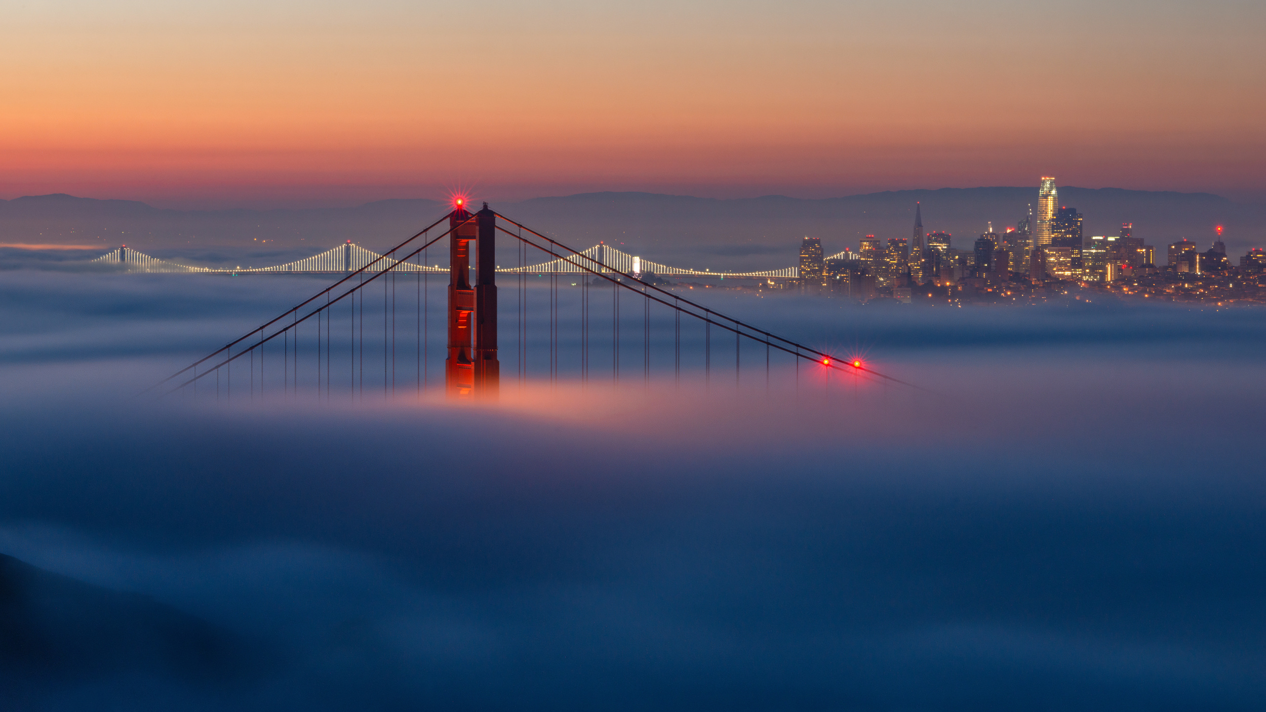
‘Golden Gate Bridge at Dawn 14’ by Xiao Xiao
It is important to emphasize once again that blue is a colour that can instantly capture attention and evoke strong emotions. Whether you are in a scene dominated by blue, or simply gazing at the sky or water, this colour uniquely influences your mood and perception of the world.
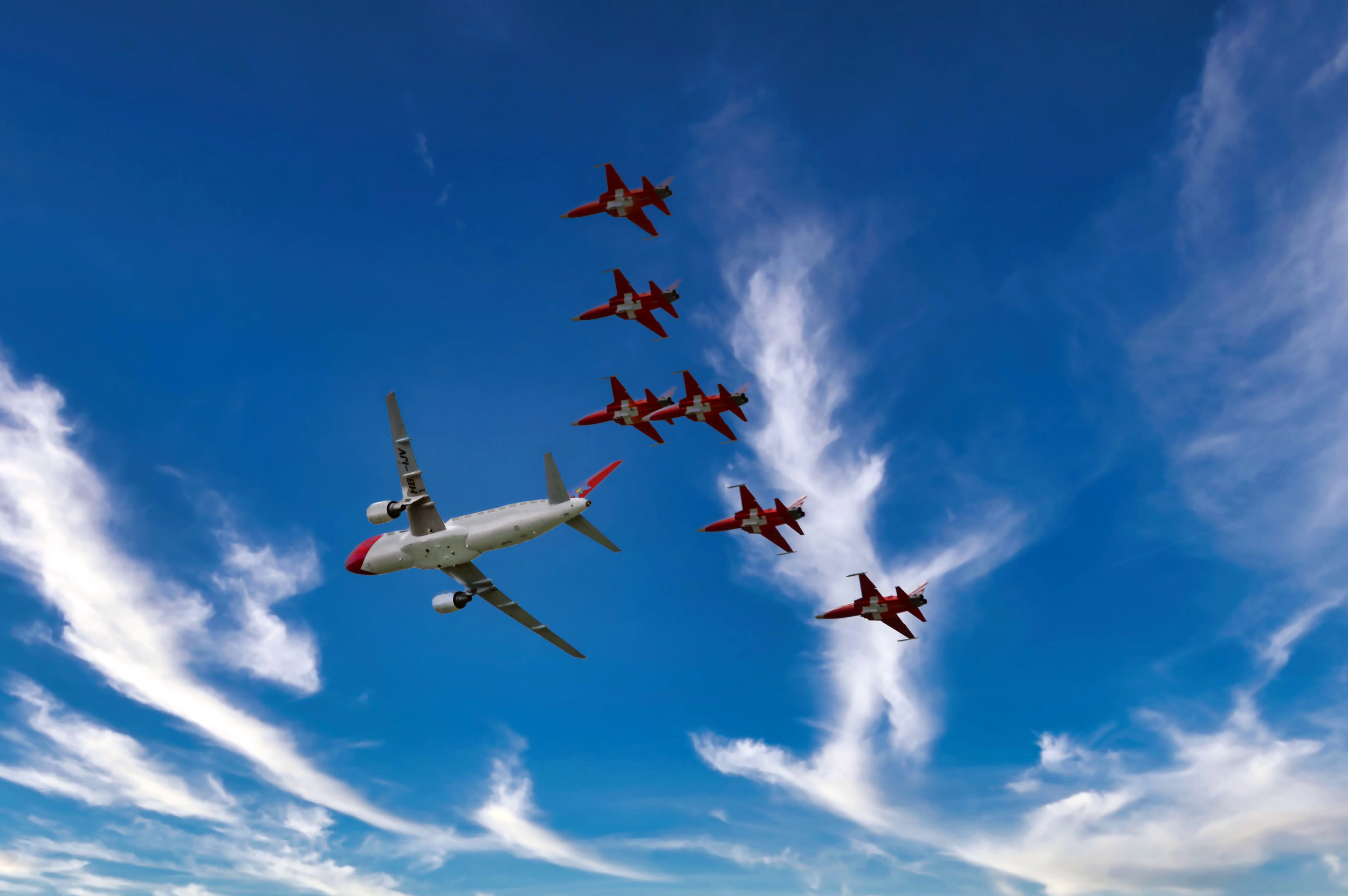
‘Faithful followers’ by Miro Susta
The colour blue has different meanings in different cultures, but it always retains its sense of power and solemnity.
In ancient Egypt, blue was considered a rare and sacred pigment. The Egyptians even developed the first synthetic blue pigment, known as Egyptian blue, which was used to decorate tombs and temples.
In the Middle Ages, the most valuable blue pigment was ultramarine, which was obtained from the semi-precious stone lapis lazuli that was imported from Afghanistan. Due to its high price, it was only used on the most prominent parts of paintings, emphasising their importance.
As chemistry and industry developed, blue pigments became more accessible, enabling artists to experiment with the colour blue on a larger scale.
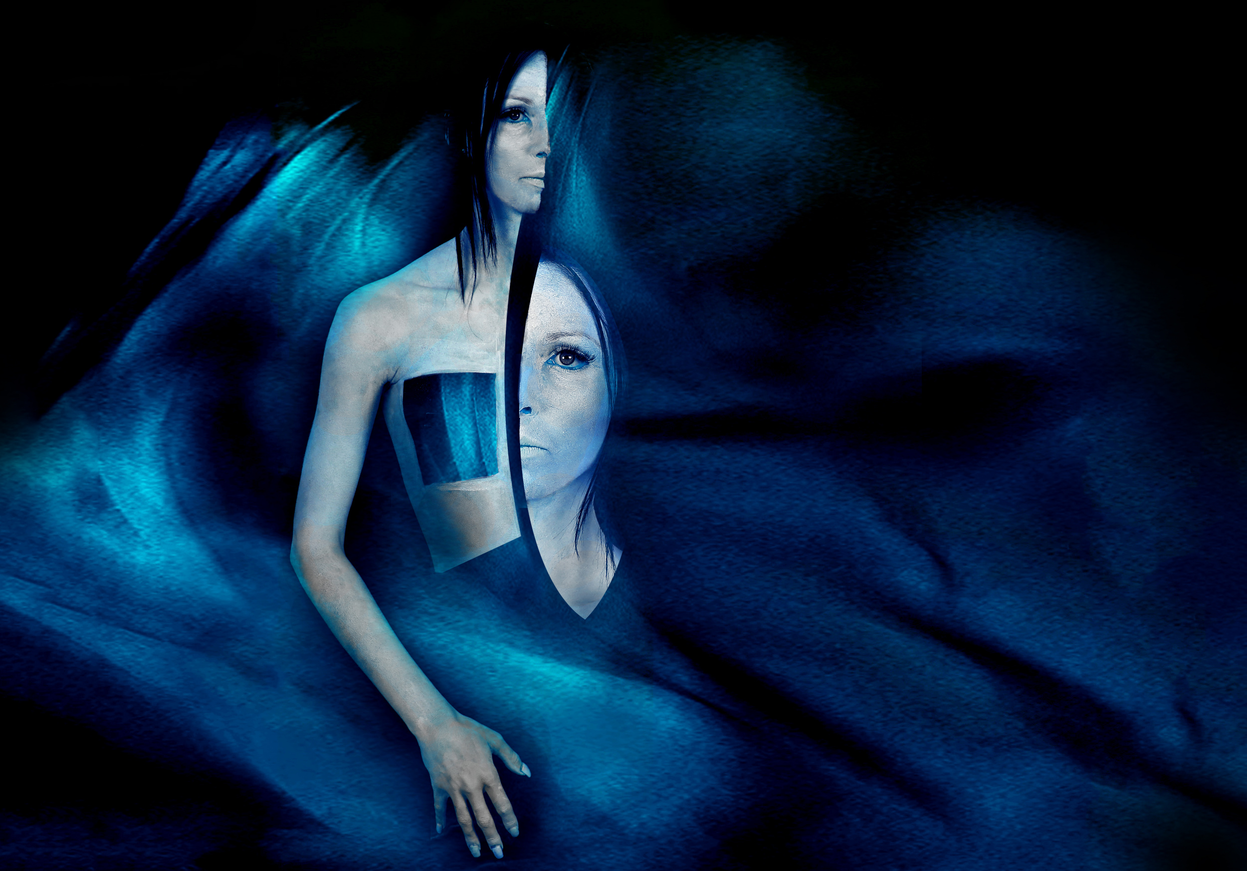
‘The Opening of the Ice-Cold Silence’ by Peter Aczel
Some selected quotes on the topic of 'blue' are included below.
Pablo Picasso: “When I realized that red wasn’t the best colour, I started using blue.”
Vasily Kandinsky: “Blue is a colour that calls a person to infinity and awakens in them a desire for purity and the supernatural.”
Henri Matisse: “A certain amount of blue is always soothing to the mind.”
Raoul Dufy: “Blue is the only colour that retains its own character in all its shades.”
Vincent Van Gogh: “I never get tired of the blue sky.”
Louis Armstrong: “I see trees of green, red roses too. I see them bloom for me and you. And I think to myself what a wonderful world. I see skies of blue and clouds of white. The bright blessed day, the dark sacred night. And I think to myself what a wonderful world.”
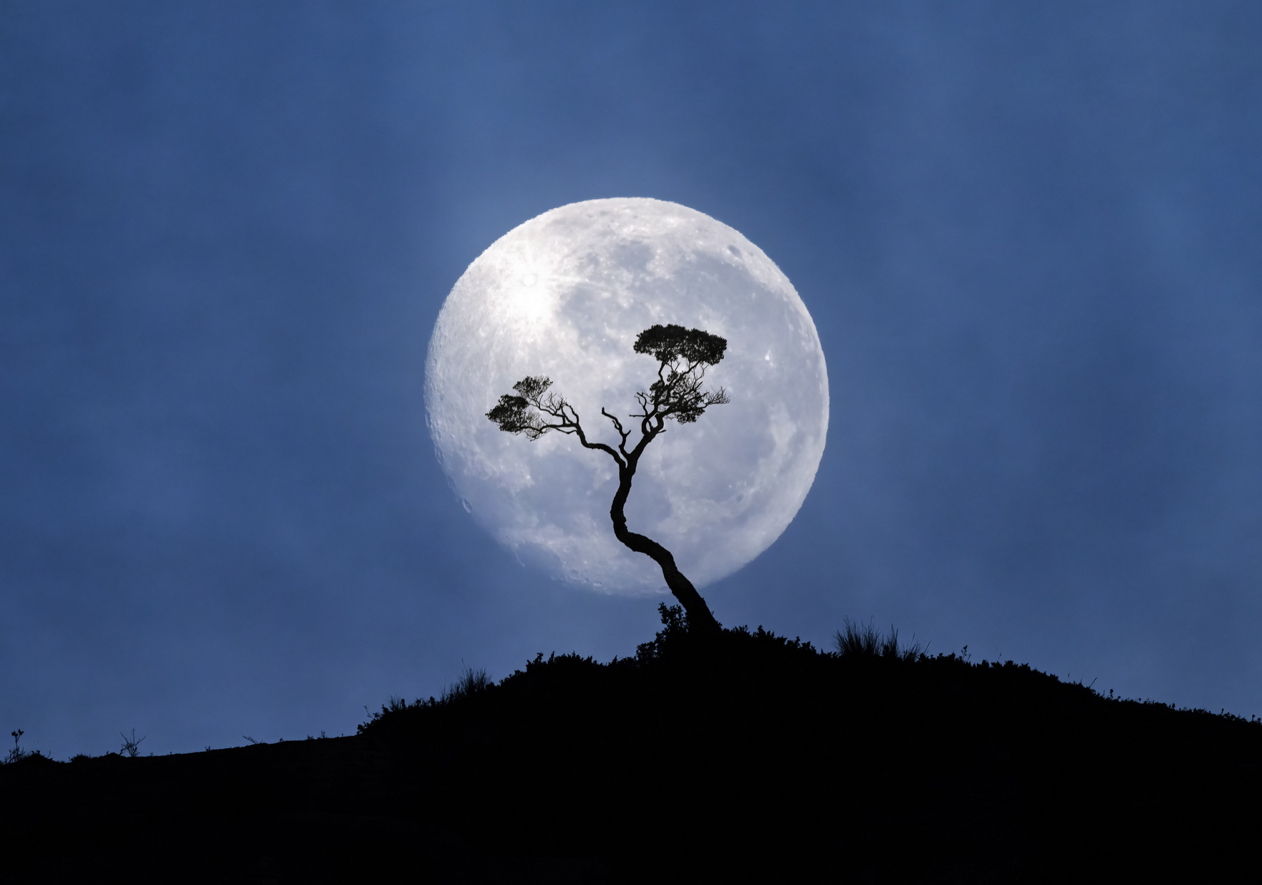
‘PATAGONIA CHILENA, FIORDO GUILLARD-15656’ by Raimondo Restelli AFIAP
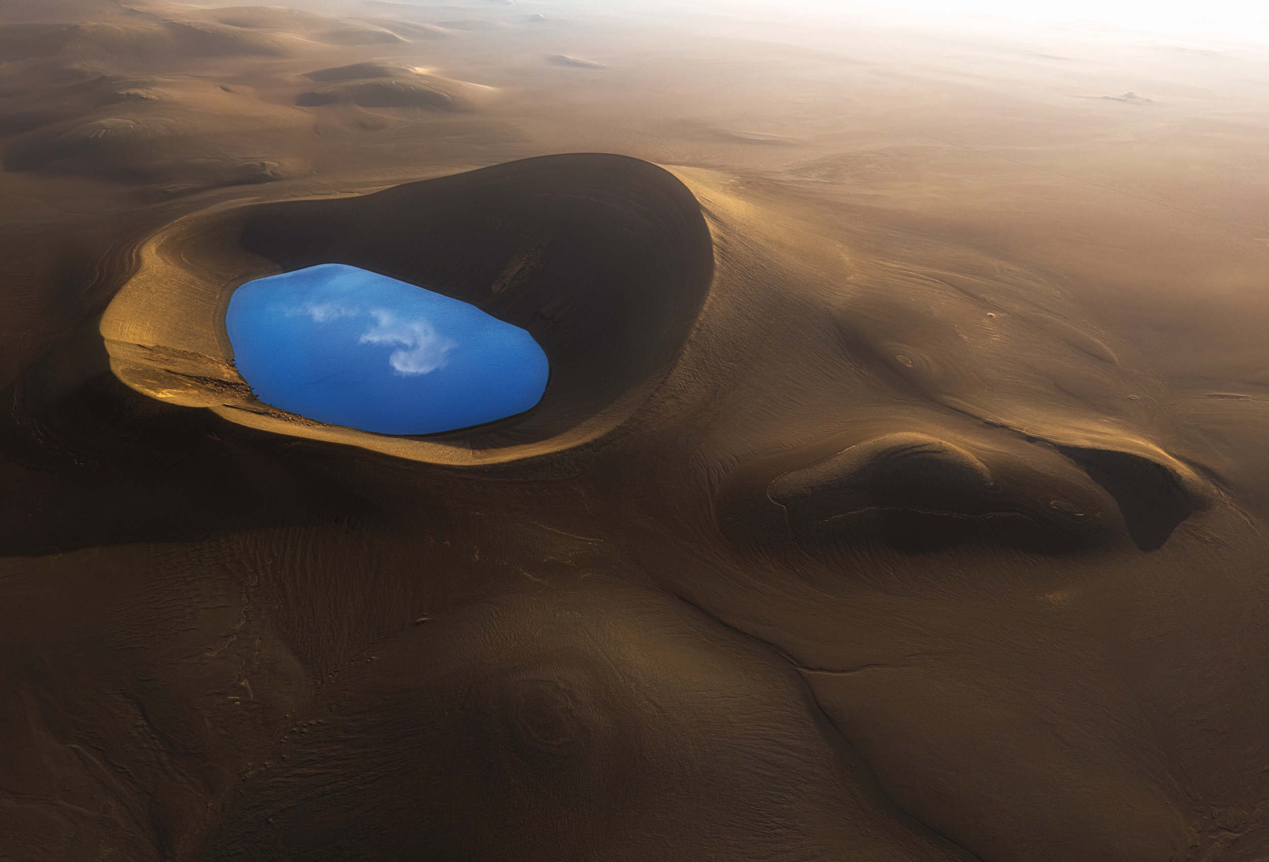
‘Jewel in Highland Iceland’ by Aidong Ning
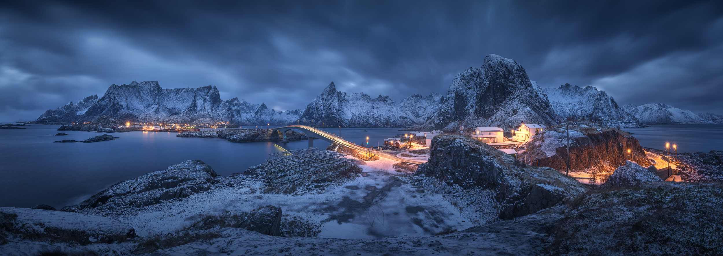
‘Hamnoy in blue’ by Pablo Ruiz Garcia
In conclusion, blue is the most popular colour worldwide. It is known to curb the appetite because it is extremely rare in natural, unprocessed foods. Blue evokes calming psychological associations, although these can sometimes be melancholic or distant.
www.mrsphoto.net
[email protected]
 | Write |
 | Xiao Xiao PRO This article is profound and brilliant! Many thanks to Miro and Yvette. |
 | Eiji Yamamoto PRO Dear Miro, thank you so much for the very interesting and wonderful article with great photos! Dear Yvette, thank you so much as always! |
 | Sokol Priftaj PRO This was a fun read |
 | Arnon Orbach CREW A beautifully conceived and richly illustrated article exploring blue through its emotional, cultural, historical and visual relationships with other colors. The accompanying gallery is superb, and I’m honored to have two photographs included. Many thanks Yvette and Miro. Have a good weekend. |
 | Hans-Wolfgang Hawerkamp PRO much interesting article with a fantastic selection of work, thanks a lot Miro and Yvette |